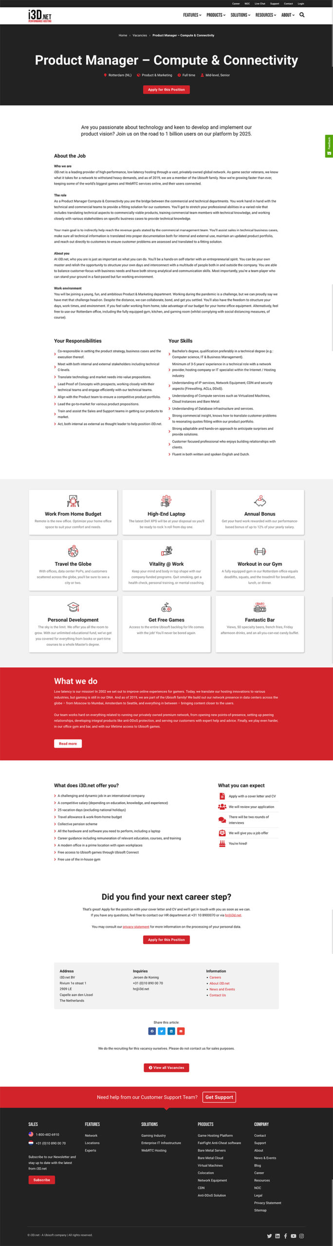
i3D Website
Before we start, to comply with my non-disclosure agreement, I have omitted confidential information in this case study. All information is my own and does not necessarily reflect the views of i3D.
—
i3D is a leading hosting provider for game studios and enterprises. Our unique network spans almost the whole globe. As gaming veterans, we have unique expertise, which enables us to bring low latency experience to end-users of the world’s biggest video games. In 2019 we decided to completely overhaul our corporate website to match the same experience we bring to gamers.
Project Overview
Challenge
- Completely rebuild and redesign the corporate website, to improve the user experience, increase conversion rate and solidify lead generation.
- Secondly, we needed a way to better serve users from different segments; the gaming industry and corporate enterprises.
Background
Role
UX/UI Designer
Time
6 months
Tools
iPad, Paper and pencil, Adobe XD, Illustrator, Photoshop, Miro, Whiteboard, Google Forms, WebAIM, GoodNotes, Excel, Teams, WordPress, Jira, GitLab.
More Details
To dive a bit deeper in the challenges mentioned above, apart from the technology revamp, we also needed to resolve a few problems we were dealing with:
- Our analytics and heatmaps were indicating that we were having some usability issues, which resulted in users not scrolling to the content that could bring value.
- We needed to completely revisit the information architecture, so users could find the content they were looking for.
- The website was built using a mobile-first point of view, which is generally good practice since mobile usage was increasing, but it affected the experience of users on desktops. The content looked as if it was zoomed in.
- We were not attracting the right target audience. Our focus is on B2B, but still a lot of consumer end-users found their way to our website.
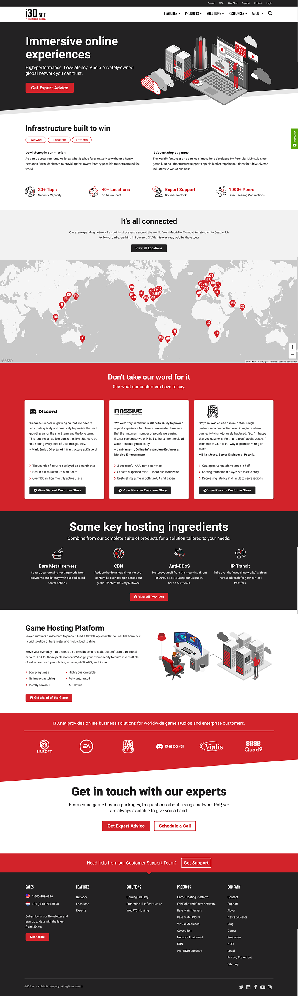
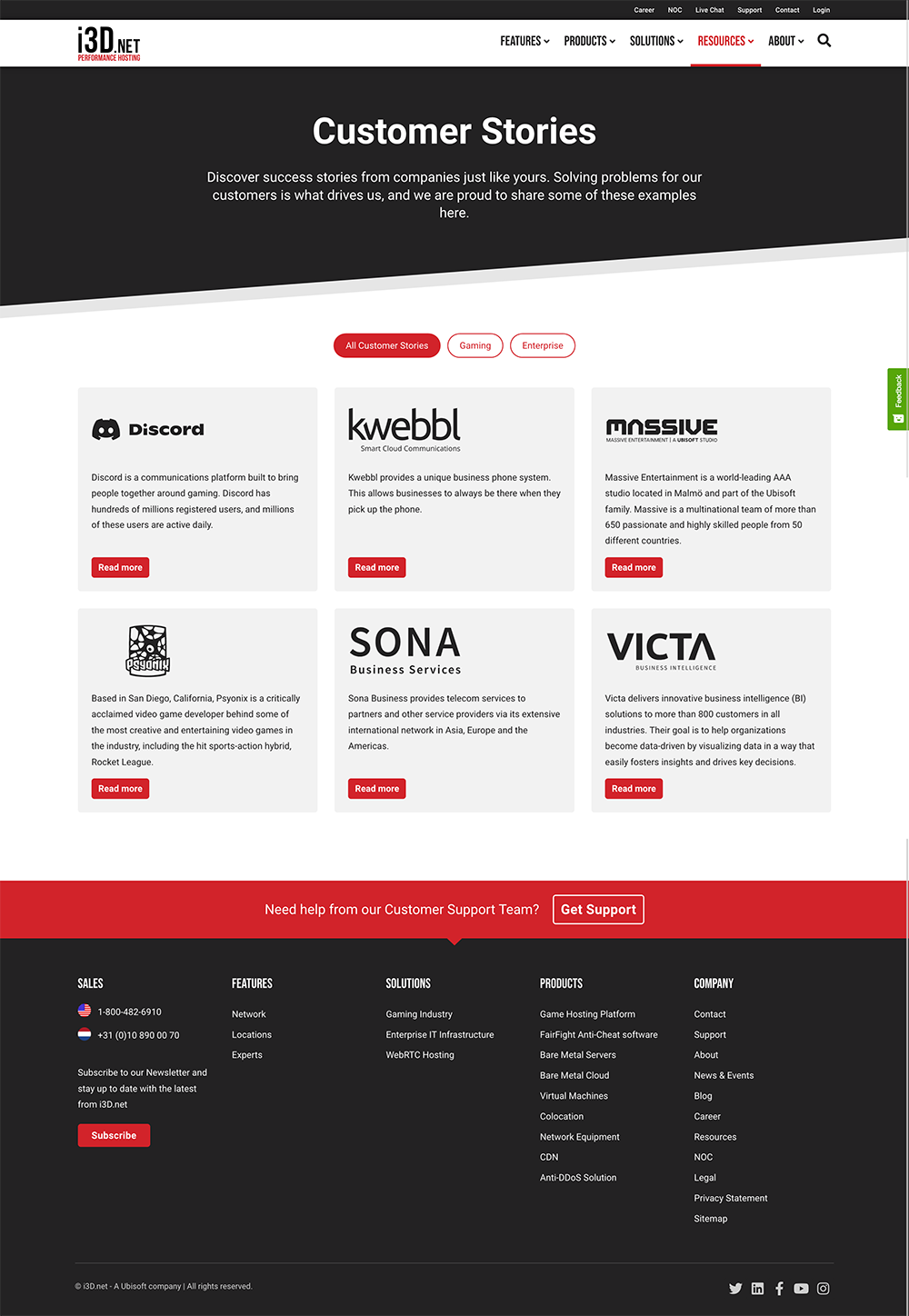
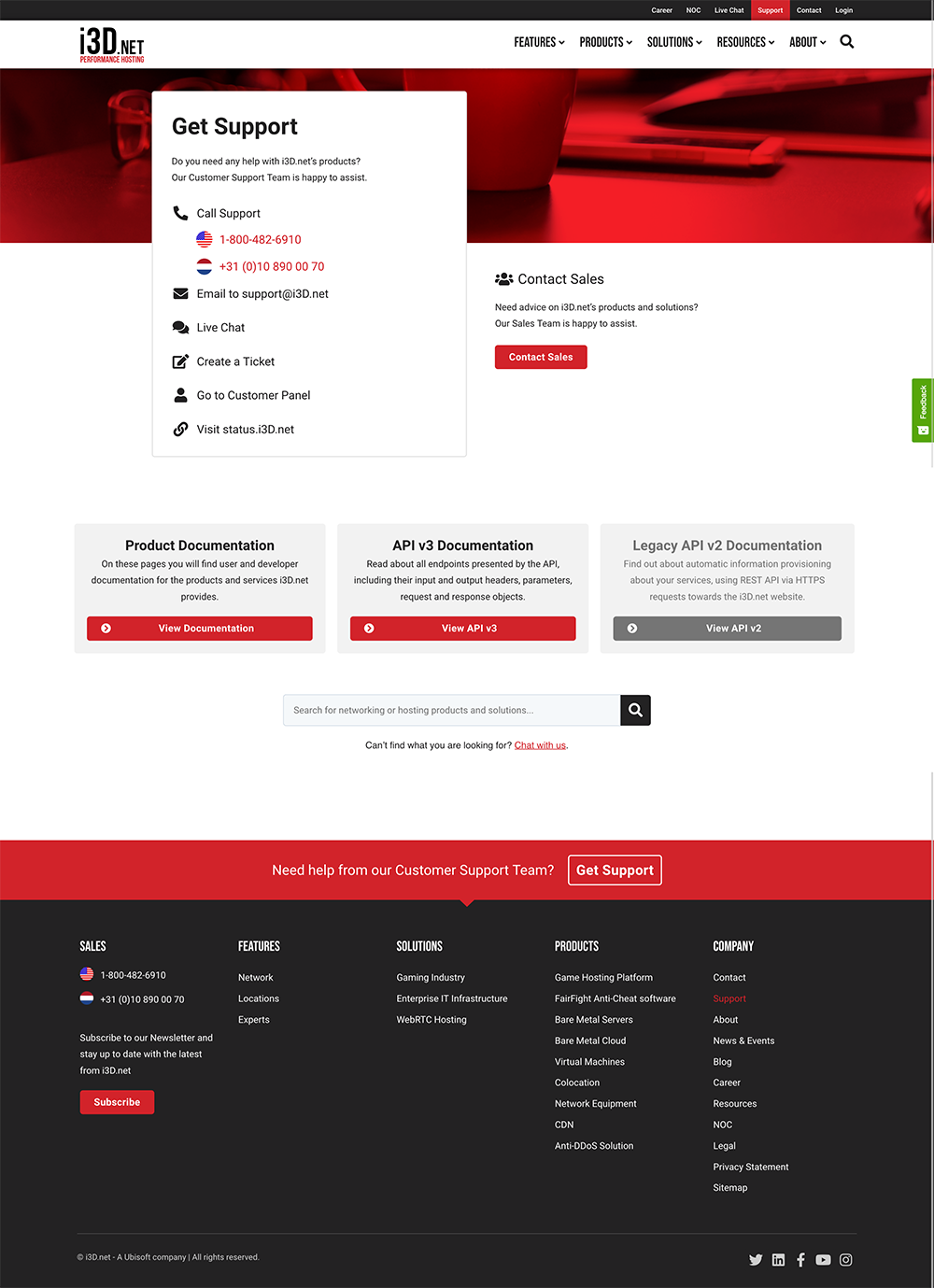
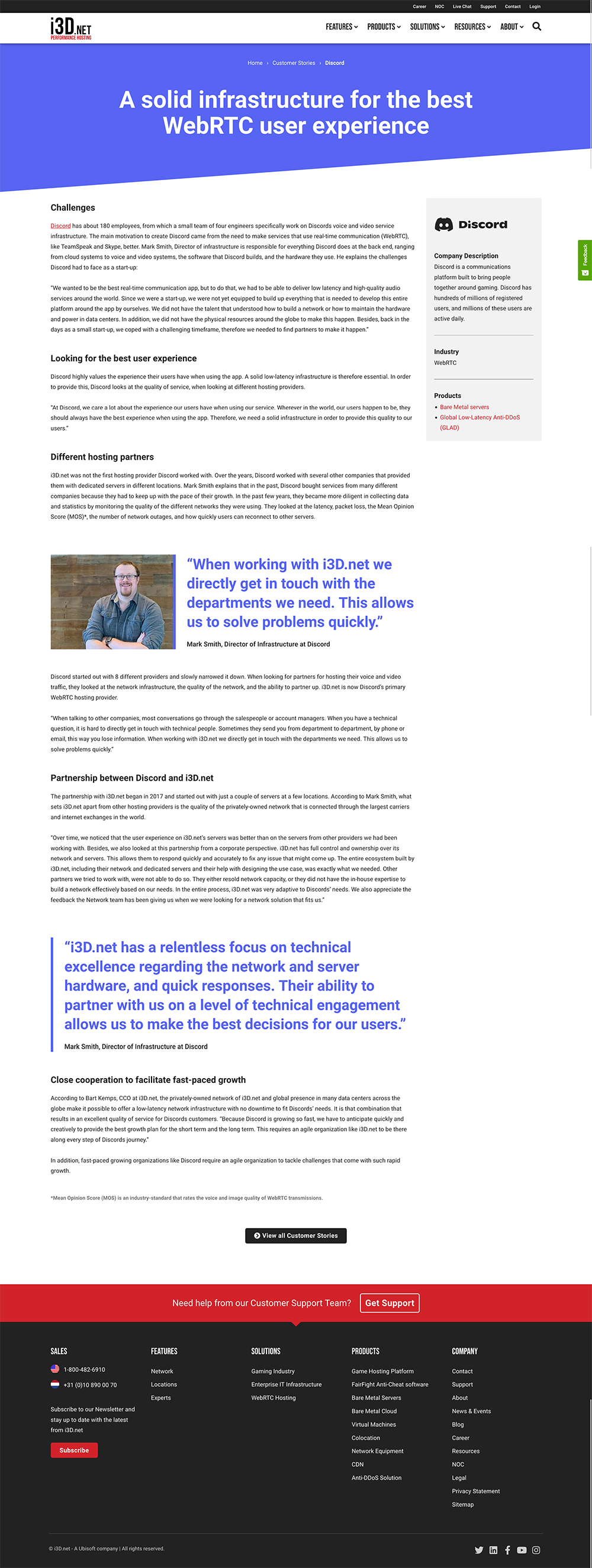
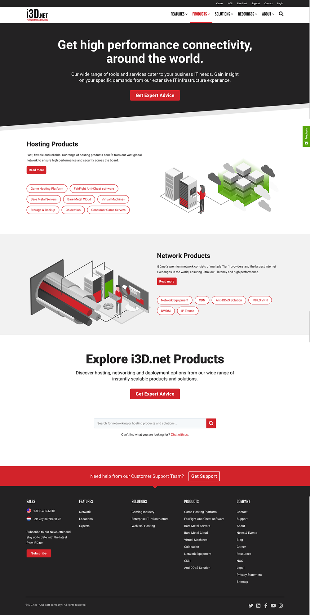
The website prior to the redesign:
You can visit the site on the wayback machine.
Homepage:
Homepage responsive:
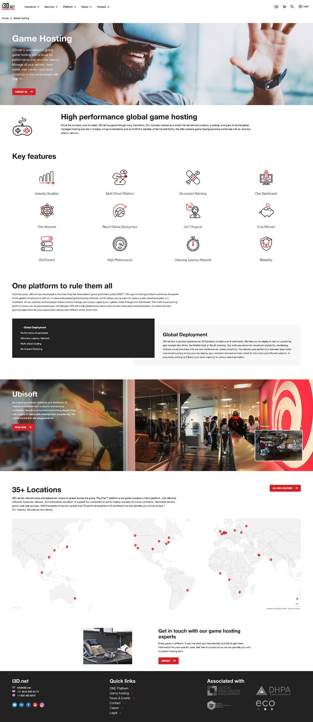
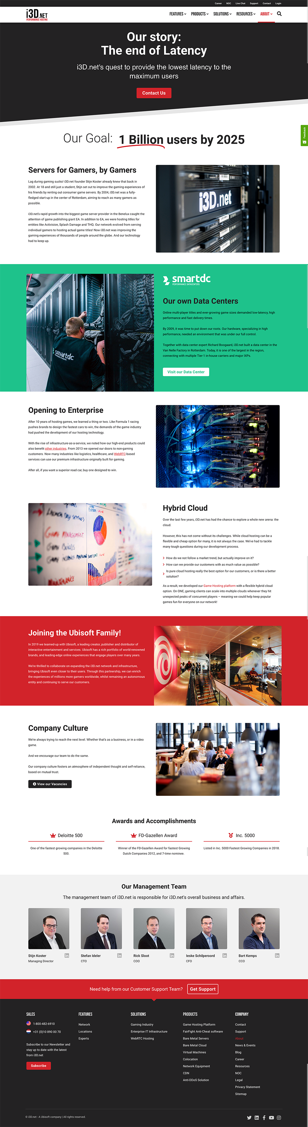
Game Hosting:
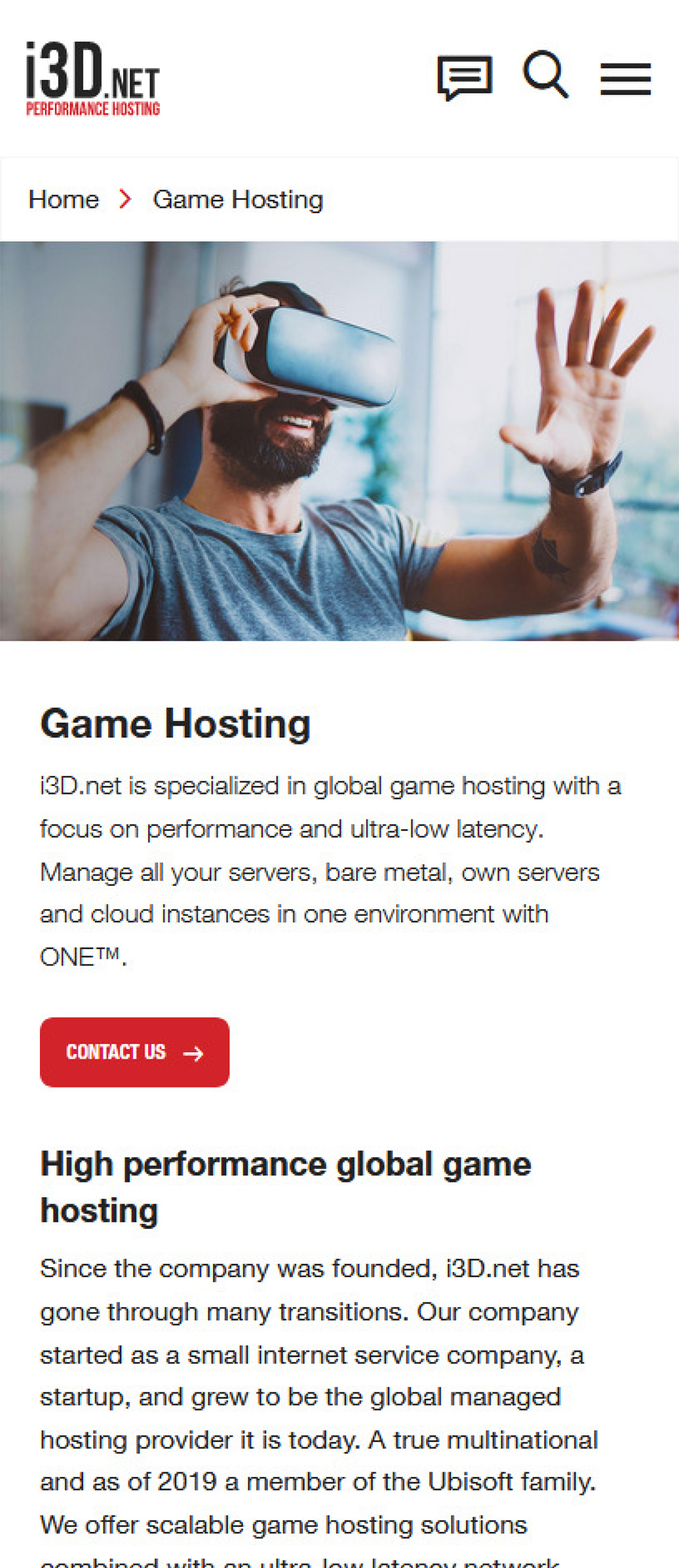
Game Hosting responsive:
Research
With having an existing customer base, we already had a pretty good idea of who our target audience would be; the gaming industry and big corporate enterprises. We decided to perform research to validate our assumptions about our user’s needs and goals, competitors, and market trends.
Through the research, we aimed to:
- Evaluate the strengths and weaknesses of our competitors.
- Discover the needs and goals, motivations, and frustrations of our users.
- Get better insight into the behavior and habits of our users.
Competitive Analysis
We wanted to take a closer look at competitors and how they are serving their target markets. Through our research, we identified competitors who serve both our target markets, and competitors who solely focus on one of our target markets. We were interested in how their websites look and perform, what kind of content they feature and how it is being presented.
GAMING & ENTERPRISE
Google Cloud Platform
Google Cloud Platform (GCP) is a suite of cloud computing services that runs on the same infrastructure that Google uses internally for its end-user products.
Strengths
- The biggest name in the industry.
- Extensive documentation section
- The Google design language is very appealing.
Weaknesses
- They offer so many products, that it’s hard to comprehend and find what you’re looking for.
- A messy-looking homepage with a lot of small content blocks.
- Different styling across different content.
GAMING
Multiplay
Multiplay (now part of Unity) is a UK-based company which was originally founded as a gaming events company. It now specialises in dedicated game servers, working directly with game studios and publishers.
Strengths
- Minimalistic and no-hassle approach, clear Information Architecture.
- Imagery resonates with the target audience; game publishers.
- Great blog content aimed at both technical and commercial audiences.
Weaknesses
- Simple and sober styling that supports heavily on images.
- Limited amount of case studies, but with well-known industry names.
ENTERPRISE
Equinix
Equinix is an American multinational that specializes in Internet connection and data centers. The company is a leader in global colocation data center market share, with 240 data centers in 27 countries on five continents.
Strengths
- Well-thought Information Architecture.
- Menus are still manageable with a lot of products.
- Simple, but effective styling.
- Sympathetic and clear tone of voice; they sound friendly.
Weaknesses
- Some UI elements rely heavily on animation.
- Product names don’t always resonate with the target audience.
ENTERPRISE
Leaseweb
Leaseweb is a leading Infrastructure-as-a-Service (IaaS) provider serving a worldwide portfolio of 20,000 customers ranging from SMBs to Enterprises, with offices in Europe, Asia, and the United States.
Strengths
- Available in multiple languages, supporting local markets.
- A wide range of customer cases is available.
- Seems to support many target audiences.
Weaknesses
- Seem to offer everything, stands in the market as a prizefighter.
- Large menus with many items.
- Optimized for responsive screens, but requires a lot of scrolling.
- No coherence in icons and imagery.
- The apparent difference between newer and older content.
User Interviews
To learn from the real experiences people have, we recruited 5 participants from a group of customers and prospected customers. We focused on asking open-ended questions to learn from their experiences, habits, and behavior, and gather as much insight as possible. With the outcomes of the user interviews, we hoped to serve better content that suits their needs and goals.
QUOTE #1
“One thing I dislike about most websites, are dramatic banners and newsletter popups.”
QUOTE #2
“I’m always very reluctant to give my personal information, for example when downloading a product sheet.”
QUOTE #3
“Whenever I am looking for a new vendor, I always check out if they feature case studies. It helps build trust.”
Affinity Mapping
To synthesize all the information we gathered from the user interviews, we collected our insights on post-its and created an affinity map.
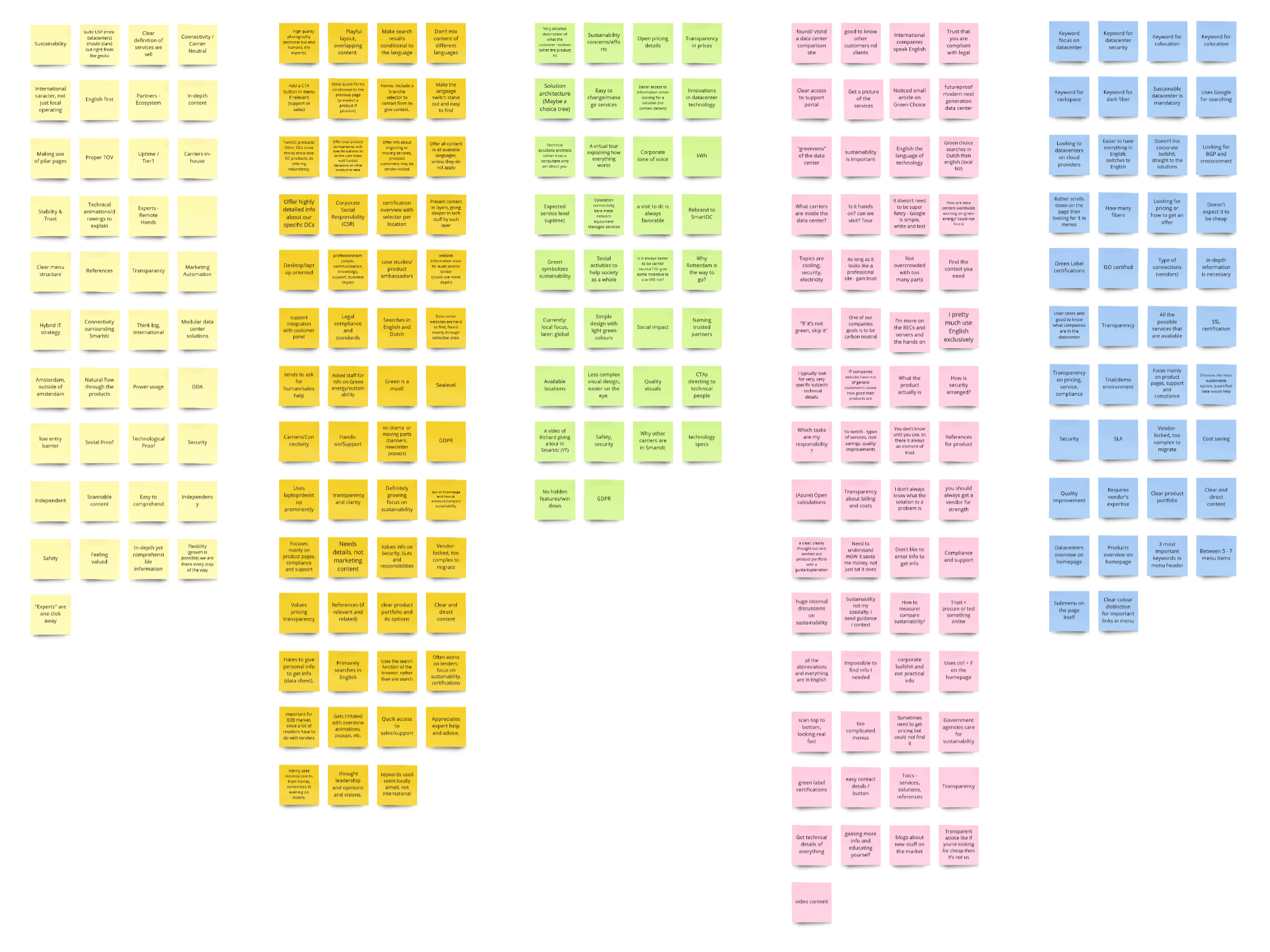
We tried grouping the insights into different topics, which helped us understand what our users truly need and thrive.
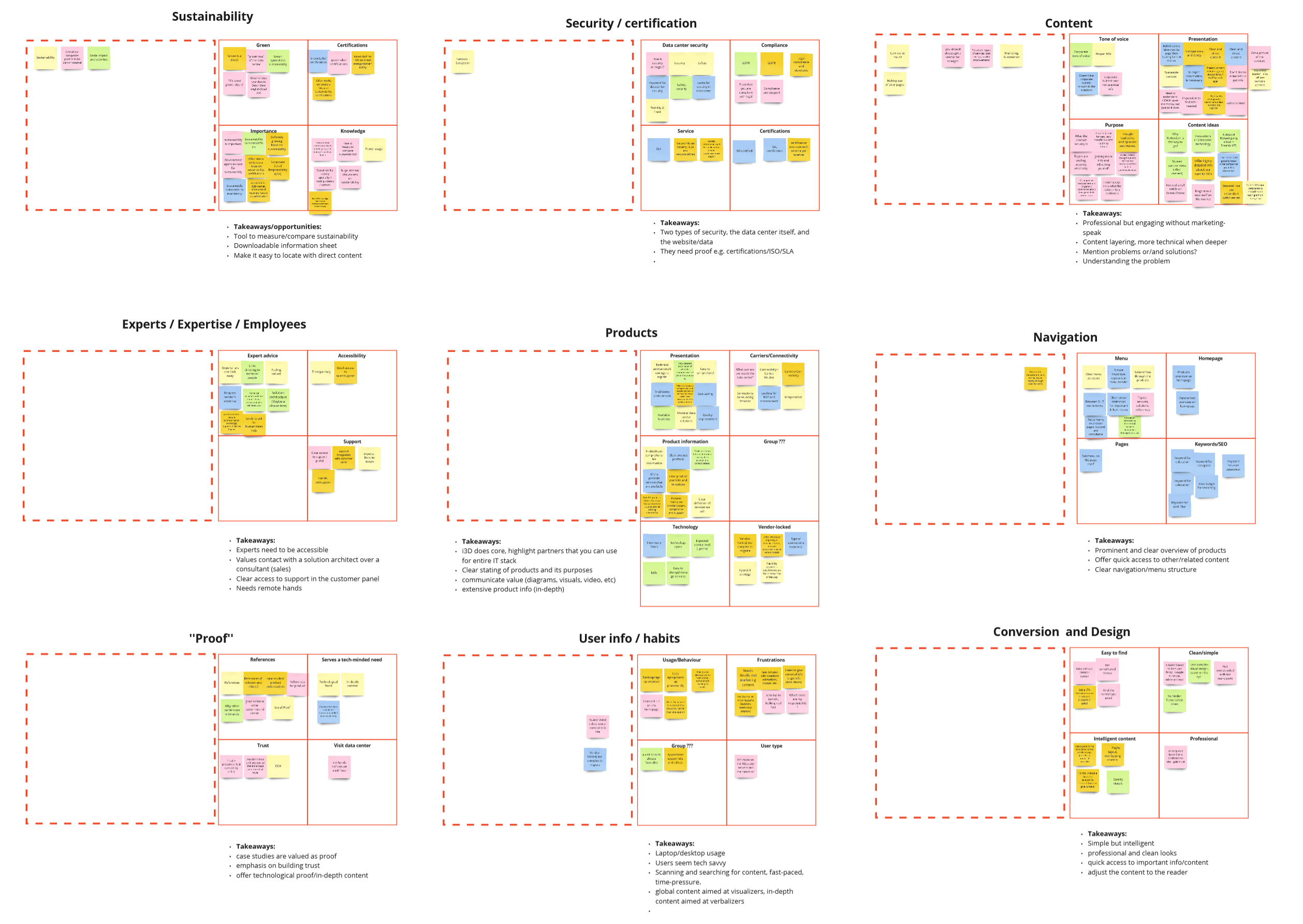
Key User Insights
We identified some patterns from the affinity map:
- Sustainability: Our users and their customers highly value sustainability, it’s often a key decision-maker.
- Security and certification: Users who take part in tenders, usually are asked to provide certifications for the partners they onboard with.
- Content: Content should be professional and engaging, without too much marketing jargon and buzzwords.
- Expertise: We are valued for providing easy access to our experts, and our support team. It should have a prominent and easy-to-find spot.
- Products: With technical products, it’s adamant we clearly state what their features are and what purpose they serve.
- Navigation: The navigation should include a clear overview of all the products we offer, with easy access to related (technical) content.
- Proof: Case studies and in-depth content are valued as proof, they help build trust.
- User info and habits: Our users are very tech-savvy, they quickly scan and search through content.
- Conversion and design: The visual design should be simple and intelligent with professional and clean looks.
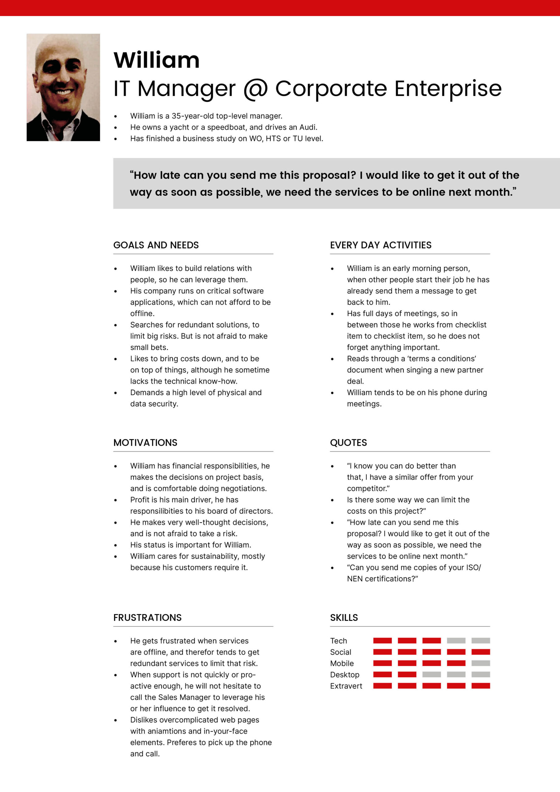
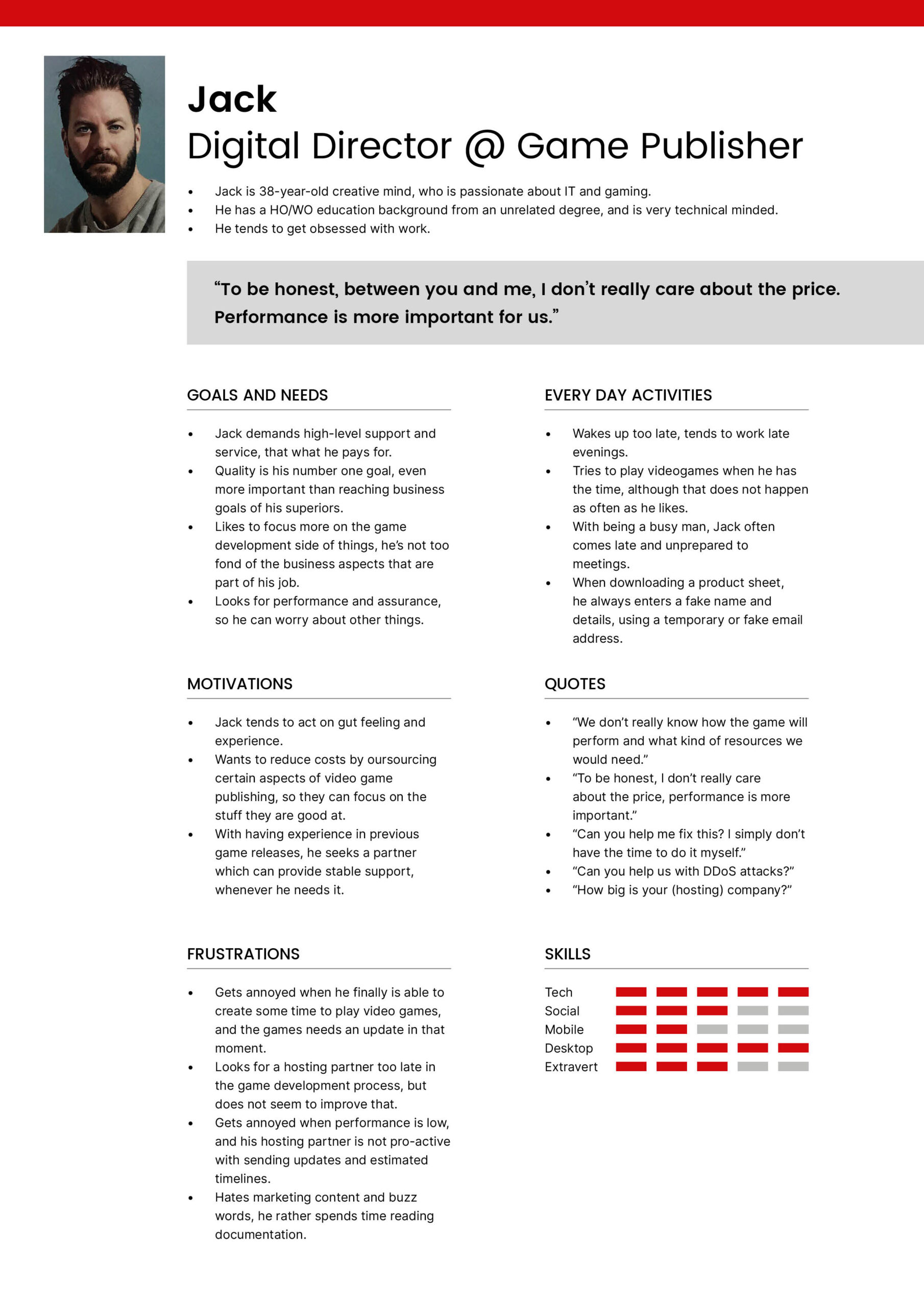
Understanding the User
User Personas
Using the Key User Insights from our research, we validated our findings against the user personas that were created when we developed the previous website, and iterated them slightly.
Understanding the Problem
Problem Statement
IT Managers, professionals, and Game developers need a way to directly get in touch with experts because they do not always have the technical knowledge or the time to invest in searching for the best setup for their hosting infrastructure.
We will know this to be true when we see an increase in the number of contact conversions and a growing number of product sheet downloads.
Hypothesis Statement
We believe that by revisiting the infrastructure and design of the corporate website, and by adding more in-depth content, we will attract more visitors from our target audience, and we will be able to generate trust to convert them to customers, so we can help them offer the best experience to their end-users.
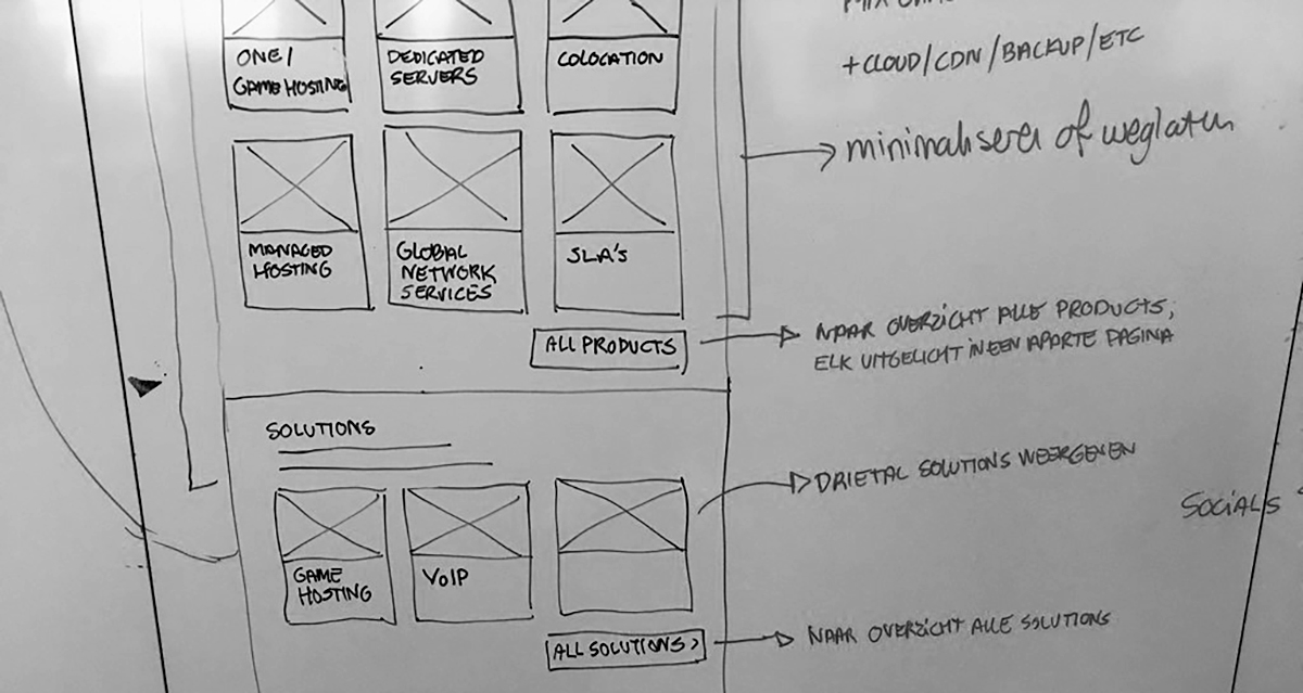
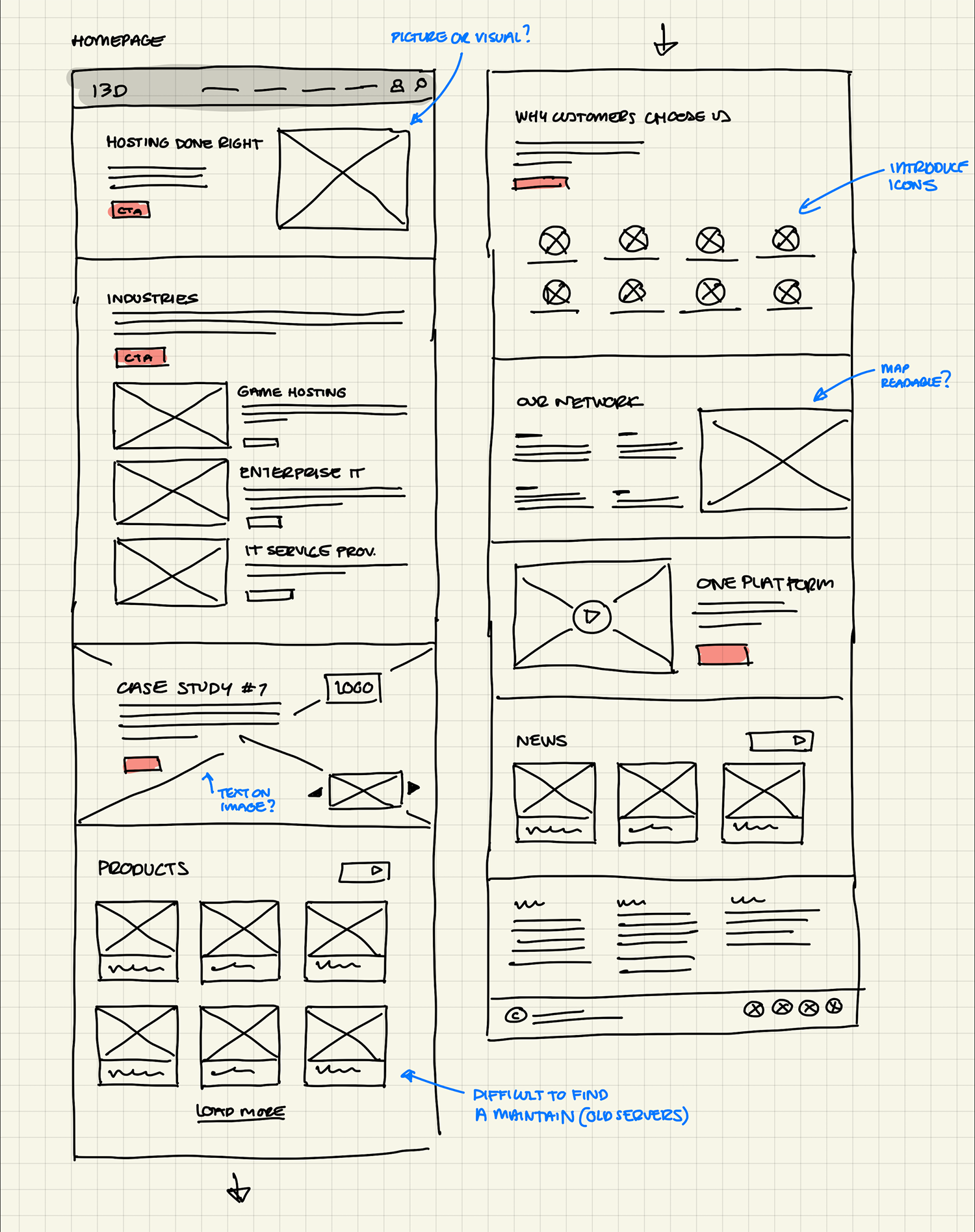
Wireframing
With the learning from the research, we started utlining the content and creating low-fidelity wireframes on whiteboards, and on paper. Both design and content were in a continuous feedback loop, to make sure both aspects were aligned.
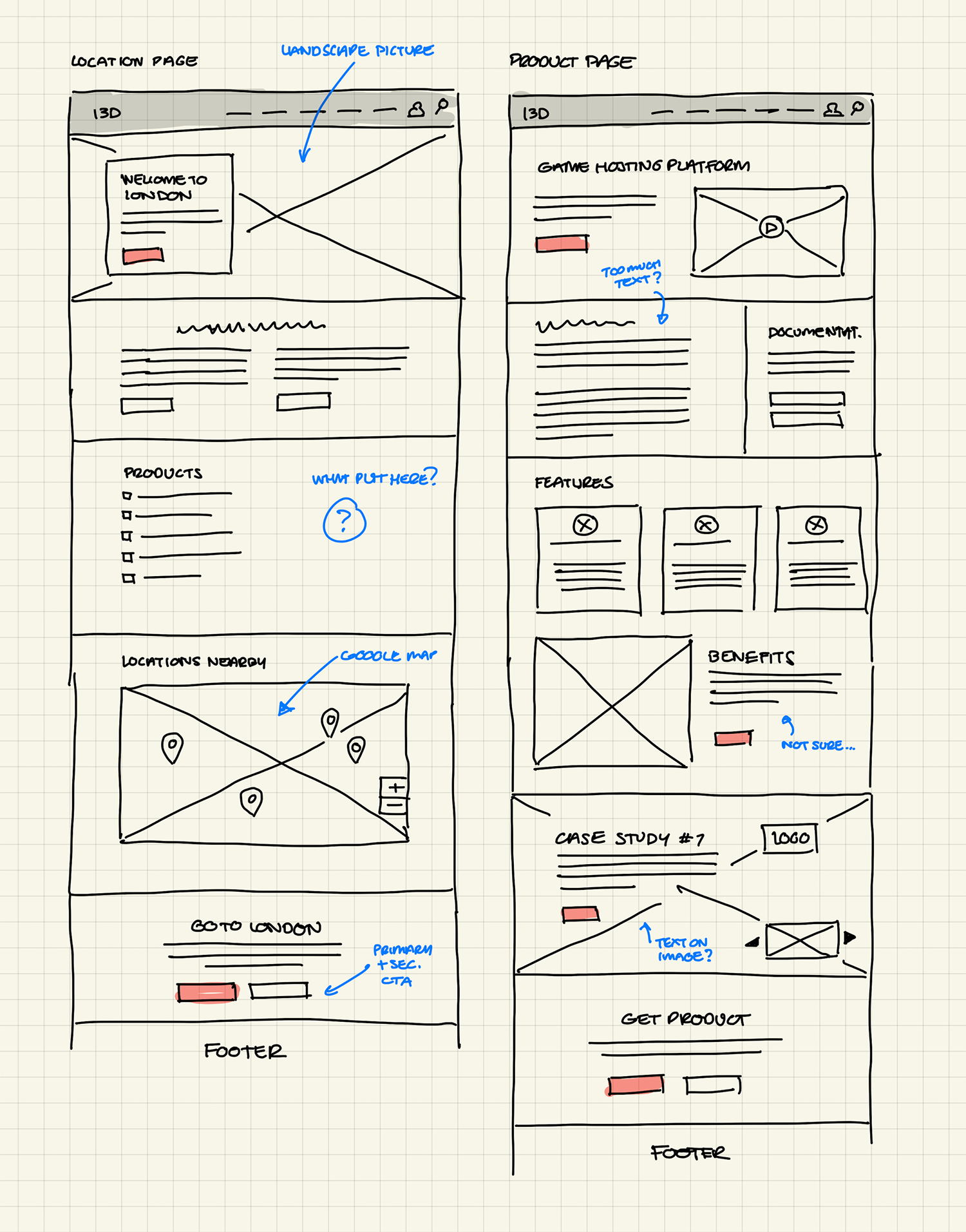
Low-Fidelity Wireframes
We made wireframes on iPad, paper and whiteboard with rapid iterations. A small selection:

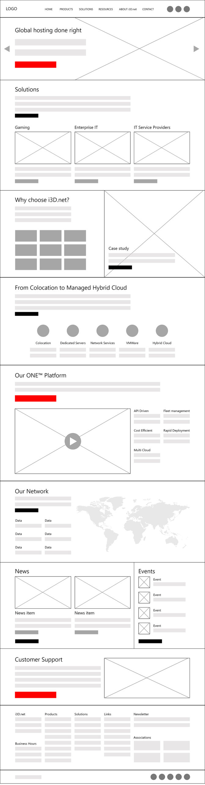
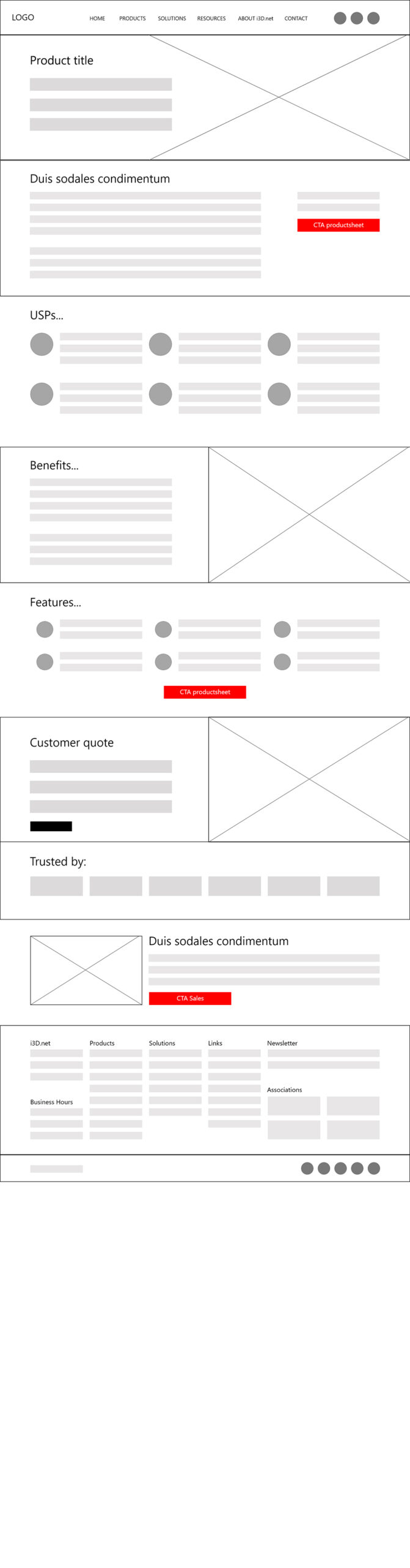
Mid-Fidelity Wireframes
For some pages we created mid-fidelity wireframes in Adobe XD as assets we could get (internal) feedback on, and discuss with stakeholders.
Creating the Design
To not lose any time, and to make full use of the flexibility of WordPress page builders, we took our learnings from the low- and mid-fidelity wireframes and outlined the high-fidelity designs directly on the website. With the technical limitations of the theme and plugins that we used, we could not afford to make a full-fledged design in a separate tool such as Adobe XD, and eventually, find out that our ideas were not feasible to develop. We decided to create the pages directly in the CMS and resolve or circumvent any issues that we came across.
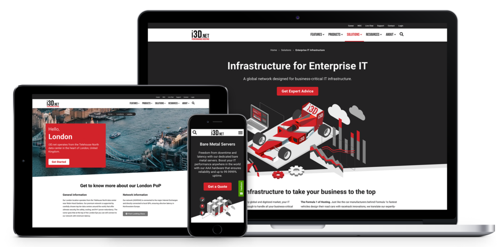
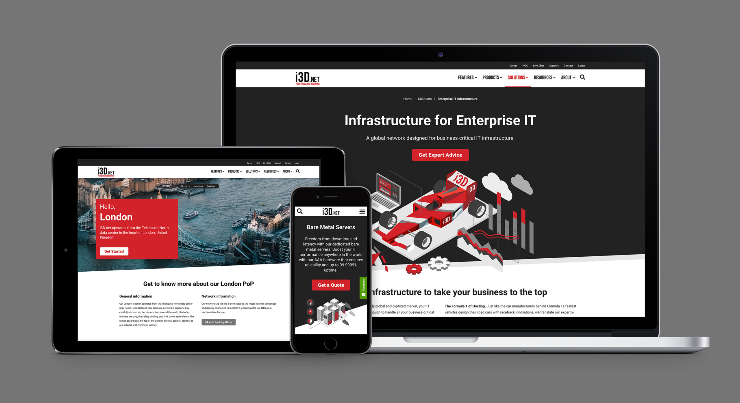
High-Fidelity Design
High-fidelity designs were directly created within the WordPress CMS, using the pagebuilder.
What we still need to do?
- With the use of different plugins and addons for the page layouts and differences in functionality, some overview pages look a bit different from each other. We need to revisit the design of those pages and apply a consistent design that works for all of them.
- We may have cut a corner here and there regarding layout spacing, applied styling, responsive behavior, etc. We need to invest time in making it more consistent.
- We’re constantly reviewing the traffic on the website, and the conversions on the offered downloads, such as product sheets. Performing A/B tests will help us adjust the layout and the design of the pages, to aim for higher conversion rates.
- The current content still lacks the technical depth that our target audience prefers.
- The performance of the website still needs adjustment. We’re experimenting with new ways of caching, hoping to improve performance and page speed ratings.
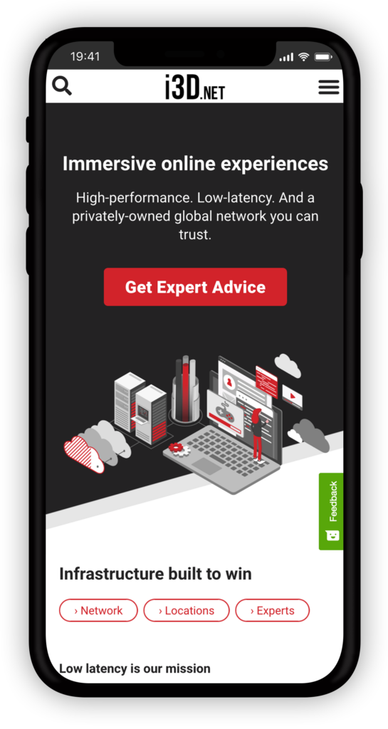
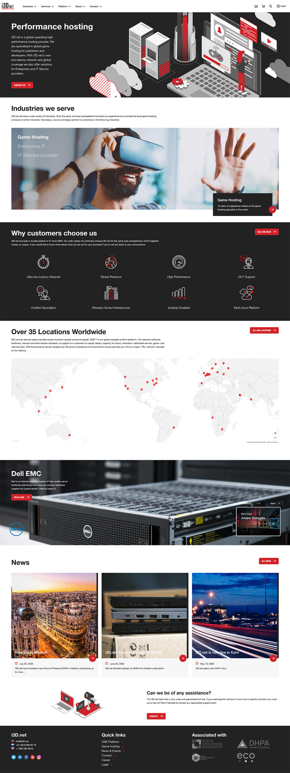
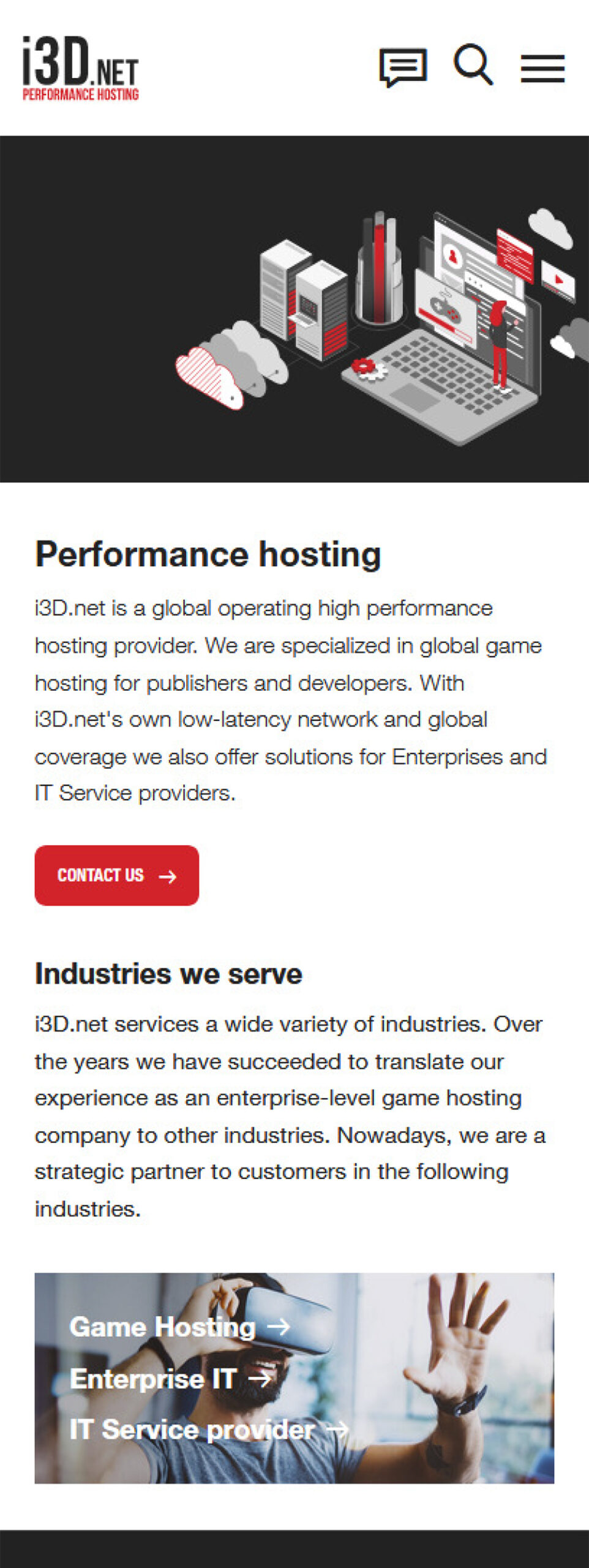
Final Result
Throughout this project, we managed to validate a lot of our assumptions, but more importantly, we learned a lot of new insights about our users. The website is an ongoing project, and while writing this, we’re already changing some of the content and the Information Architecture.
We managed to deliver a completely new website that has a much better user experience, shows higher conversion rates, and has already proven to be a solid lead generator. With ongoing tweaks, we hope to dial in on our target audiences even more, and hopefully serve the content they are looking for.