Making workspace navigation faster in Postman
How a simple "remove workspace from list" request uncovered a deeper navigation problem and led to starring, peek, and faster workspace switching.
Snapshot
Workspace navigation in Postman had become slow and error-prone, especially for users juggling many workspaces. What started as a simple request to “remove workspaces from the list” revealed a deeper issue: people lacked control and confidence when switching contexts.
By rethinking the workspace switcher around prioritisation and lightweight context, we turned a flat list into a decision surface. Starring, peek, and clearer signals helped users recognise the right workspace faster without opening several tabs or guessing.
The result was a navigation experience that quickly became part of everyday workflows, reducing friction in one of the most frequently used parts of the product.
The Core Problem
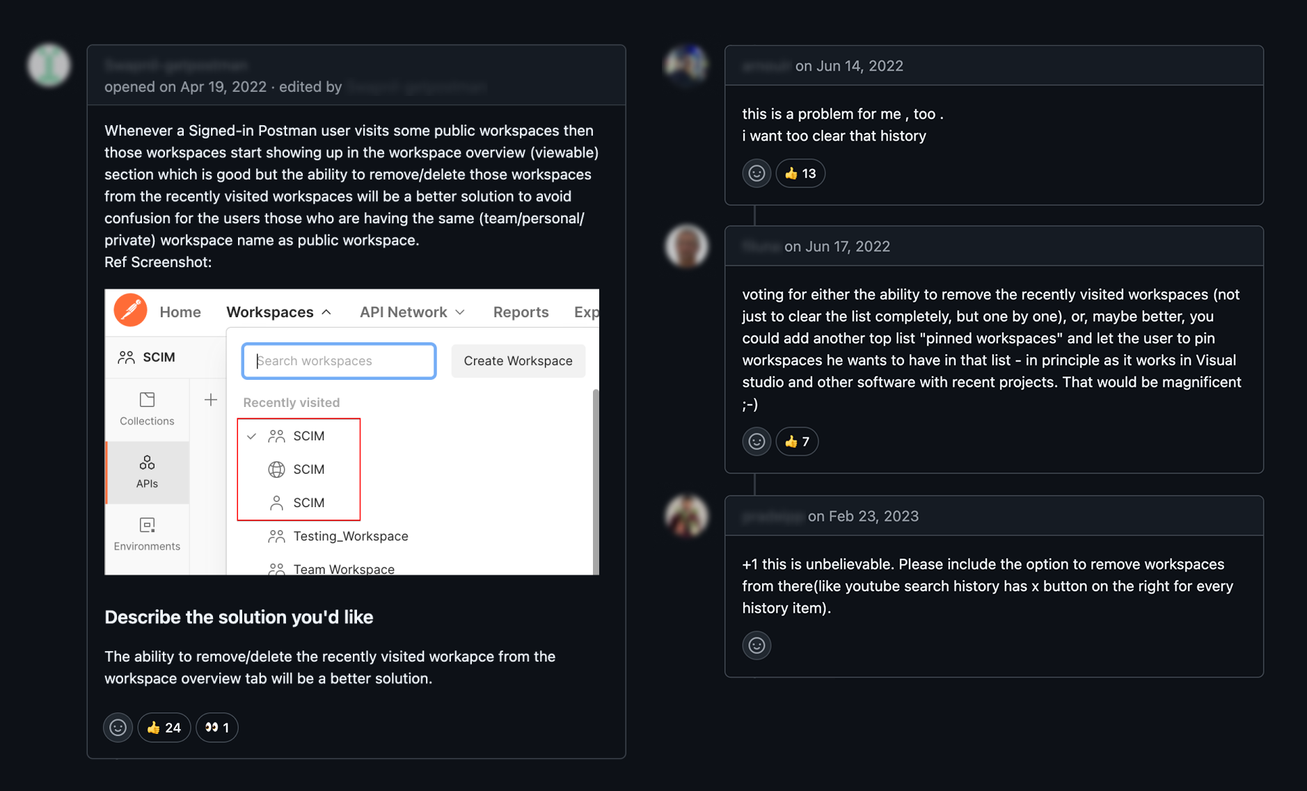
A highly upvoted GitHub thread pushed this issue to the top of the backlog. Developers didn’t hold back:
“My switcher is full of workspaces I never needed.” “I visited a workspace once by accident and now it is stuck there forever.” “The names don’t help at all. I keep opening the wrong one.”
Quotes from users on GitHub
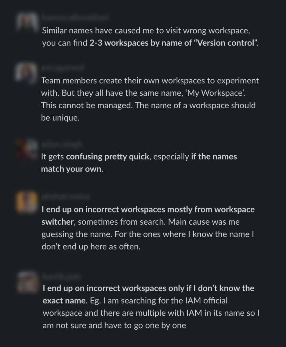
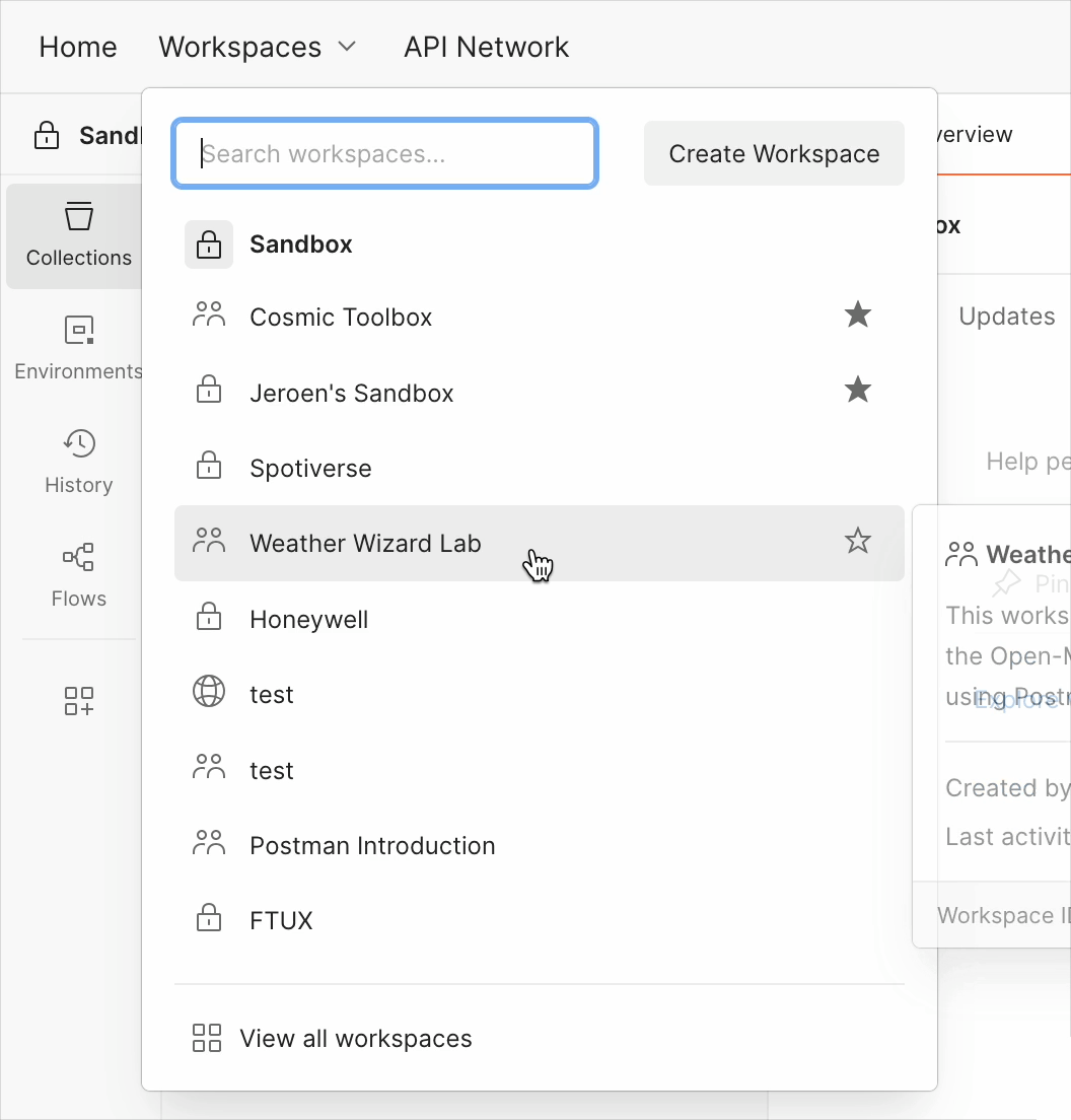
Many asked for a delete button. But once we looked deeper through interviews and usage patterns, it became clear that deletion was only a symptom of something bigger. The switcher wasn’t aligned with the workspaces people actually depended on, and workspace names alone weren’t enough to recognize anything. Teams often reused the same names or used vague labels, so users ended up guessing their way through navigation multiple times a day.
Users needed clarity, not cleanup tools
People weren’t asking for deletion because they wanted to curate lists. They were asking because the system wasn’t helping them. Once that clicked, the underlying issue came into focus: the real problem was relevance and recognition, not cleanup.
The Solution
We rebuilt workspace navigation around clarity and user control.
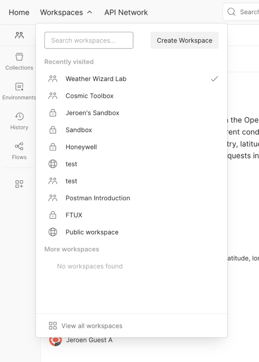
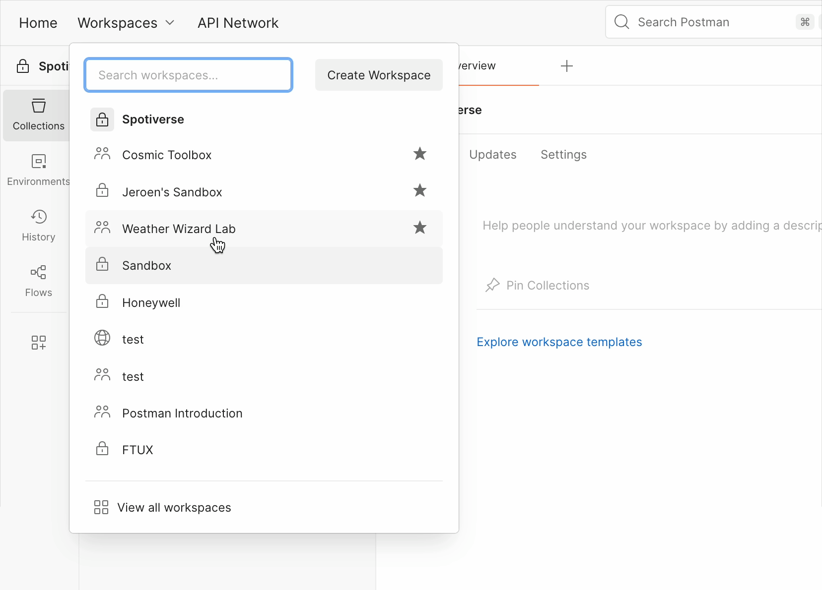
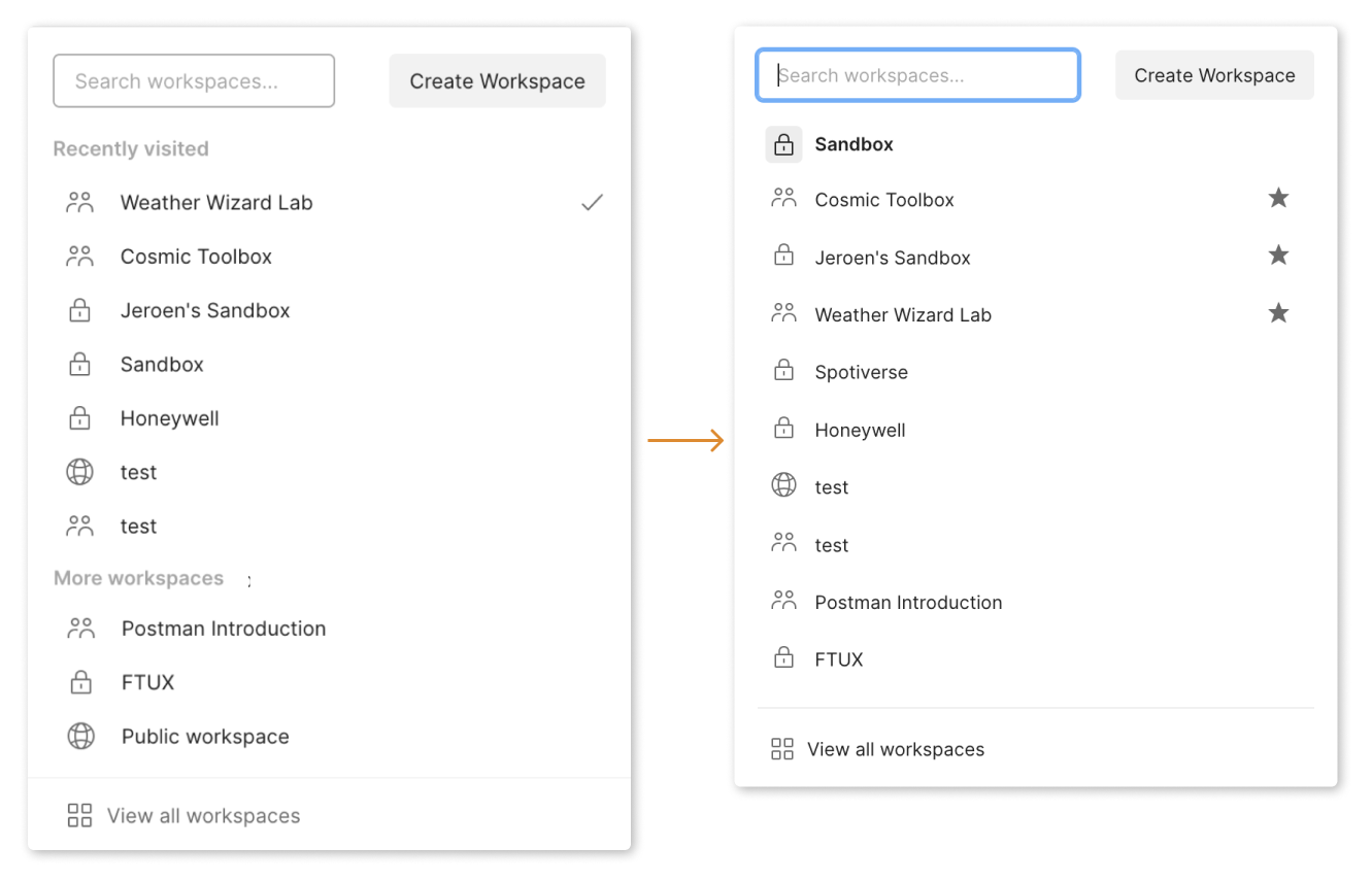
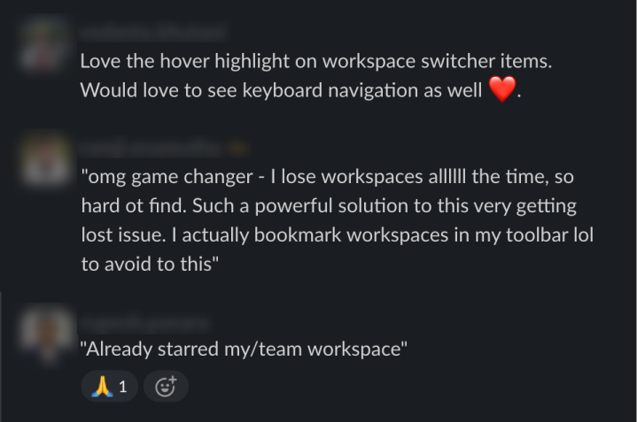
Starring for relevance
Starring gives users a simple way to elevate the workspaces they rely on most. Starred workspaces now appear first in the switcher and receive priority in search and forking flows.
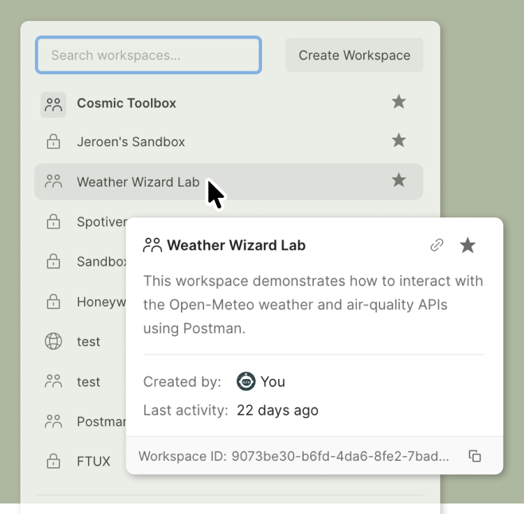
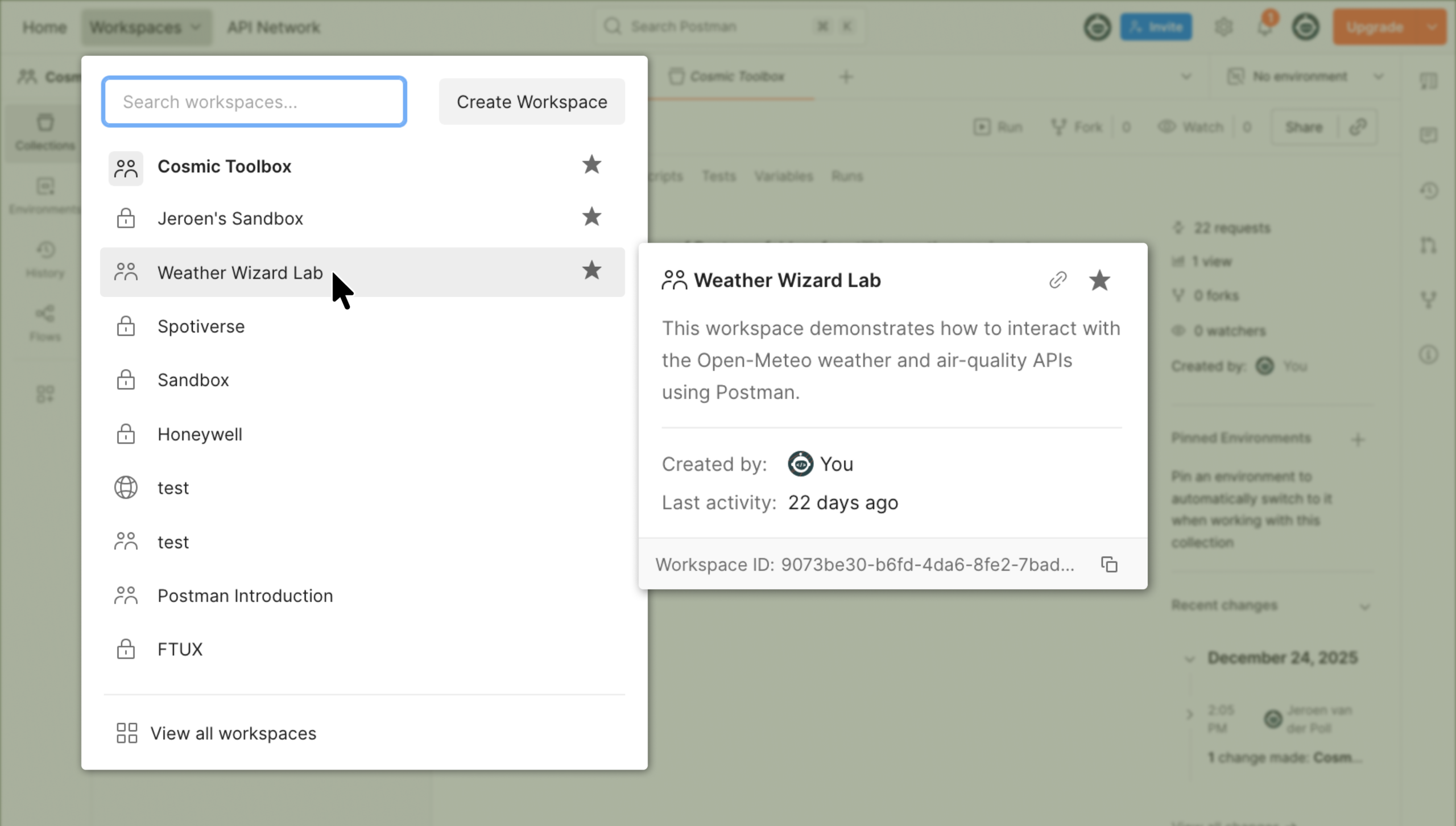
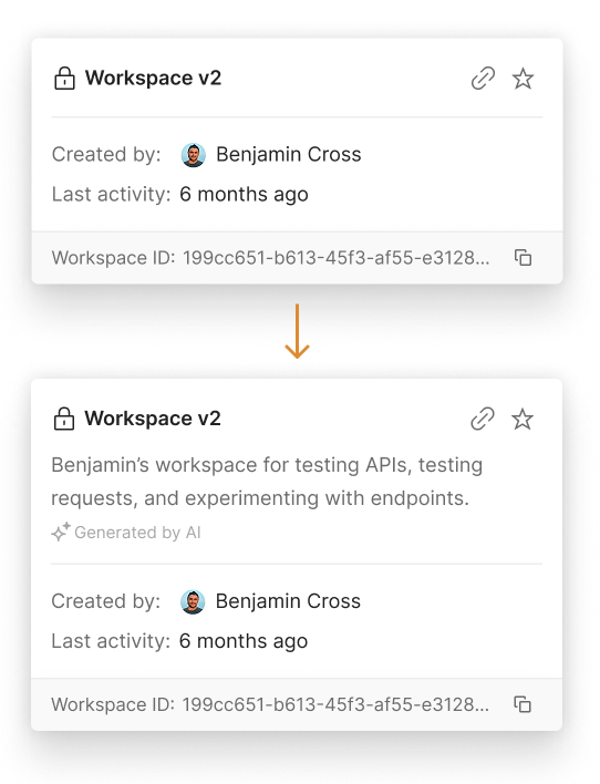
Peek for recognition
To address ambiguous naming, we introduced peek. Peek appears on hover anywhere a workspace name is shown and includes essential context:
- quick actions like starring or copy link
- summary when available
- owner
- last activity
- workspace ID
Peek turns “Is this the right workspace?” into a quick, confident check instead of trial and error.
Ordering users can trust
The previous list leaned heavily on recency, causing workspaces to jump around in ways that were hard to anticipate. We shifted toward relevance and ownership, so the list behaves consistently and aligns with how people mentally organize their work.
How We Worked: AI Accelerated and Prototype Led
Prototype first, align early
AI shaped how this project came together. We started with an interactive prototype built in Lovable and Cursor that included the new switcher, starring, deletion, and peek. Seeing these flows in context helped us validate what worked, what did not, and where the real technical constraints were.
Because the prototype was concrete, engineering began drafting implementation details before final designs existed. Product leaders aligned faster by interacting with real flows instead of debating abstract options.
Keep momentum without slowing engineering
As the deadline approached, I used Cursor to handle small UI refinements directly in code. This allowed engineering to stay focused on higher-risk work like end-to-end testing, edge cases, and activity signal alignment. It was a small contribution, but it helped us maintain momentum and ship a cleaner experience on time.
This AI-supported workflow has since become my default. It helps me explore earlier, reduce uncertainty, and keep cross-functional teams aligned around real artifacts instead of assumptions.
Key Decisions
Decision 1
Do not build a delete function. Solve relevance instead
The loudest user request was deletion. But removing items from an unreliable list doesn’t make the list better. Starring and peek solved the underlying issue and removed the need for manual cleanup entirely.
| Criteria | Delete from list | Starring + peek |
|---|---|---|
| Solves root problem | ❌ No | ✅ Yes |
| Ongoing user effort | ⚠️ High | ✅ Low |
| Scales well | ❌ No | ✅ Yes |
| Outcome | ❌ Rejected | ✅ Chosen |
Decision 2
Choose “last activity” instead of “last updated”
Early interviews pointed toward last updated, but deeper conversations showed the nuance. Most users judge relevance by usage, not edits. Activity became the stronger signal. I initially leaned toward last updated, but after revisiting users with more focused questions, I realized I was wrong and shifted direction. Engineering was building an activity endpoint in parallel, so we aligned around that and ensured it captured the necessary signals.
“Probably like most users, I judge relevance by usage, not edits; if people keep visiting it, that’s a strong signal.”
Internal user quote
Decision 3
Pause AI generated summaries
Given the scope of foundational work around metadata, activity signals, and peek itself, we decided to ship a dependable foundation first and treat AI summaries as a follow-up.
AI-generated summaries would significantly improve recognition, especially in teams where workspace names are reused or vague. They would reduce the burden on authors and help collaborators quickly understand whether a workspace is relevant.
Impact and Reflection
Early internal signal
Internal testing showed immediate improvement. Colleagues adopted starring quickly and relied on peek to get context without opening multiple workspaces. One teammate even used a screenshot of peek when filing a bug, because it already contained everything needed to identify the correct workspace and reproduce the issue. It was a small moment, but a strong signal. Peek had already become the fastest way to understand a workspace at a glance.
Pattern adoption
Beyond the switcher itself, this work started to ripple outward. Starring now influences search relevance, helping surface the most important workspaces across the product.
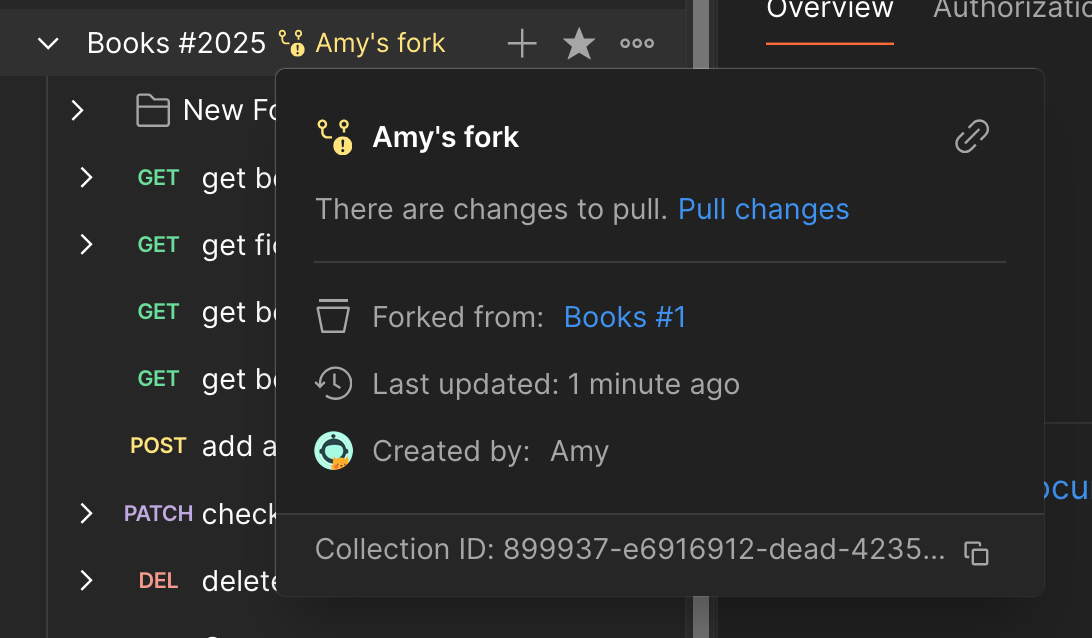
Peek also proved to be a reusable interaction pattern. Other teams began adopting it for collections and related resources, using the same interaction to reduce unnecessary navigation and provide lightweight context wherever users needed it.
Immediate impact
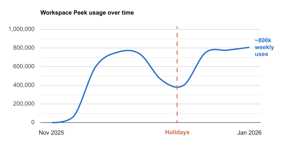
In the months after launch, Workspace Peek was used over 5 million times, making it clear that previewing workspace context solved a real, frequent problem.
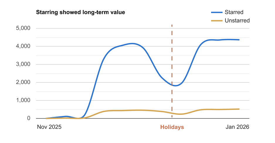
People did not just hover and move on. Peek regularly led to workspace switches, deep links, and starring, showing that users were actively using the added context to make decisions. Starring in particular showed strong signal of long-term value, with far fewer unstars than stars.
We did not have full journey tracking or clean before-and-after baselines, but adoption, repeat usage, and low failure rates gave us confidence that this reduced friction in one of Postman’s most common workflows.
Next steps
With the interaction model in place, the natural next step is richer context. AI-generated summaries would help users quickly tell similarly named workspaces apart and decide whether something is relevant without opening it.
Over time, combining summaries with ownership and activity signals could further reduce navigation overhead, especially for larger teams managing many workspaces.
Final Takeaway
Even when users strongly request a specific feature, it’s important to understand what motivates them.
Fifty developers on GitHub gave us a strong signal, that we could not ignore, but designing for 35 million users requires solving the underlying problem, not the literal ask.
If you want to discuss this work, feel free to reach out.