
Simplifying Workspace Types in Postman to Reduce Collaboration Friction
??????????? ???????????? ????????????? ?????? ????????????? ?????????? ???? ??????? ?????? ??????? ????????????? ????? ?????? ?????

<insert table of contents here>
Snapshot
Most work in Postman starts in a personal workspace. It is the single player mode of the product, and people stay there longer than they should. The moment they tried to involve someone else, things got complicated. You had to either move your collection somewhere else or convert your entire workspace. Neither felt natural, and both slowed people down.
I led the redesign of this experience together with partners in Product, Design, and Engineering. Our goal was simple. Make it easier to go from single player to multiplayer. We created a unified Internal workspace type and shifted the model from picking a workspace type to setting who can see your work. It sounds obvious in hindsight, but it took a lot of untangling to get there.
The Core Problem
Sharing is one of the most important behaviors in Postman. When people share, team usage grows, collaboration deepens, and the product becomes more valuable. The problem was that our very first sharing step carried too much friction.
If you started in a personal workspace, sharing meant making a structural decision before you could make a simple one. Move your collection into a different workspace? Convert your entire workspace? Hope you picked the right path? Many users simply exported instead because it avoided dealing with workspace rules entirely. Exporting worked, but it created duplicate collections that drifted out of sync and kept teams from working in the same place.
Customer calls made the picture clearer. One engineering manager said, “Most of them are still working in their personal workspaces.” It wasn’t a lack of desire to collaborate. The system just made staying in single player mode the easiest option.
We also had constraints. We could not change Postman’s backend workspace model. Plan limits, approval flows, and legacy behaviors all had to remain intact. Fixing the experience meant simplifying the model on the surface while respecting everything underneath.
The Solution
We merged personal, private, and team workspaces into one unified type: Internal. An Internal workspace can be visible only to you and invited people or to everyone on your team. The type never changes. Visibility does.
This shift removed three legacy decisions and replaced them with one clear question: who should see this work?
????????????
Sharing from an Internal workspace that is visible only to you now expands visibility in a predictable way. On lower plans, that means exposing it to the team. On higher plans, it means private collaboration. Many modern tools take this approach because it aligns with how collaboration-driven business models work. You opt out of visibility, not into it.
????????
We also unified inviting people and managing roles into a single access modal. These actions used to live in separate parts of the product, which added friction and made role upgrades harder to discover. Bringing them together aligned with users’ mental models and matched patterns they already understood from other tools.
What I am most proud of is the level of systems thinking this required. Understanding how every part of the model behaved across plans, approvals, and legacy patterns was its own challenge. Modernizing the experience without touching the underlying system meant I had to know that system inside out. And because we were introducing organizations as a new top-level entity, we designed everything to support that future model as well.
How We Worked
We started by mapping how people move through the work lifecycle: from working alone, to private collaboration, to fully shared team work. We aligned this with the software development lifecycle to understand where friction showed up and what actually mattered. Benchmarking confirmed a clear pattern across modern tools. Creation and access belong together. Visibility is the mental model people rely on.
Diagrams, wireframes, and prototypes in Figma helped us test ideas quickly. Weekly syncs, async Looms, and tight loops with Engineering kept us aligned. Because we had to support every plan tier, approval flow, and legacy edge case, we continuously validated scenarios and documented gaps as we found them.
We also made intentional scope calls. As we tested flows, we uncovered long-standing issues outside the project. Fixing everything would have ballooned the effort, so we focused on the friction that blocked collaboration and captured the rest as debt.
Key Decisions
Decision 1
Unify personal, private, and team into a single Internal workspace type
The old model forced users to choose between three collaboration types before they even knew what they needed. Internal replaced all three. Users now set visibility instead of switching workspace types, which matches how developers already think about internal, partner, and public APIs. It removed cognitive overhead and cleared the path to collaboration.
Decision 2
Make collaboration the default path
Workspace creation now defaults to Internal with team visibility. Sharing from a workspace visible only to you expands visibility in one step. A few users were surprised by this behavior on lower plans, but it was an essential shift. Many modern tools use this pattern because it nudges users toward collaboration without forcing it.
Decision 3
Merge invites and role management into a single modal
Inviting someone and managing permissions were split across different parts of the product. Combining them gave users one clear place to handle all access decisions and increased discoverability of role upgrades. It required more design and engineering work, but created a simpler and more predictable experience.
Impact and Reflection
We tracked adoption closely after launch. Every morning started with a fresh pull of overnight data, and watching the charts climb became a small ritual. Our dashboards were still being stitched together, and we had occasional misfires in event tracking, but even with imperfect data the trend was unmistakable. Collaboration was increasing fast.
The impact followed quickly.
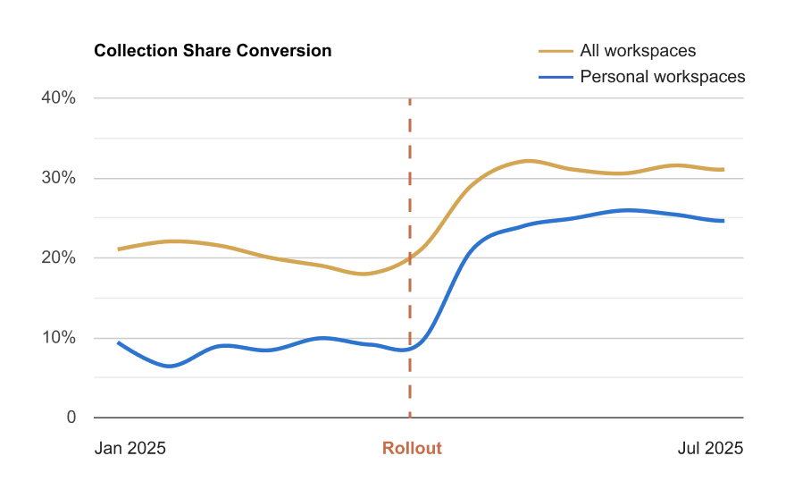
Collection share conversion jumped from about 10 percent to 28 percent within two months.
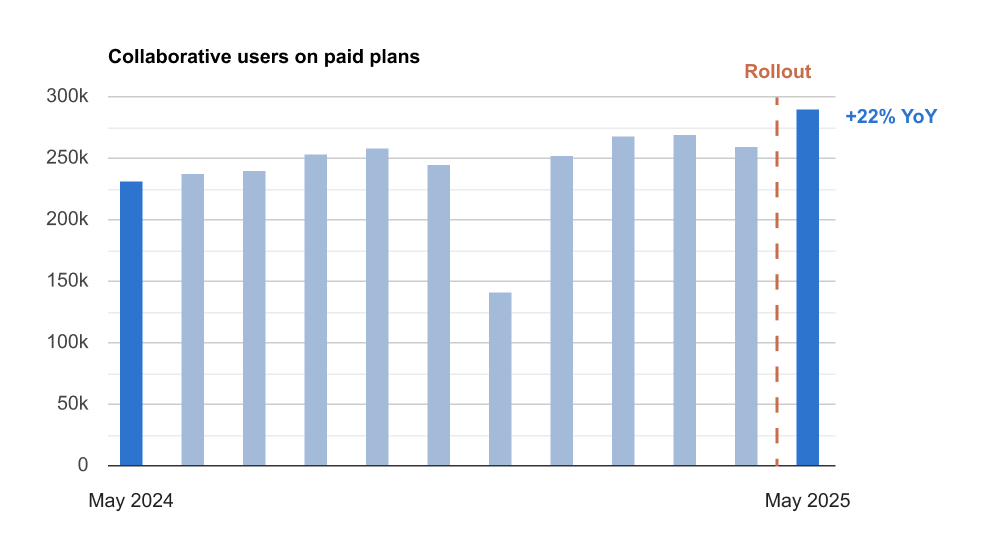
This helped drive a 24 percent year-over-year increase in collaborative users on paid plans.
After updating the share modal in personal workspaces, conversion rose from 8 percent to over 21 percent in the first week, later stabilizing around 25 percent.
Team invites hit all-time highs across email, guest, and link flows.
Thousands of users moved from individual to multi-user teams for the first time.
Internal workspaces with at least two active collaborators reached new records, especially in professional domains.

We also heard from users right away. One person was surprised that sharing a collection implicitly expanded visibility for the entire workspace. They thought they were sharing with a single person, not the whole team, because their plan did not support private collaboration. They missed the upgrade nudge that communicated the difference. The feedback was valid. It was one of the tradeoffs of the model, and undoing the action required going back to the workspace. In practice, though, most users never adjust visibility after sharing, and the broader behavior still moved in the right direction.
If I had more time, I would finish the job by collapsing types and visibility entirely, letting users set “who can see this and what can they do” from one single place.
This was one of the most system-heavy projects I have worked on. It was challenging, but also rewarding. Seeing collaborative behavior shift almost immediately is one of the reasons I love this work.
Final Takeaway
People often assume meaningful impact comes from shipping something new. More often, the leverage is already there. It just needs to be tightened, simplified, and stitched together so it works as one coherent product.
This project reinforced that lesson. Simplification is still one of the most powerful tools in product design. One day I might even finish that Steve Jobs book on my shelf and get the official endorsement.