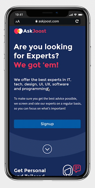
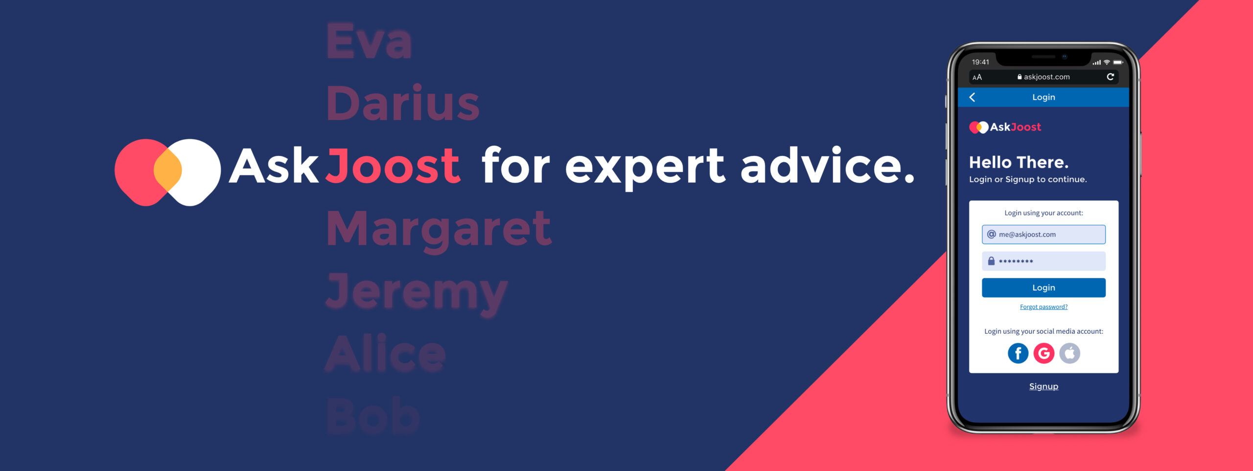
AskJoost
AskJoost is an expert app aimed at IT/Design students and professionals who seek personal and tailored advice regarding their career, education, and related software tools from experienced experts in UX, design, software, technology, programming, etc. I designed AskJoost as a project for CareerFoundry’s Certified UX Designer course.
Fun Fact
In Dutch we have this saying: “Joost mag het weten”, which roughly translates to “Joost knows all”.
If you have a question, ask Joost, or as we say it; AskJoost.
Project Overview
Challenge
Background
If you seek specific and timely advice, it can be difficult to find the correct answers online. It’s challenging to filter the good from the bad, plowing through search engine links, forums and Facebook groups. Your results can be unreliable, and it often deviates from your specific question.
AskJoost is a responsive web application that offers users the opportunity to interact with verified and experienced experts to receive tailored and personal advice in a timely matter.
Role
UX/UI Designer
Time
8 months
Tools
Research
Competitive Analysis
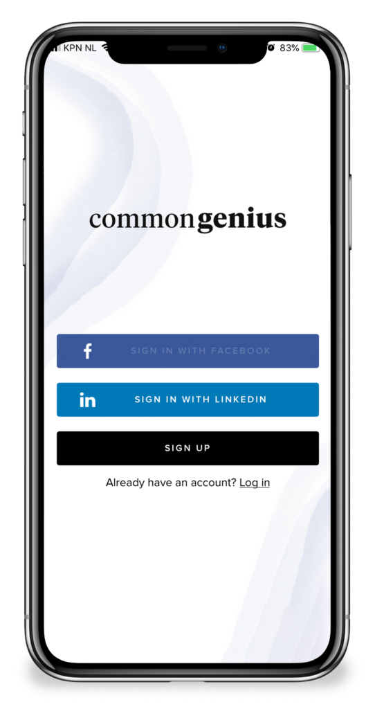
COMPETITOR #1
CommonGenius
CommonGenius is an expert marketplace that enables professionals to schedule on-demand, paid 1-on-1 video meetings with thousands of the world’s leading consultants, coaches, and executives.
SWOT Profile
Strenghts
- Offering high-end experts.
- Professional looking website.
- Broad range of available experts.
Weaknesses
- High membership costs.
- Only aimed at top market professionals.
- Bad usability and UX on all platforms.
Opportunities
- Improve usability of app and website.
- Improve marketing presence and brand recognition.
- Online advertising aimed at professionals.
Threats
- Competitors offering similar service for a reasonable price.
- Not living up to growth predictions and hype by media coverage.
COMPETITOR #2
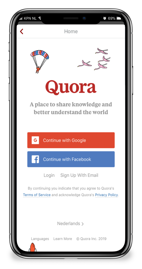
Quora
Quora is a free online platform to gain and share knowledge. Users can ask questions and connect with people who contribute unique insights and quality answers.
SWOT Profile
Strenghts
- Has a huge community.
- Large online presence.
- User-generated content.
Weaknesses
- Highly moderated content and censorship.
- Troll users and fake content.
- Great amount of unanswered questions.
Opportunities
- Further growing the community.
- Getting investor independent.
- Better moderation.
Threats
- Growing too fast, not profitable yet.
- Data breaches causing bad reputation.
- Bad reputation due to heavily moderation.
- Defining their own truth.
User Research
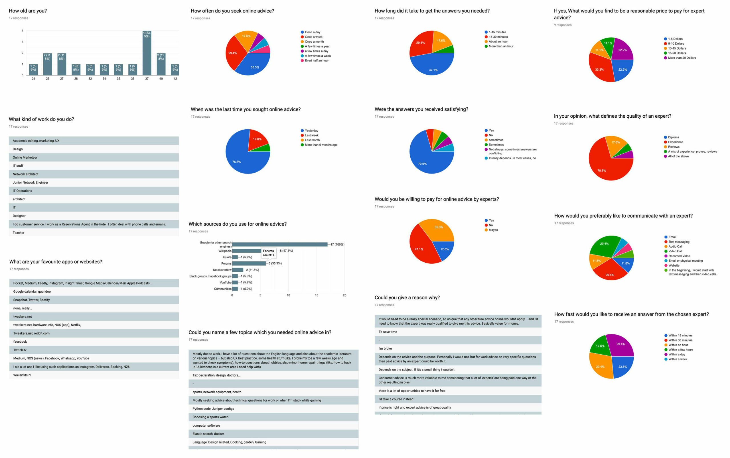
I conducted an online survey with 17 participants, and held user interviews with three potential users, to get insight in the needs and goals of my users. I learned about how users seek online advice, which platforms they use, what they consider good or bad experiences, and what their frustrations are.
Survey Results
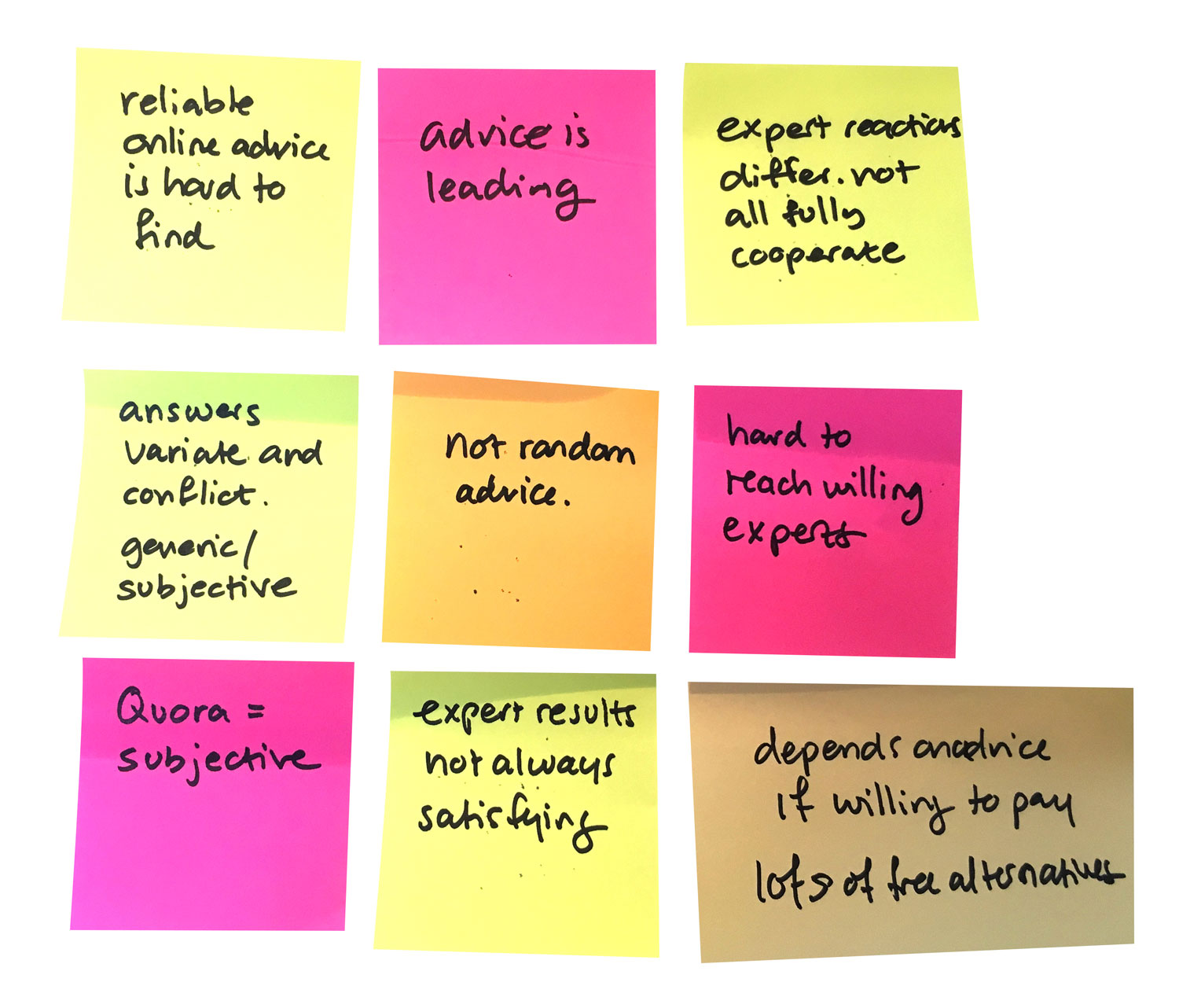
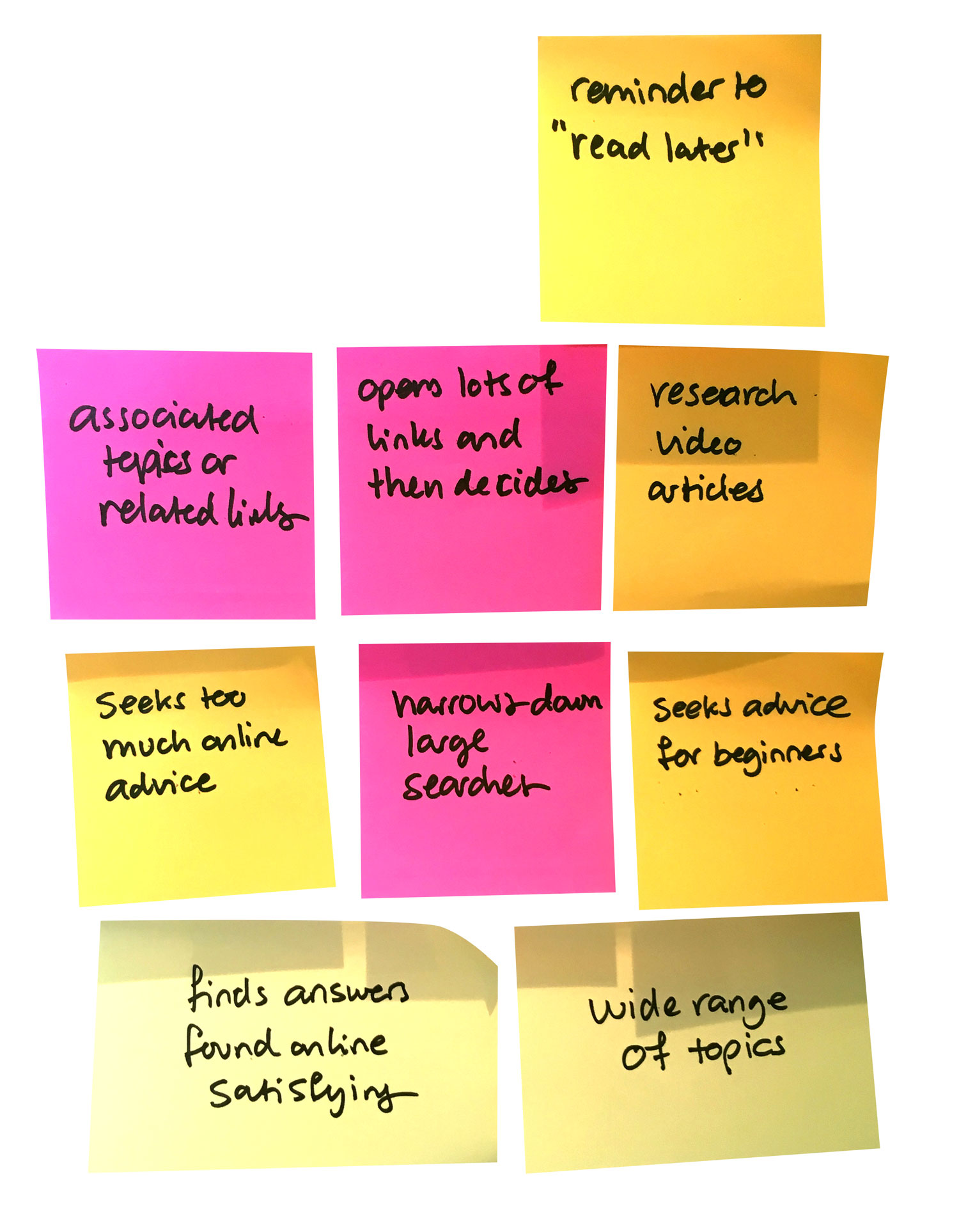
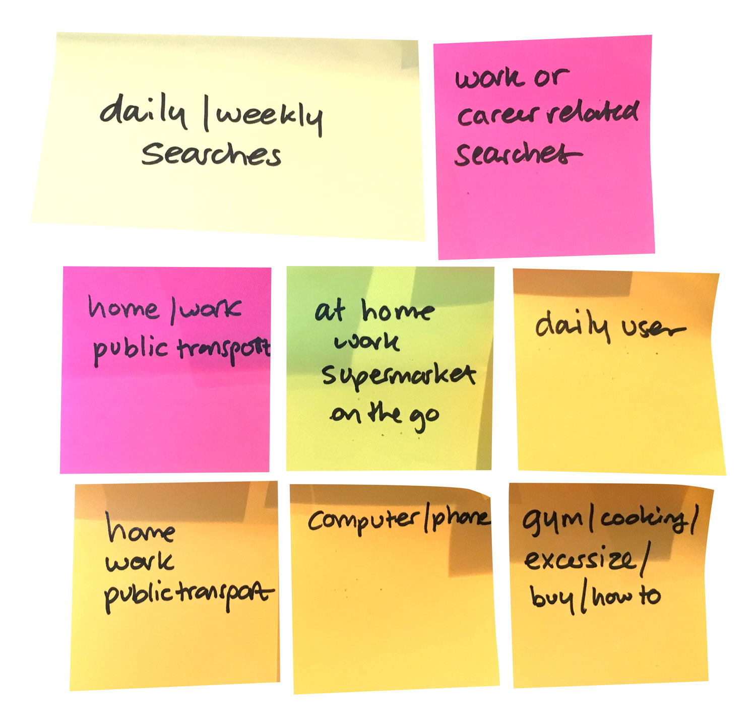
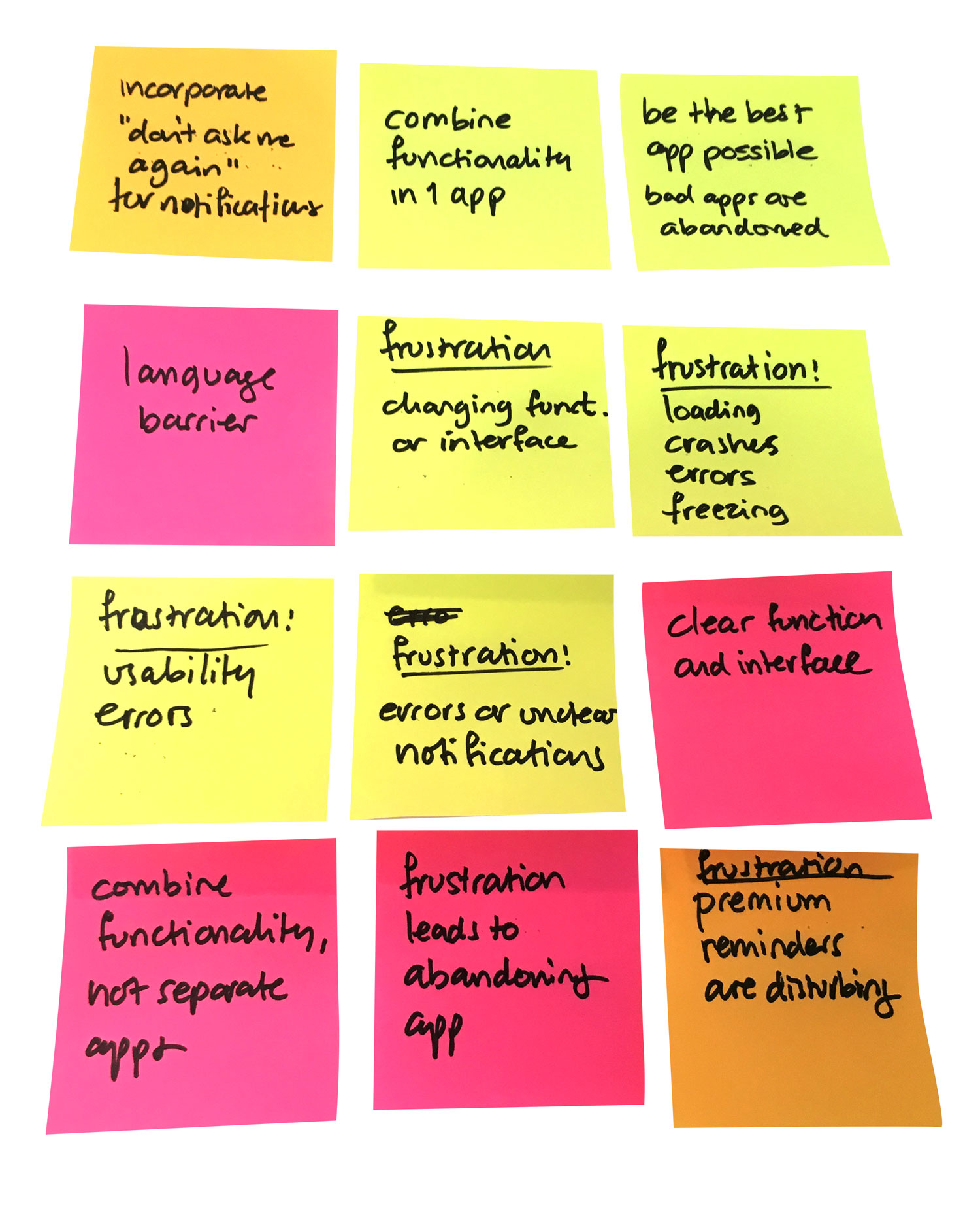
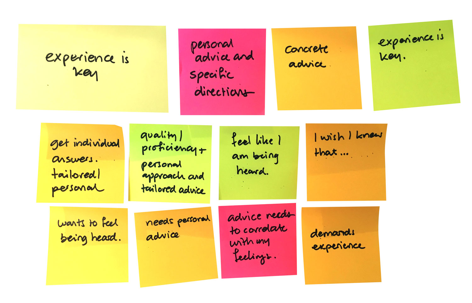
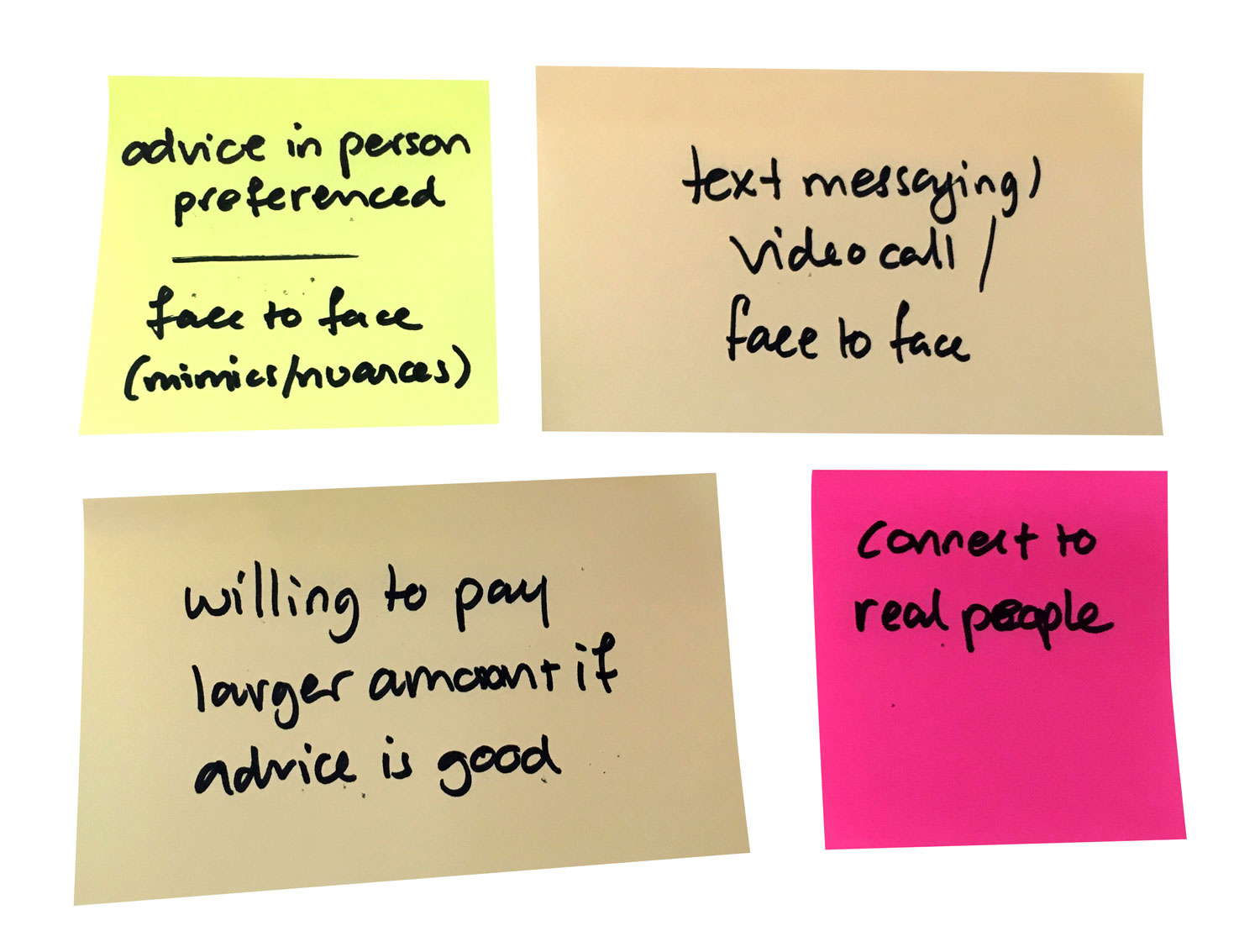
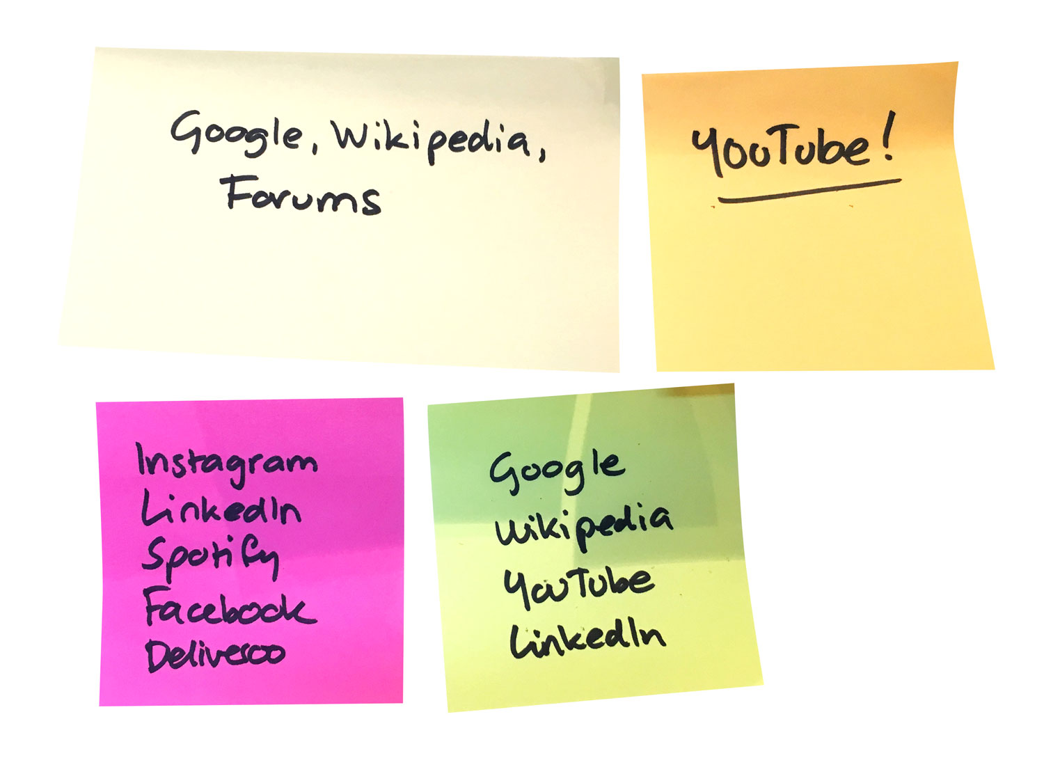
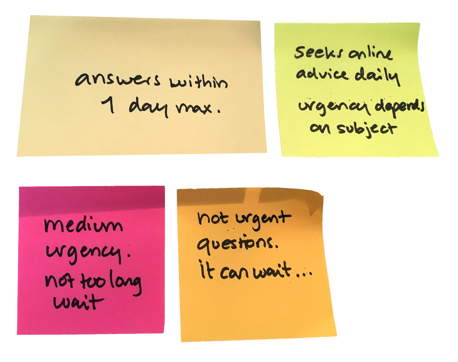
Affinity Mapping
Key User Insights
- Users seek online advice on a daily basis. Mostly using Google, YouTube, Wikipedia, etc.
- Seeking online advice is being done everywhere: at home, work, public transport, while waiting in queue, in the supermarket, etc.
- Online advice can be subjective and rather an opinion than facts. It’s hard to know exactly if something is trustworthy.
- The expert’s experience is more important than the level of degree or diplomas.
- User reviews of experts are found to be helpful in finding the best expert match.
- Users prefer to communicate in person as much as possible. Because that is most personal and all mimics, small nuances or gestures are noticed.
- They to communicate with experts by audio/video call or recorded calls. If needed in combination with text messaging.
- Quick response times are key in getting expert advice; preferably within an hour, with the maximum of a day.
- Advice should be personal and on point.
Understanding the User
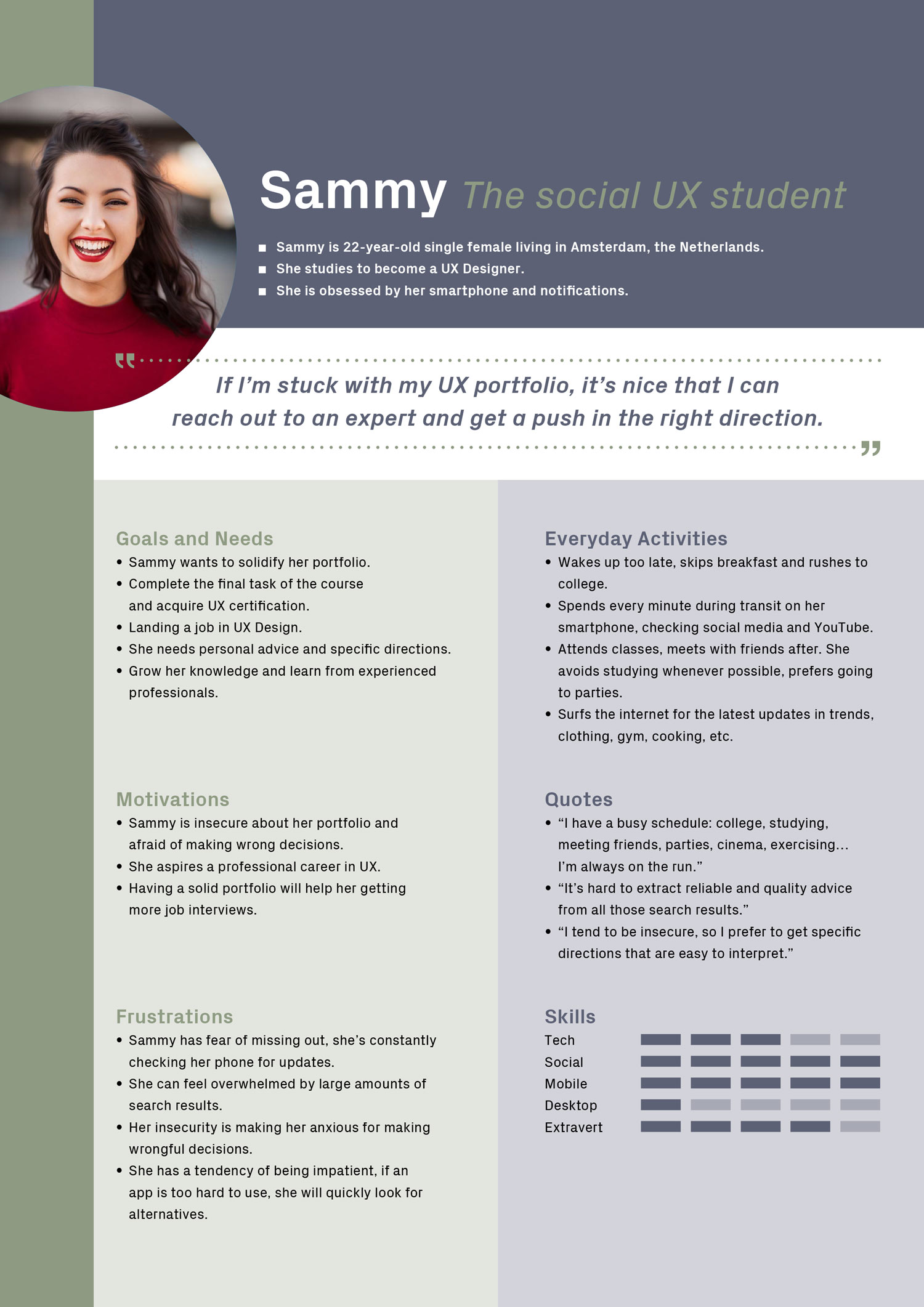
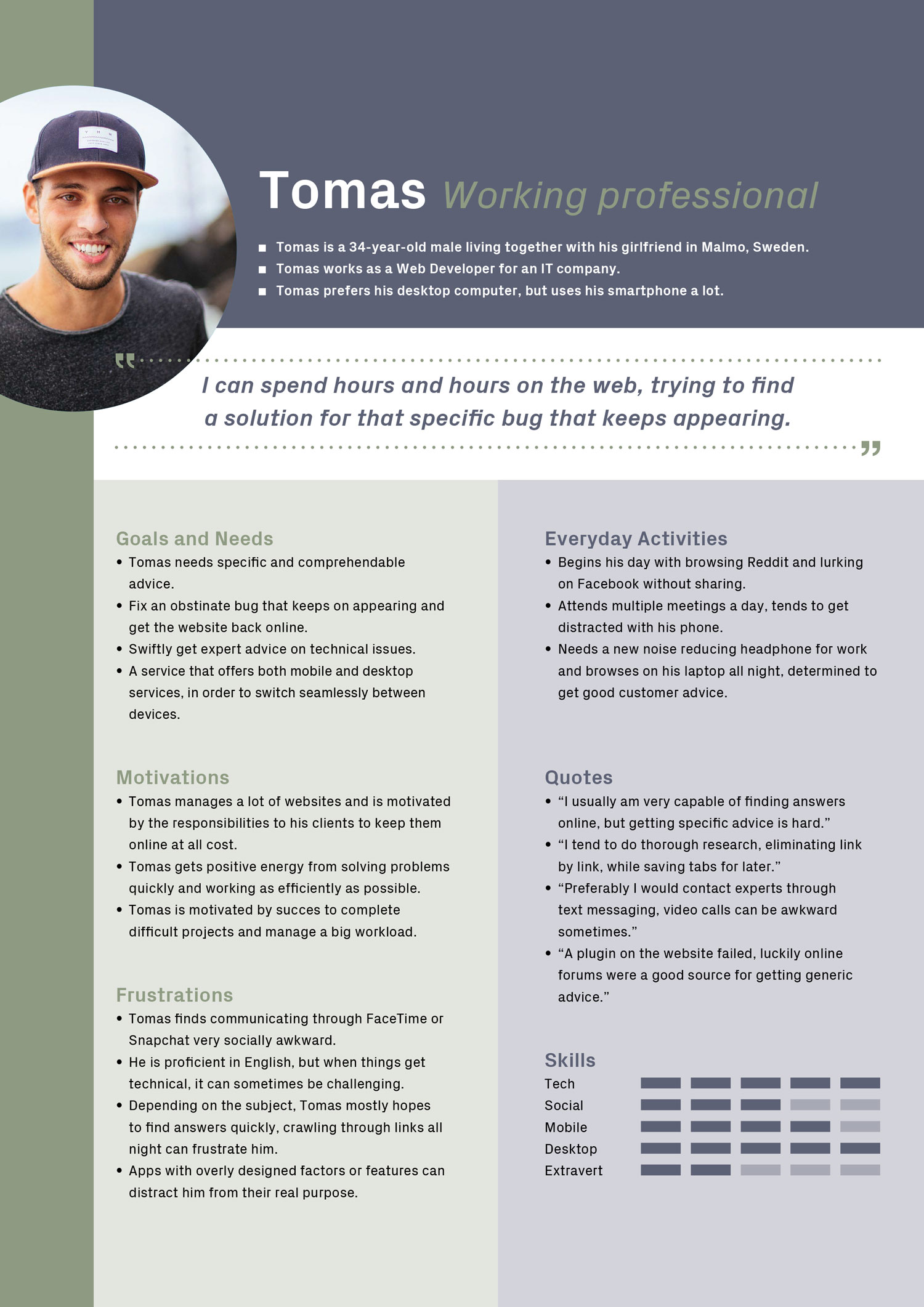
User Personas
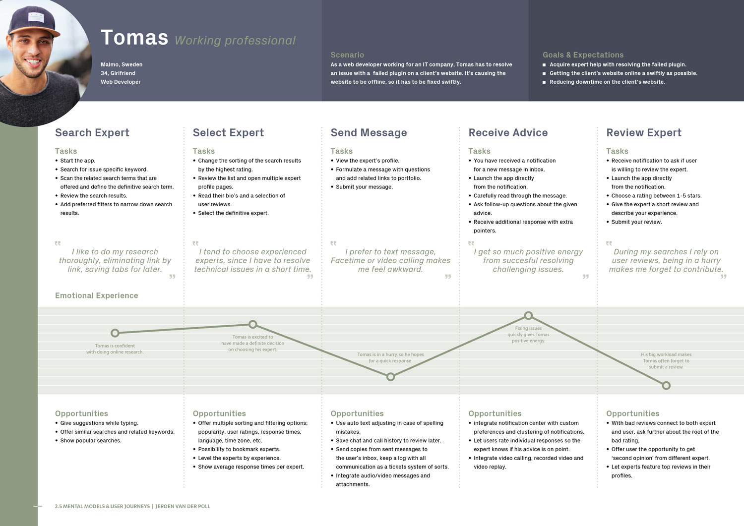
Using the Key User Insights from my research, I crafted two user personas. Let’s meet Sammy and Tomas.
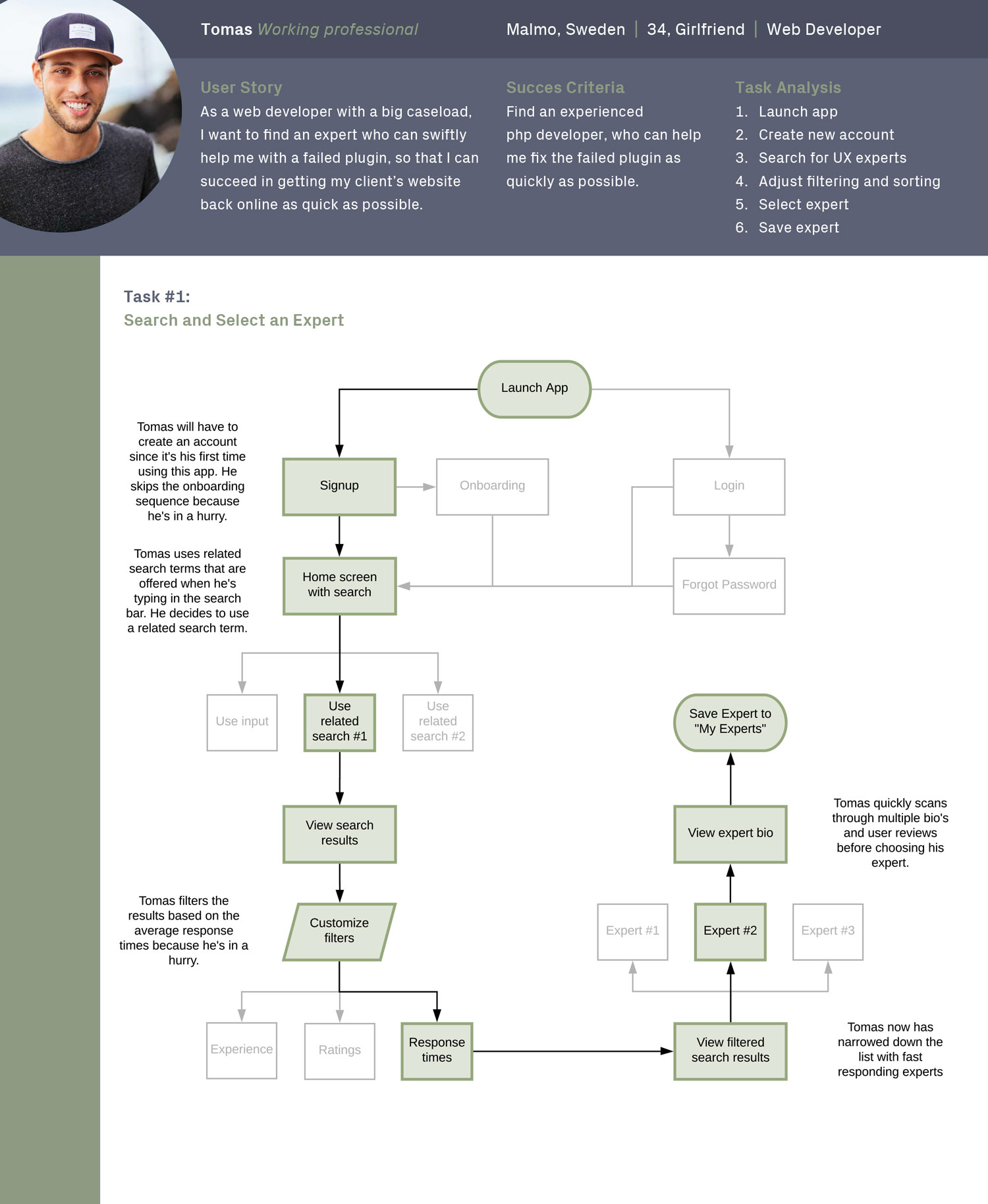
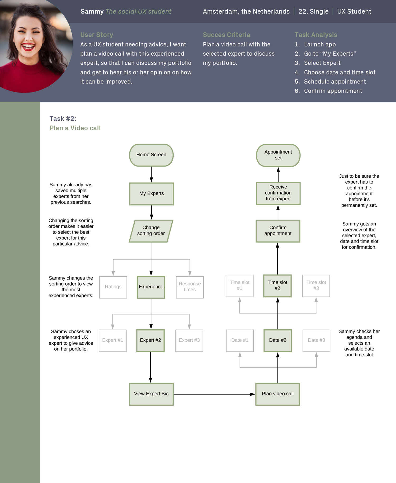
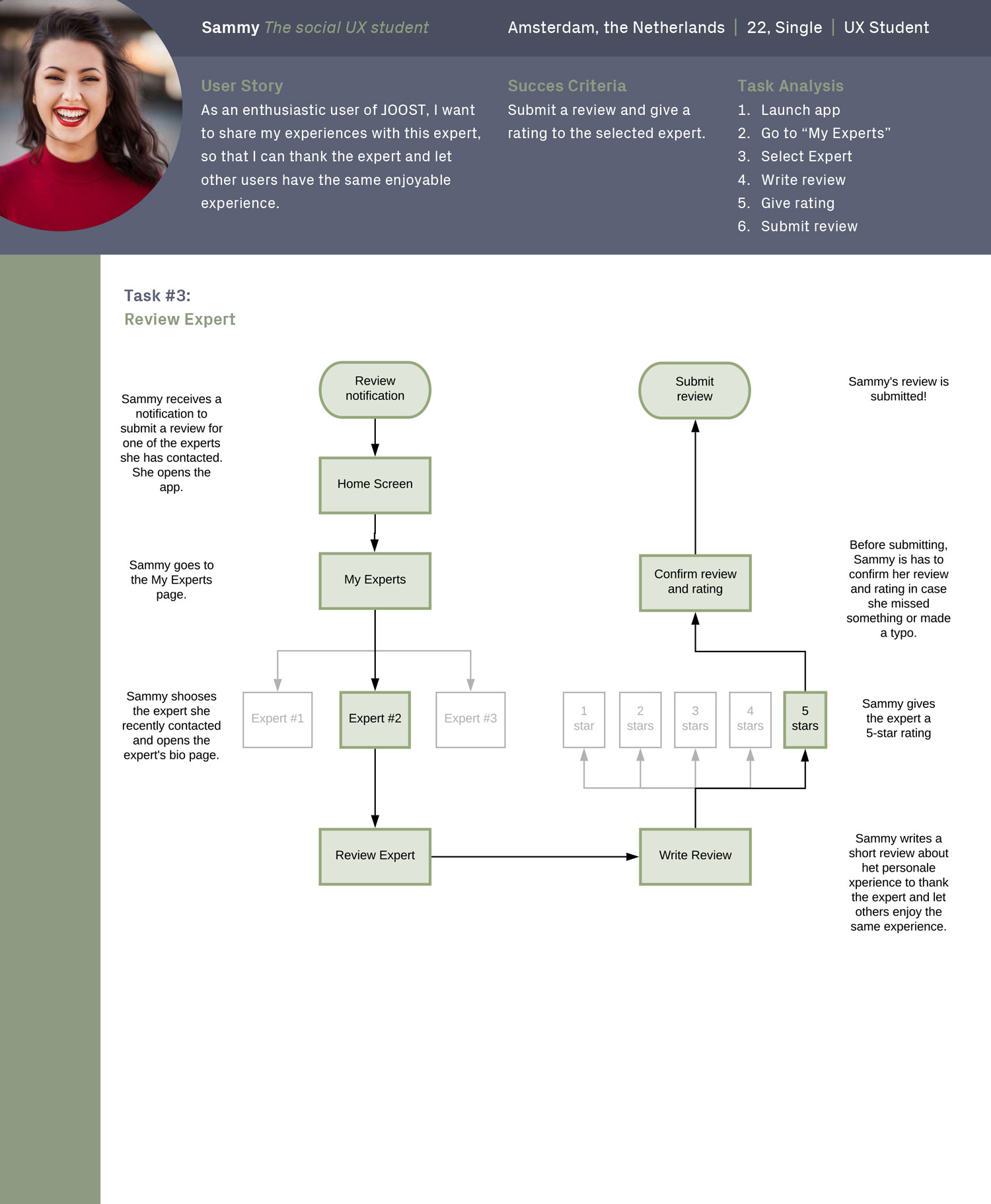
User Flows
I subjected Sammy and Tomas to a series of tasks and created site flows to show the flow attached with each task.
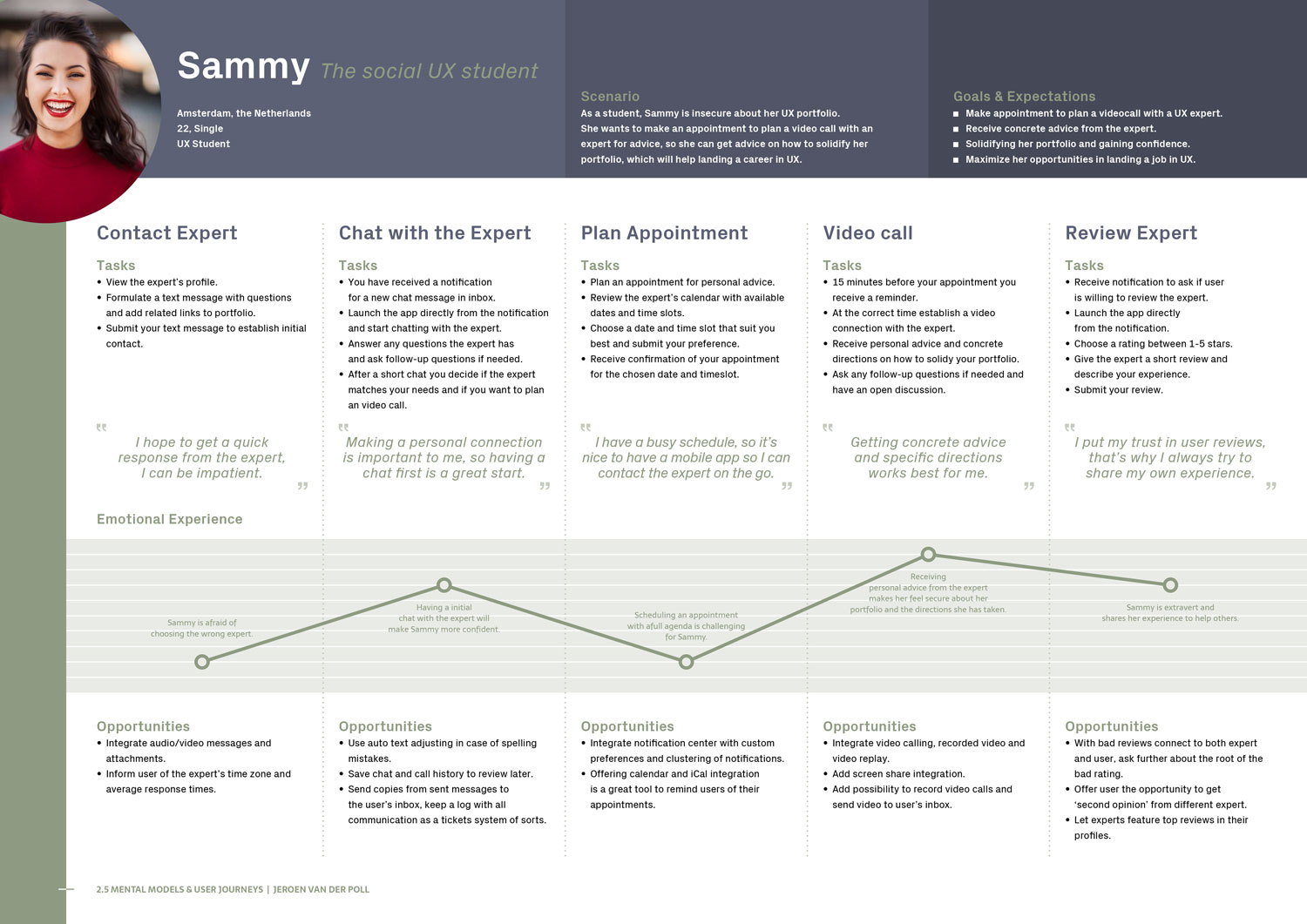
Mental Modals
For both user personas I created a mental model for a single task. The model shows the their experience through each step of performing the task.
Understanding the Problem
Problem Statement
IT/Design students and professionals need a way to get specific advice from reliable experts regarding their career, education, related software tools, because the lack of reliable and qualitative results given by search engines and forums can make them feel unsatisfied and frustrated.
We will know this to be true when we see an increase in user-expert interactions, high amounts of app-downloads, a growing number of recurring users and positive user ratings.
Hypothesis Statement
We believe that by creating an online Q&A platform featuring advanced sorting and filtering methods, showing expert experience levels and average response times, we will achieve having our users connect with experienced experts matching their needs, to acquire personal advice and overcome their work or education-related obstacles.
Wireframes & Prototyping
Designing the Interface
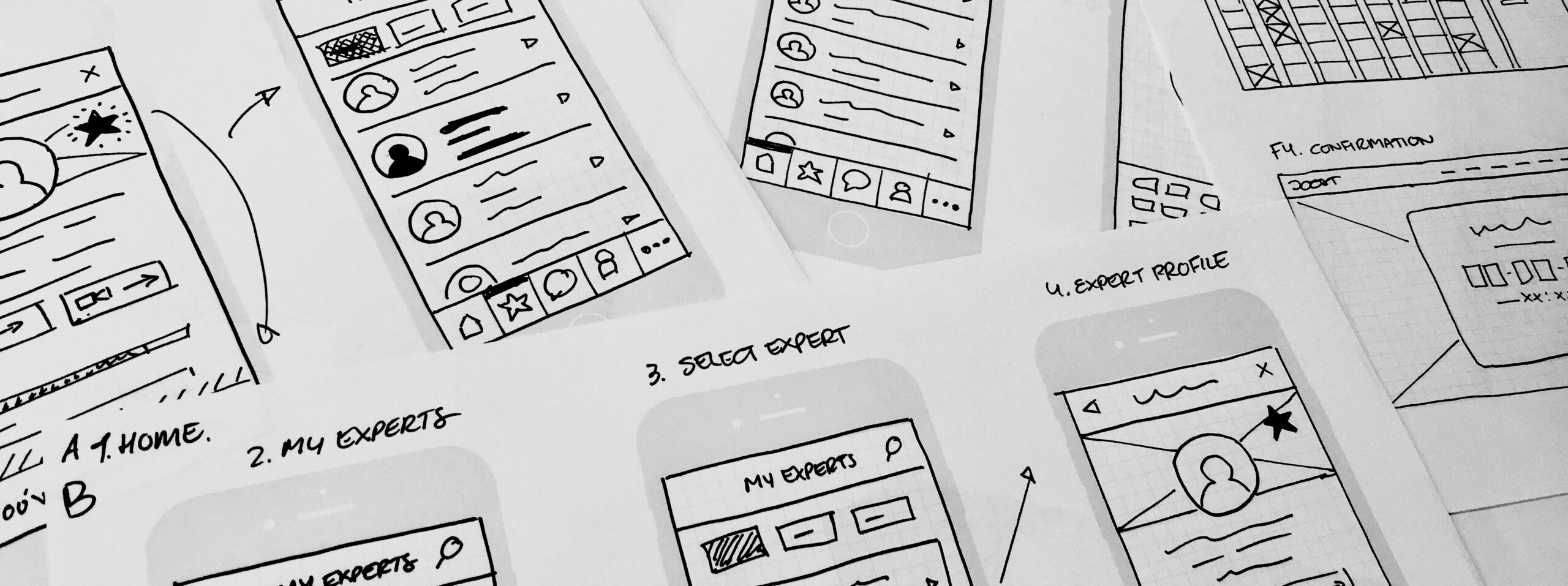
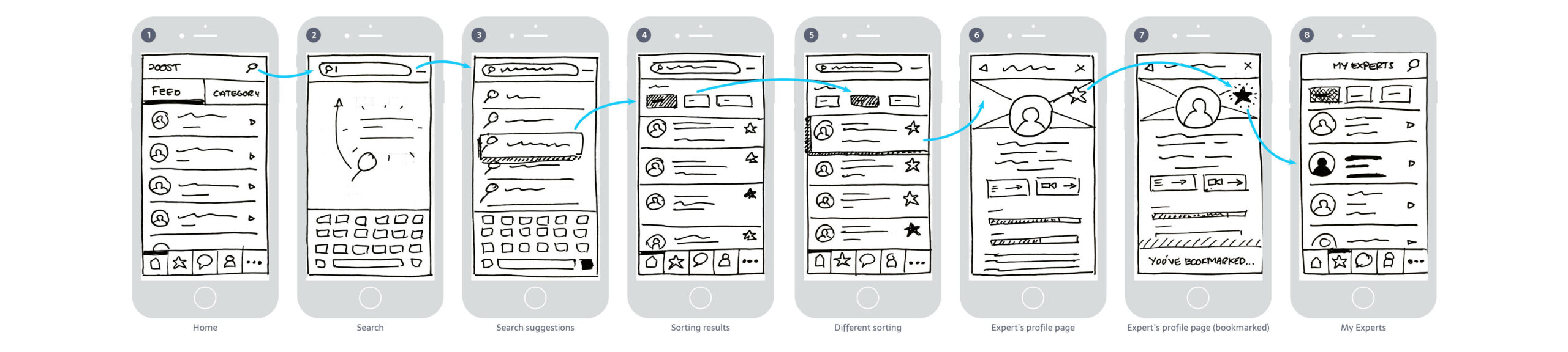
Low-Fidelity Wireframes
Pen and paper sketches with rapid iterations.
Searching and bookmarking an expert.
Mid-Fidelity Wireframes
Monotone with minimal assets, created in Adobe XD.
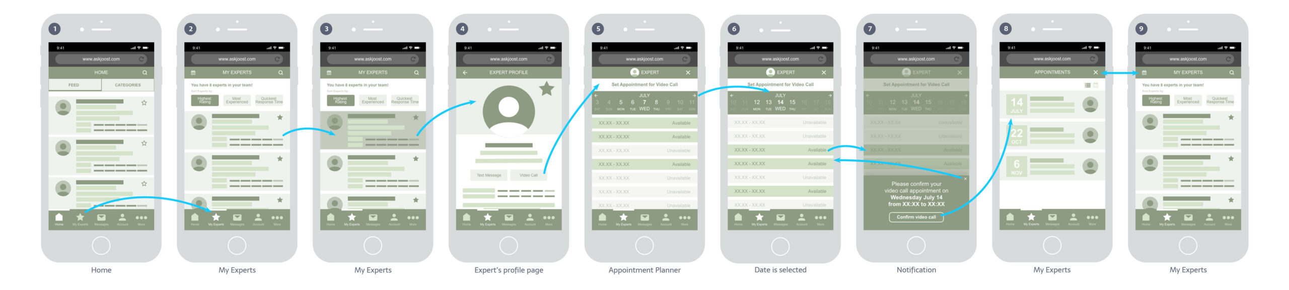
Scheduling a video-call appointment.
Hi-Fidelity Wireframes
Monotone with imagery, designed in Adobe XD.
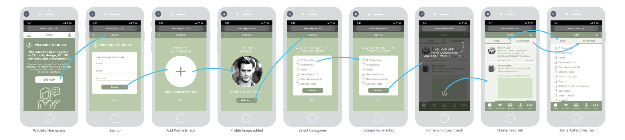
Onboarding Process.
Testing the Usability
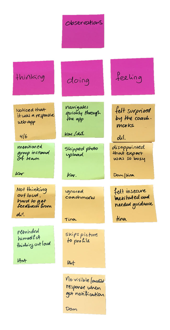
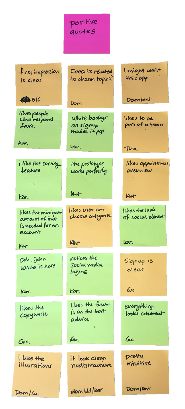
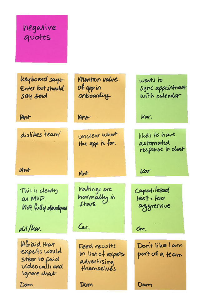
From my high-fidelity wireframe I created an interactive prototype to test the usability and functionality of the app. I needed to know if users can easily locate and understand the core functionalities, determine if improvements could be made to the app’s intuitiveness and verify if the app satisfies the user’s needs. I conducted a moderated remote test with a total of 6 participants in sessions of 10-15 minutes.
Objectives
- Determine if users can quickly and easily onboard and navigate through the app.
- Determine if the expert search functionality produces the desired outcome and if users are triggered to build their personal team of experts.
- Observe how users interact with the text messaging functionality; assess the intuitiveness of the feature and determine if additional features are desired.
- Determine if users can easily schedule video call appointments; is it easy to use and did any frictions occur?
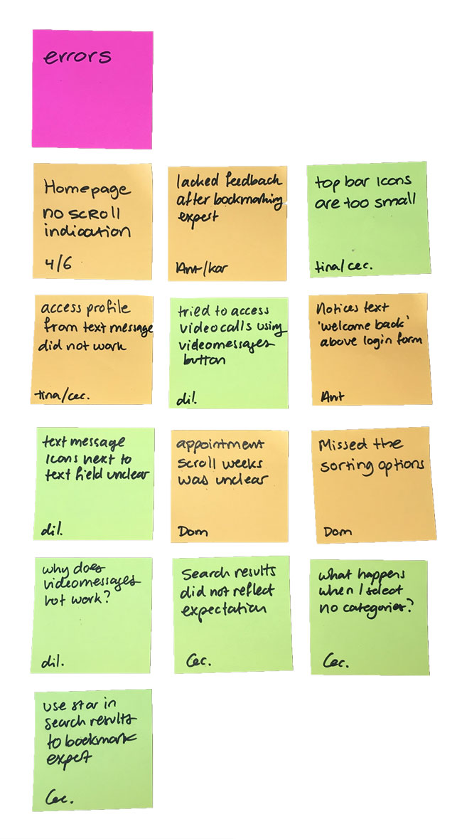
Results
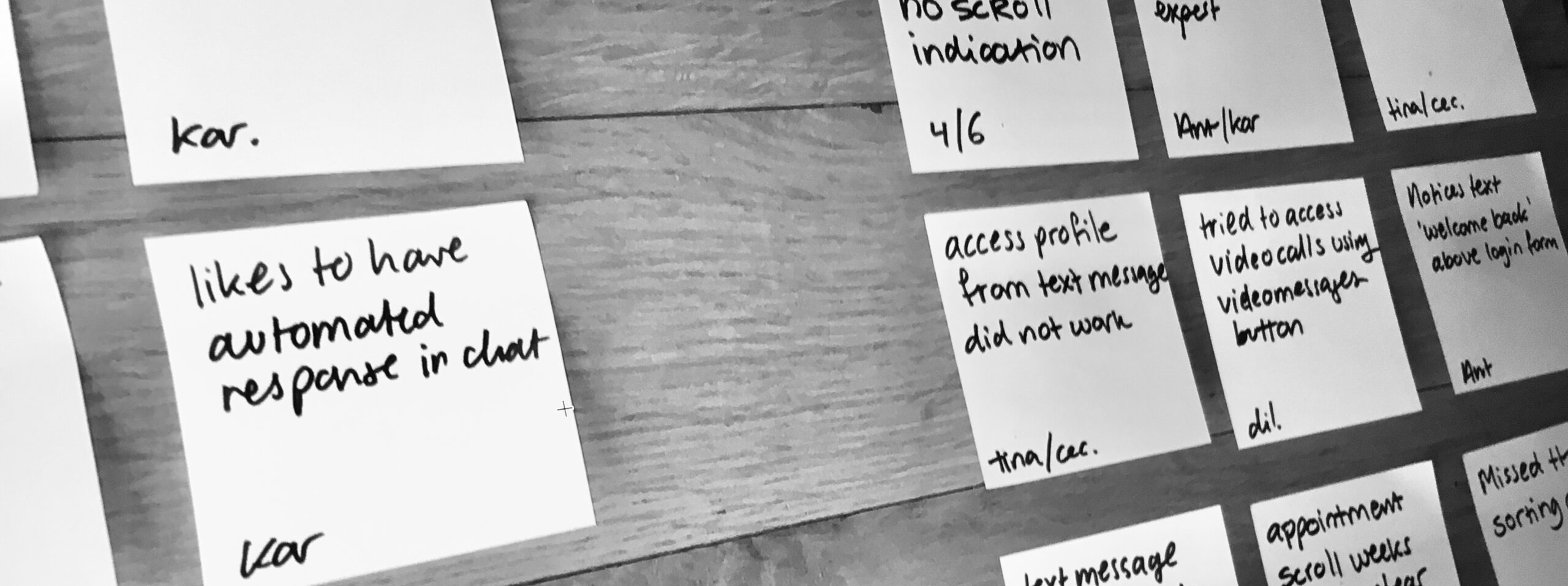
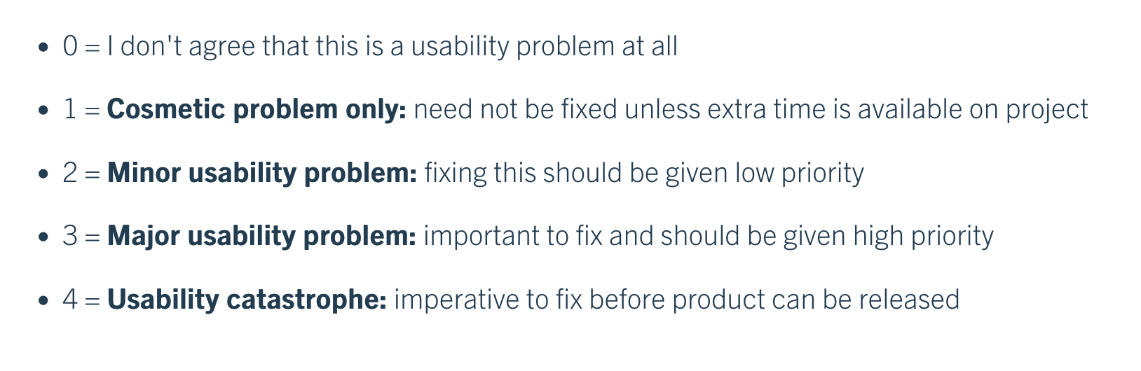
All participants in the usability test used the prototype with ease and found it be very intuitive to use. The tests revealed a catastrophic usability error and multiple major and minor usability errors. I listed the top 5 of errors and issues, and rated their severity using Jakob Nielsen’s four-step rating scale. I included a suggested change for improvement.
Affinity Mapping
Rainbow Spreadsheet
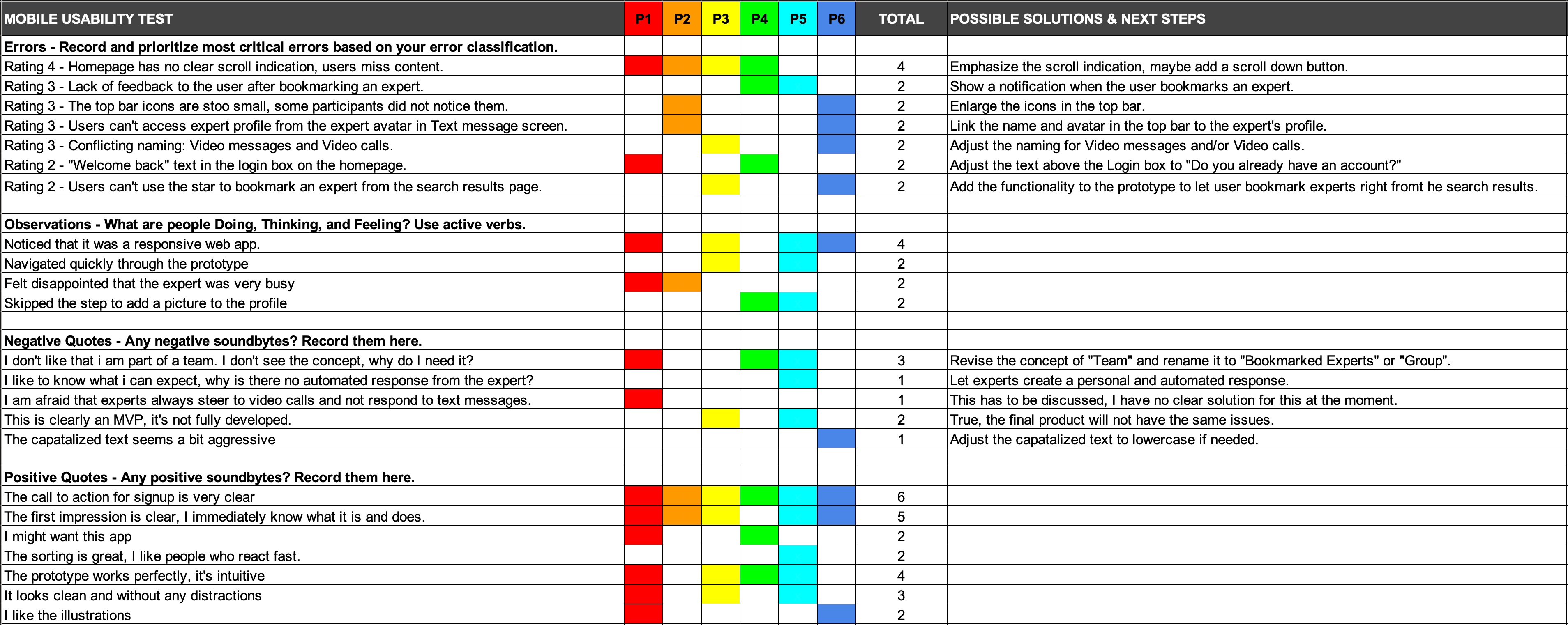
ISSUE 1
Rating:
Homepage has no clear scroll indication, users miss content.
Suggested Change
Emphasize the scroll indication by showing parts of additional content. A second method could be by adding a scroll button to the page, so it becomes very clear that users can scroll.
Evidence
In total 66% of the participants did not scroll the homepage and therefore missed important information about the application and its features. The remaining part of the participants did scroll the homepage, but did this out of curiosity, not because there was a clear scroll indication.
ISSUE 2
Rating:
Lack of feedback to the user after bookmarking an expert.
Suggested Change
Show a clear and visual notification as feedback to the user when they bookmark an expert.
Evidence
33% of participants were unclear if they completed the bookmarking of the expert. The bookmark star changed color, but there was no clear visual feedback given to the user. They had to visit the My Experts page to confirm if the expert was bookmarked.
ISSUE 3
Rating:
The top bar icons are too small, some users missed them.
Suggested Change
Enlarge all the icons in the top bar so they are easily visible, including the backward navigation and close window icons.
Evidence
During the tests 33% of participants had trouble finding the search icon in the top bar. On the My Experts page there is an icon in the top bar for navigating to the video call appointments, only 16% of the participants noticed this icon.
ISSUE 4
Rating:
Users can’t access expert profile from the expert avatar in Text message screen.
Suggested Change
Link the name and avatar in the top bar of the Text Message screen to the expert’s profile.
Evidence
In total 33% of the participants clicked the expert’s name and avatar to visit their profile. Eventually they visited the My Experts page and visited the profile from there, but this felt cumbersome to the participants.
ISSUE 5
Rating:
Conflicting naming: Video messages and Video calls.
Suggested Change
Adjust the naming for “Video messages” to “Recorded Videos” so it hopefully does not conflict with “Video Calls”.
Evidence
33% of participants tried to click the Video messages section (which was not developed in the prototype) to hopefully make a video call appointment.
Refining the Design
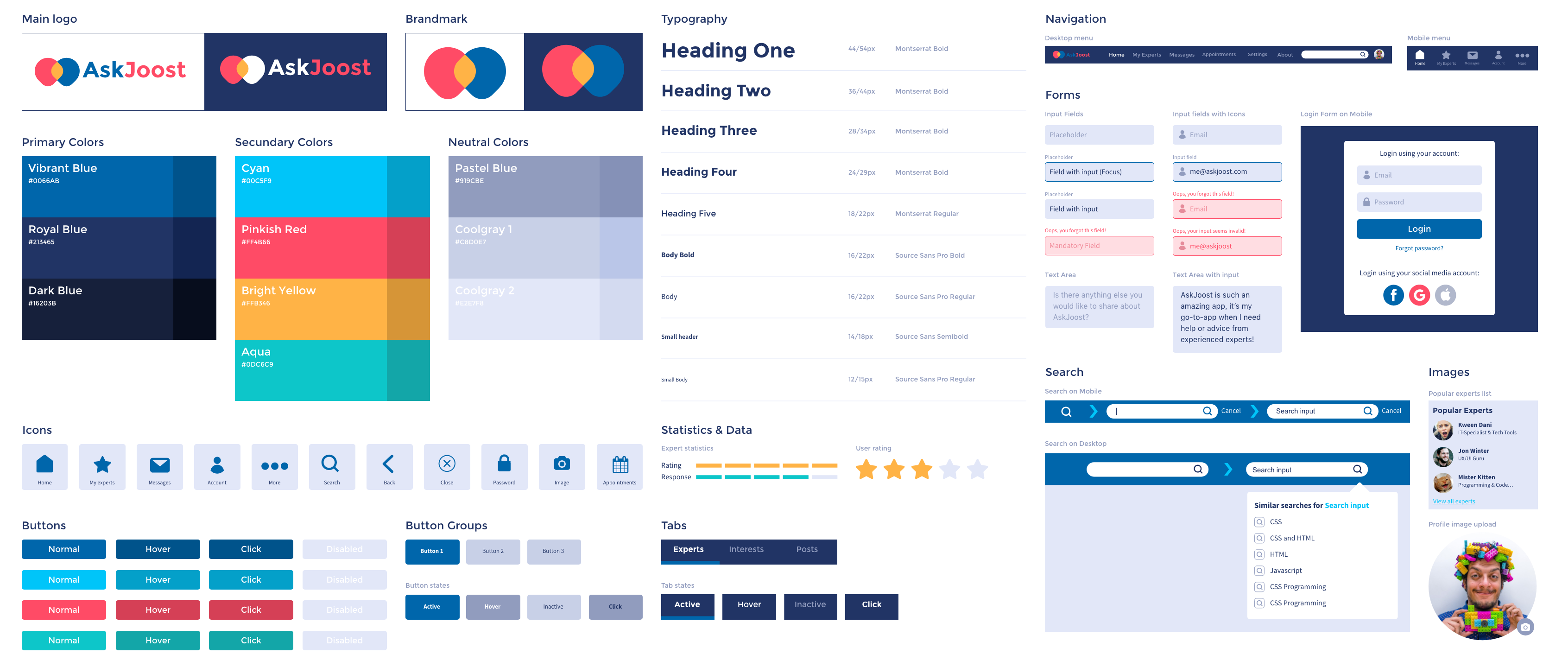
I used the results from my usability tests to further refine my high-fidelity prototype. After completign this step, I started refining and polishing the app’s design using the Gestalt and other design principles, accessibility guidelines and feedback from peers. To solidify AskJoost as a brand, I created a style guide and defined a design language. After multiple iterations, the final design of AskJoost was finally taking shape.
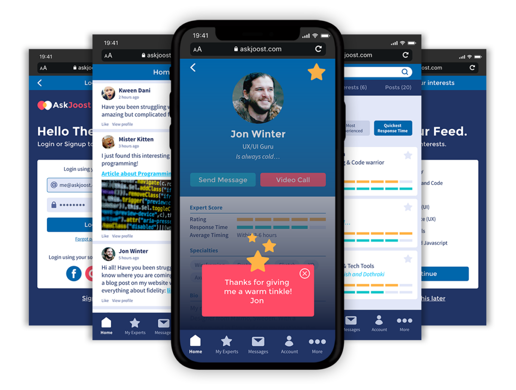
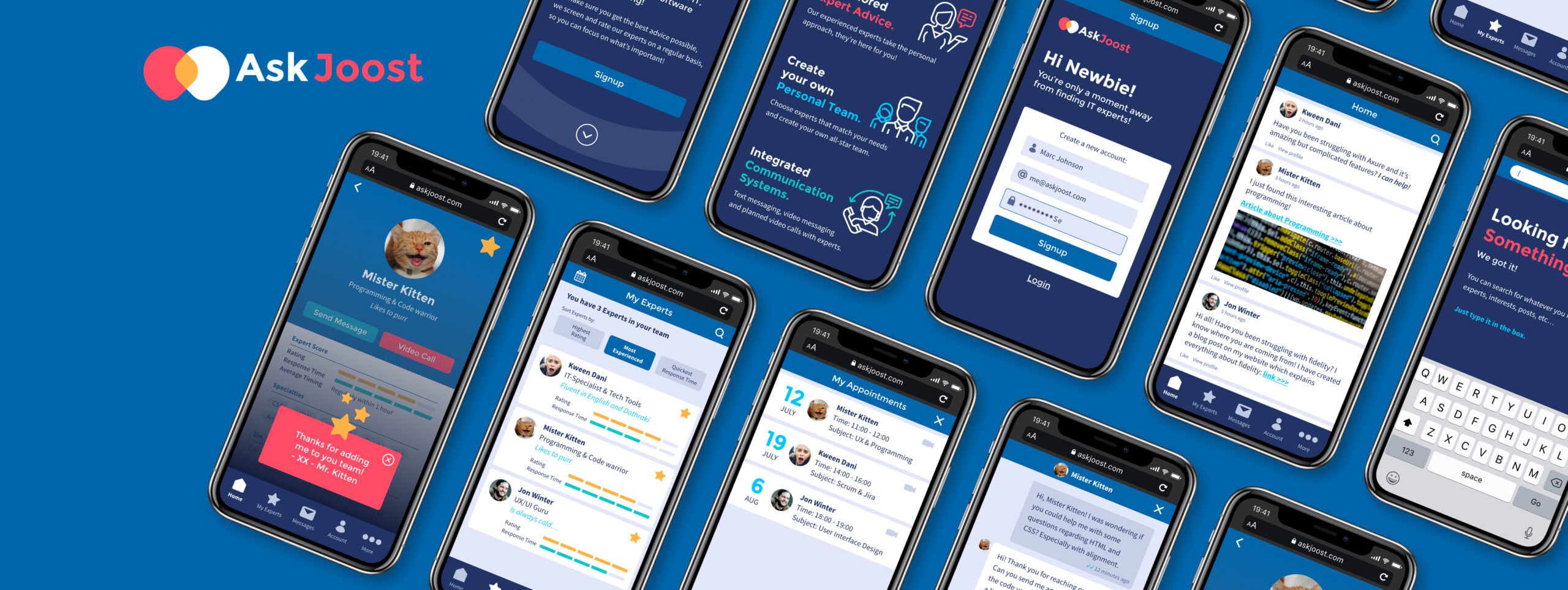
A selection of screens from the “final” design.
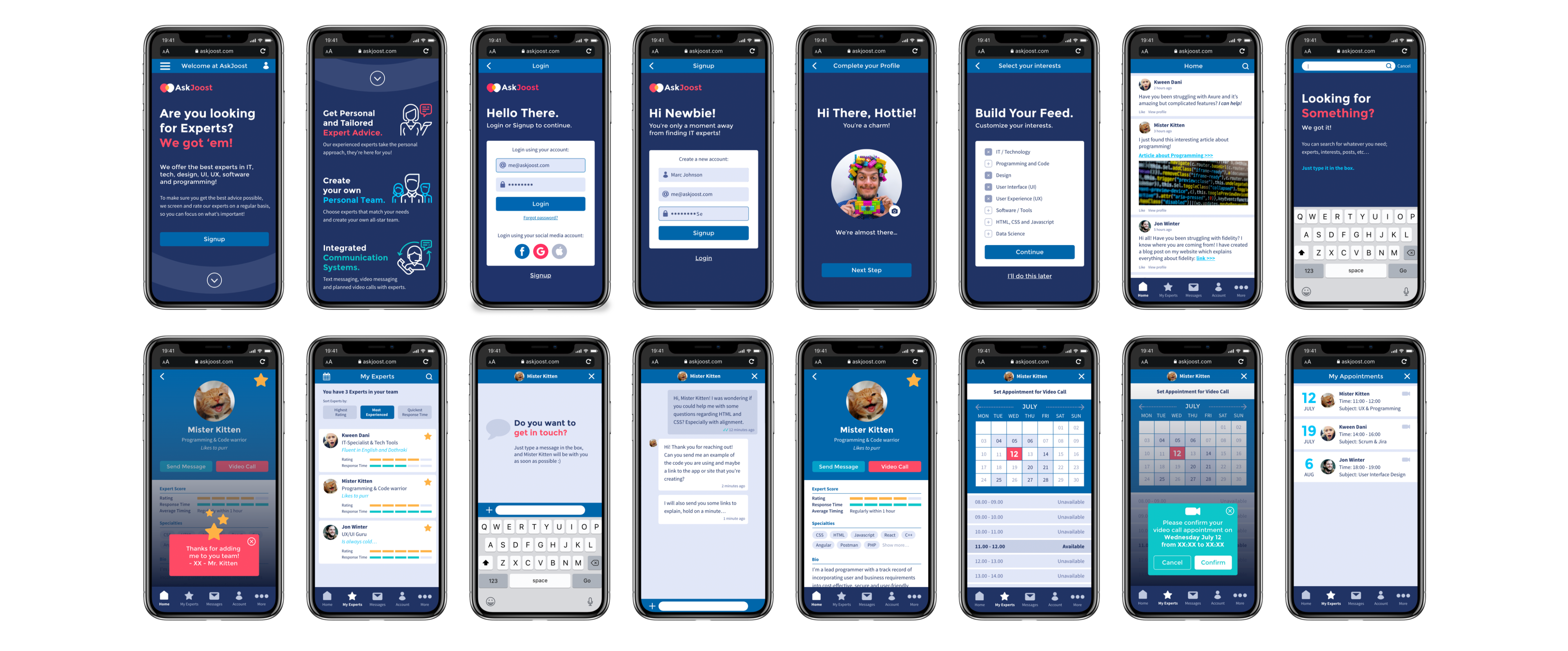
Final Prototype
Throughout this project, I have learned so much about user experience and user interface design. Design is not all about creating pretty things, but also about getting to know your user and their needs and goals.
Never before in my life, I had done this many iterations on a single design. You start by following your gut, but after doing research and validating your choices, you learn that your gut is not always right. Every user is different. That’s why the users and their experience should be at the center of it all.