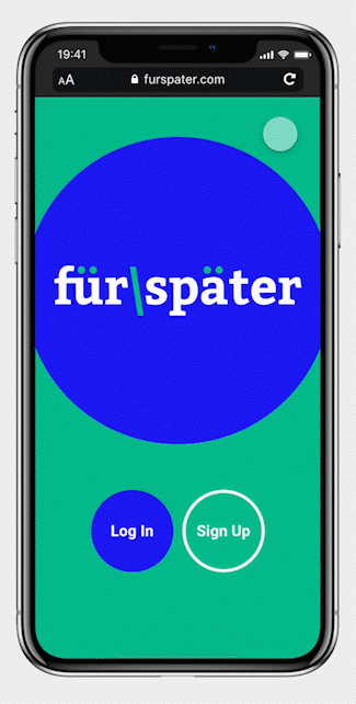
Für Später
Für Später is a responsive web app aimed at working professionals with a steady income, who would like to invest in real estate to achieve financial security. I designed Für Später as part of the UI Specialisation in CareerFoundry’s Certified UX Designer course.
Fun Fact
Für Später is the literal German translation of “for later”.
It implies that you invest money for a rainy day.
Project Overview
Challenge
Create a UI design for a responsive web application where users could search for properties to invest in.
Background
Role
UX/UI Designer
Time
3 months
Tools
Mapping out User Journeys
User Flows
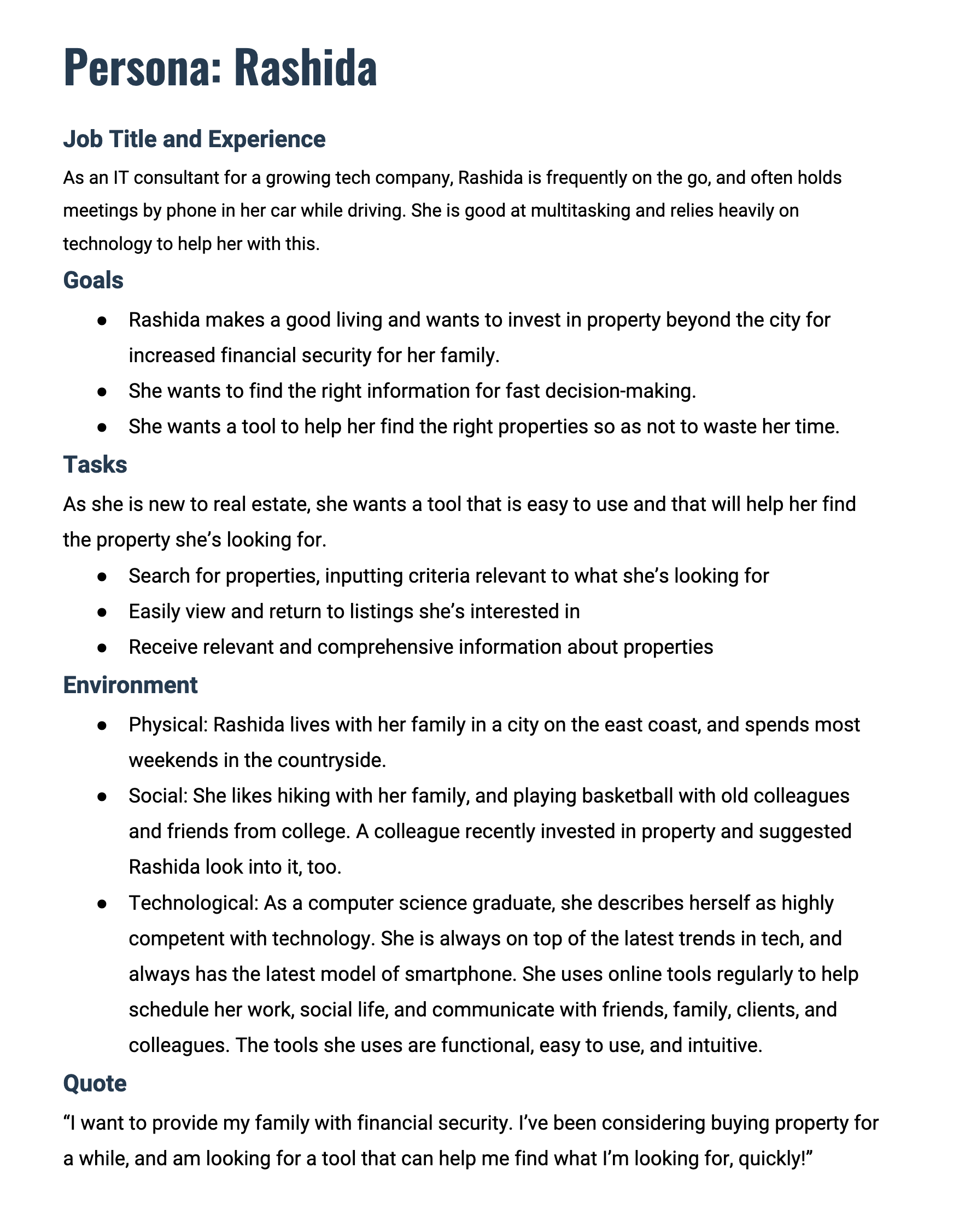
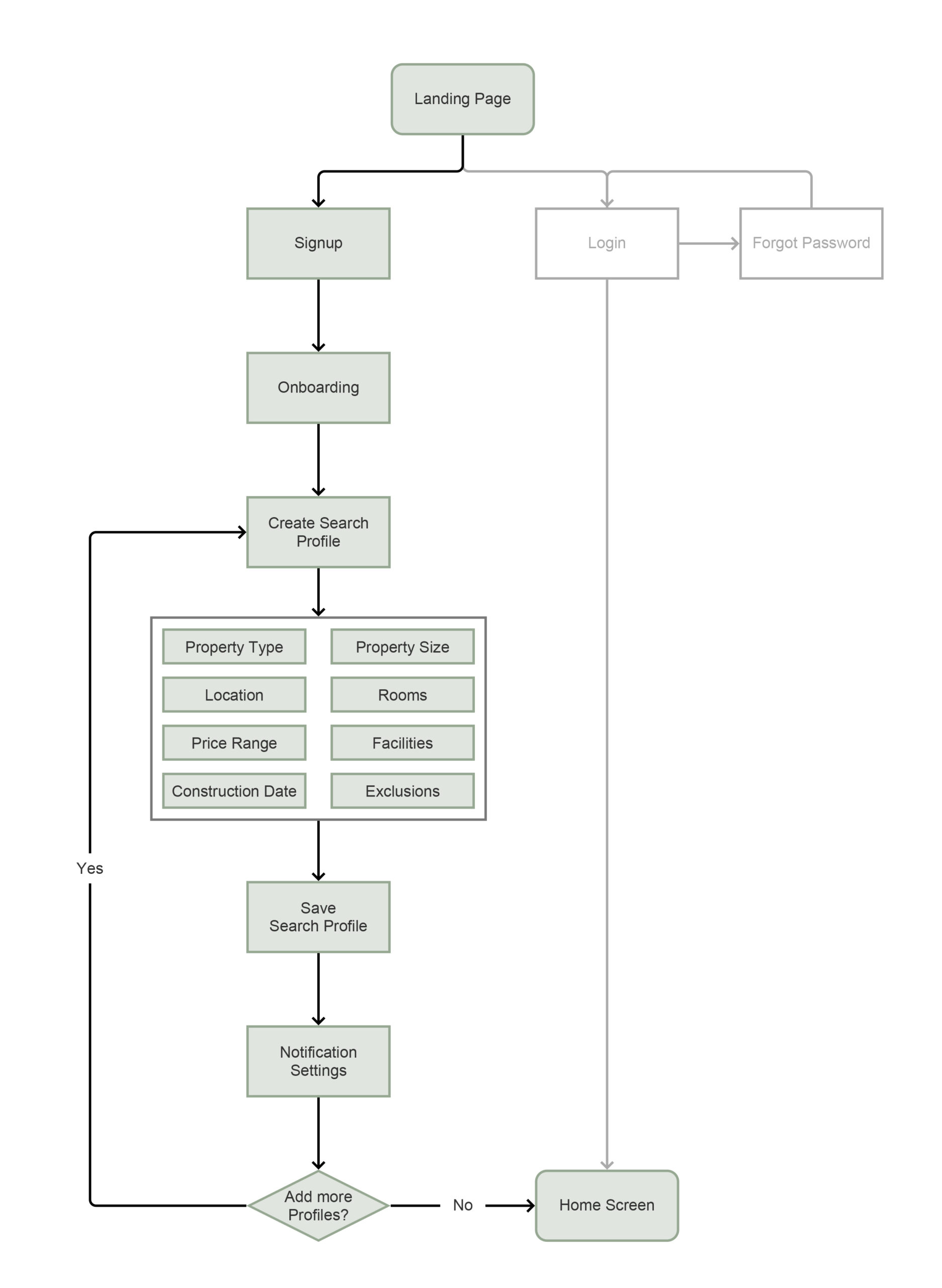
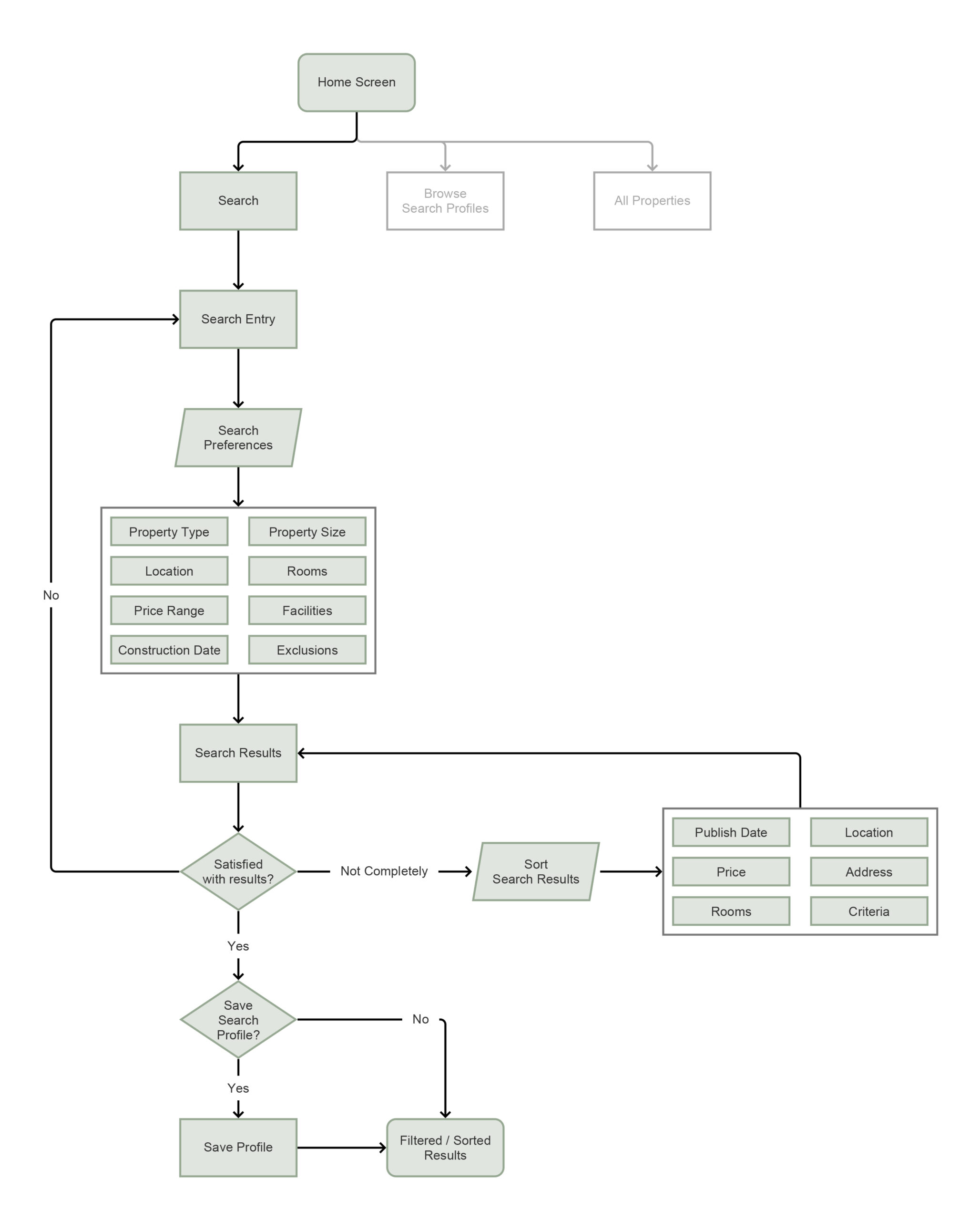
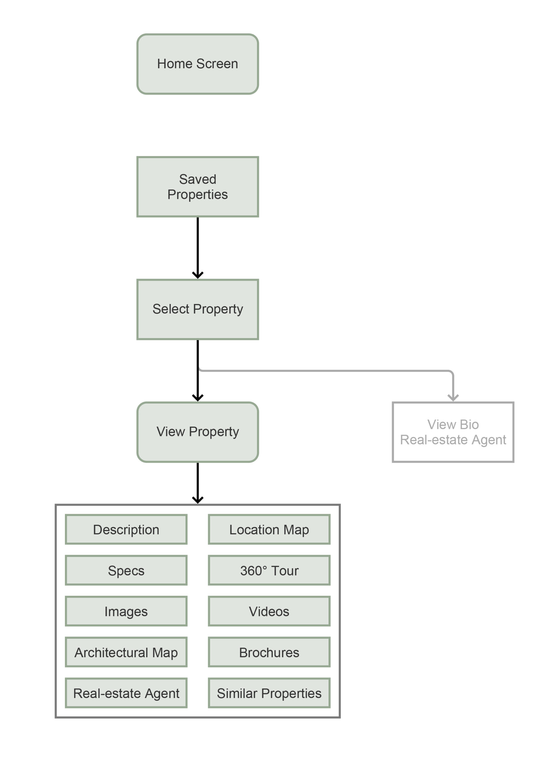
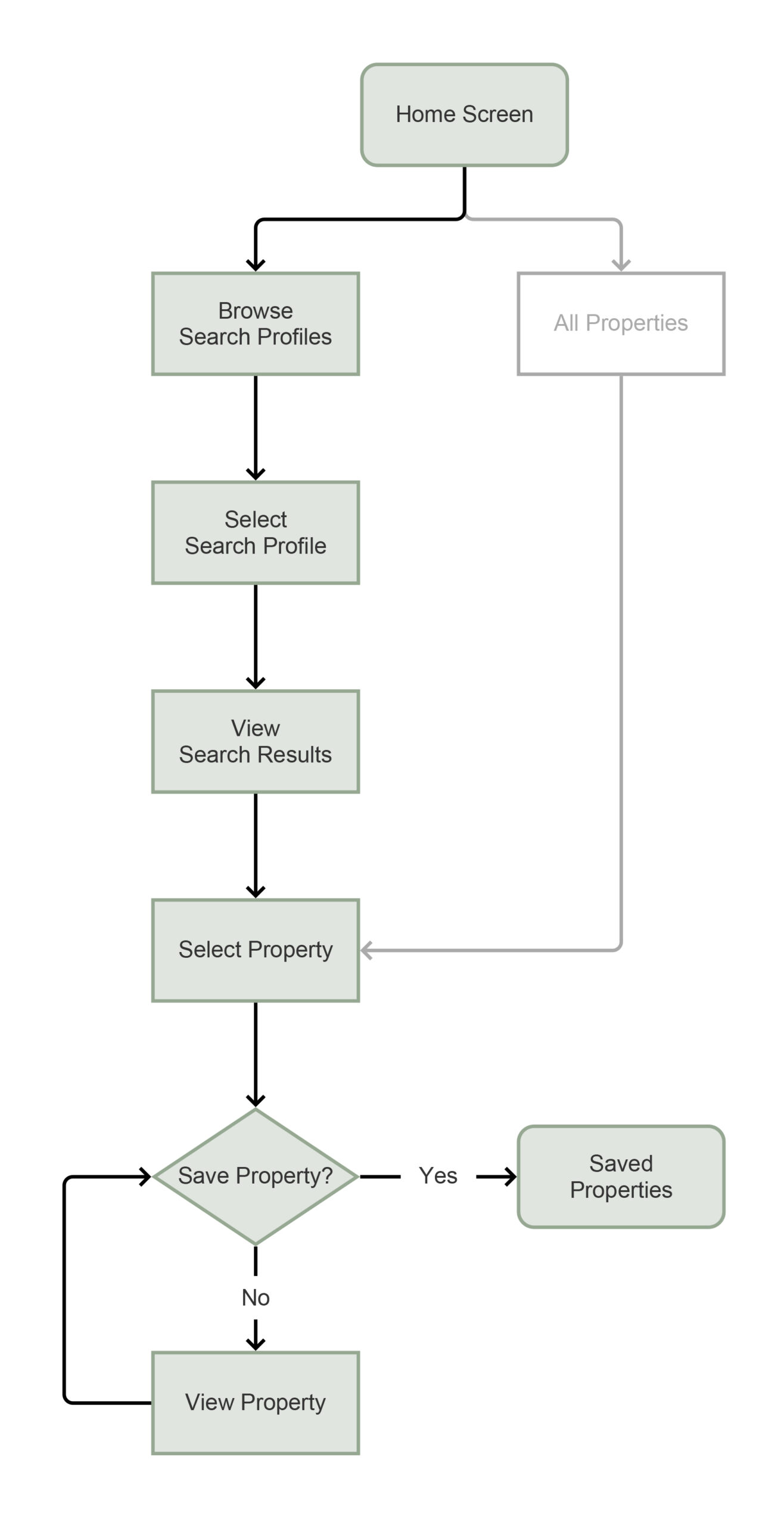
For this task a user persona was presented; Rashida is an IT consultant for a growing tech company.
I subjected her to a series of tasks, and created user flows to show the flows attached with each task.
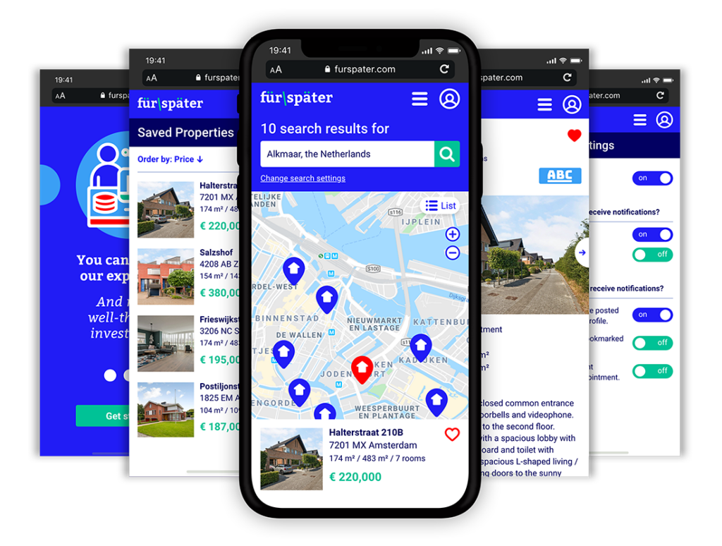
Onboarding & Search Profiles
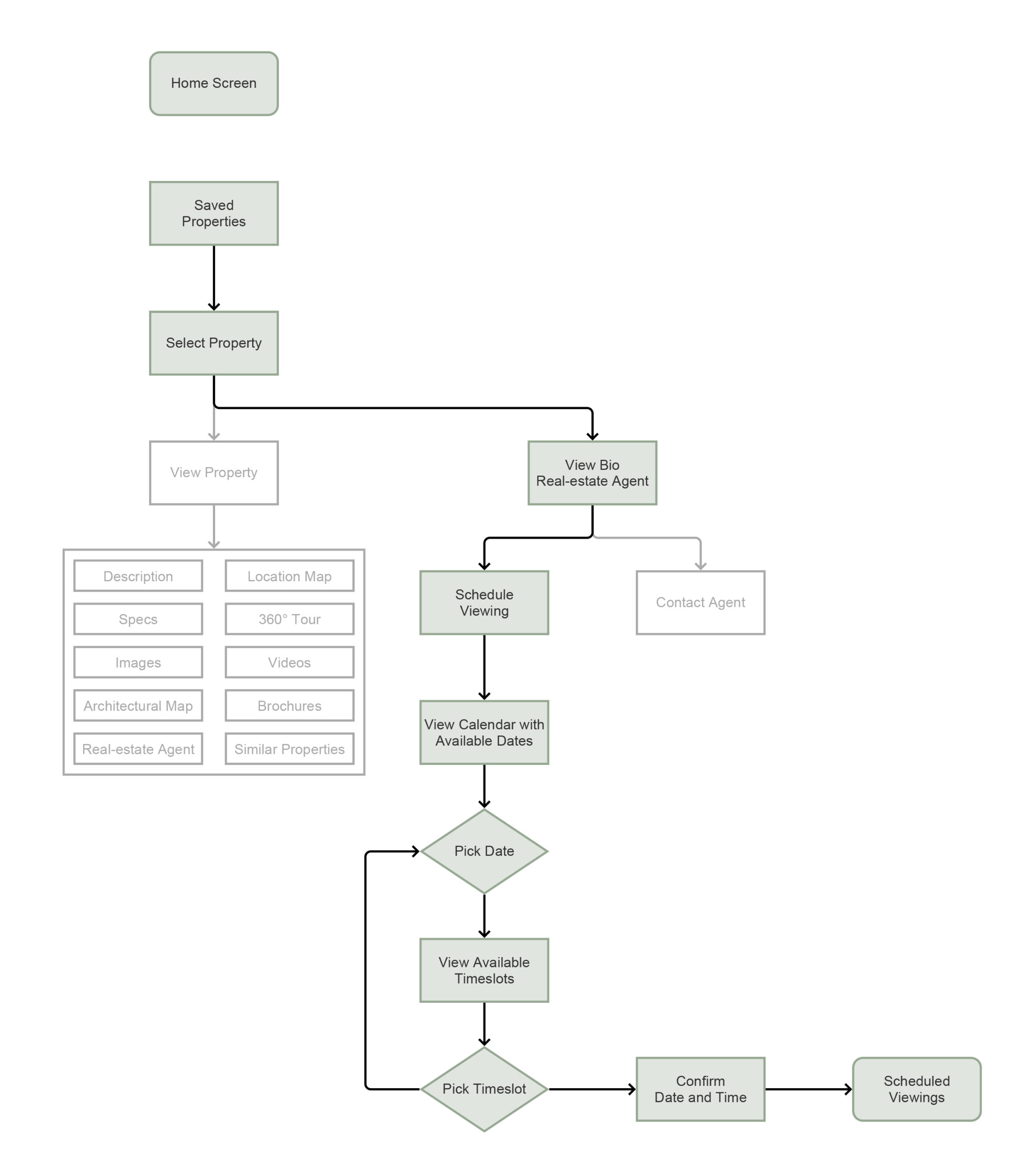
Search for Property
View Property page
Save a Property
Request a Viewing
Wireframes & Prototyping
Designing the Interface
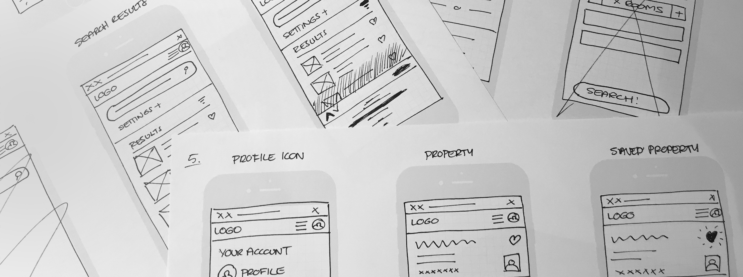
I started by quickly sketching wireframes using pen and paper. This is a good method to see what works, what needs to be displayed and how the flow between the screens will work. The big plus of this method, is that you can iterate quickly. Obvious usability errors will occur, if flows don’t feel natural. Through each fidelity step in the design process, I gradually increased the level of detail.
Low-Fidelity Wireframes
Pen and paper sketches with rapid iterations.
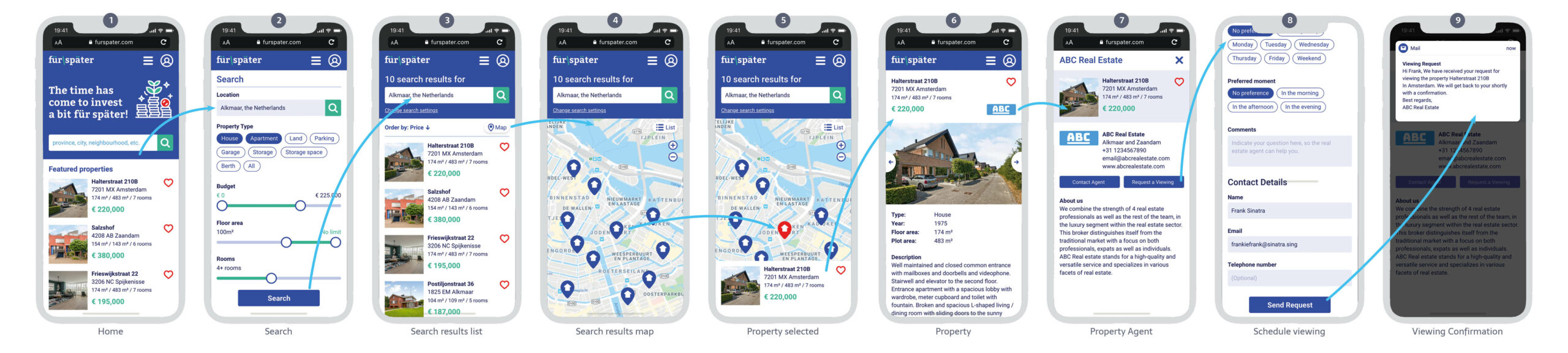
Schedule a viewing for a property.
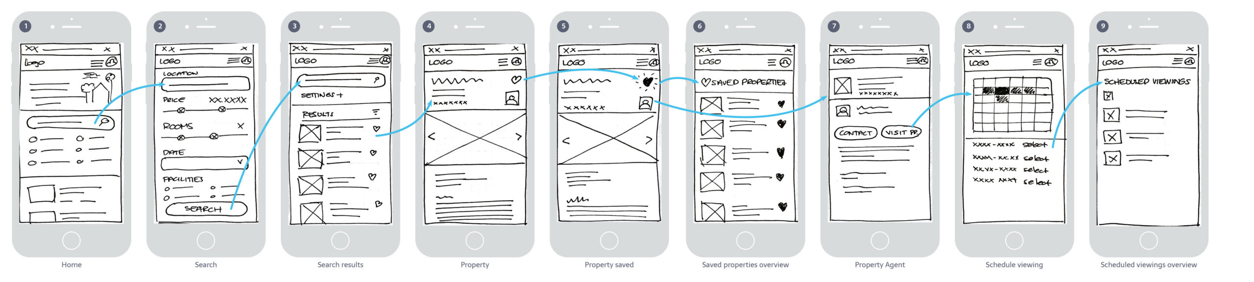
Mid-Fidelity Wireframes
Monotone with minimal assets, created in Adobe XD.
Schedule a viewing for a property.
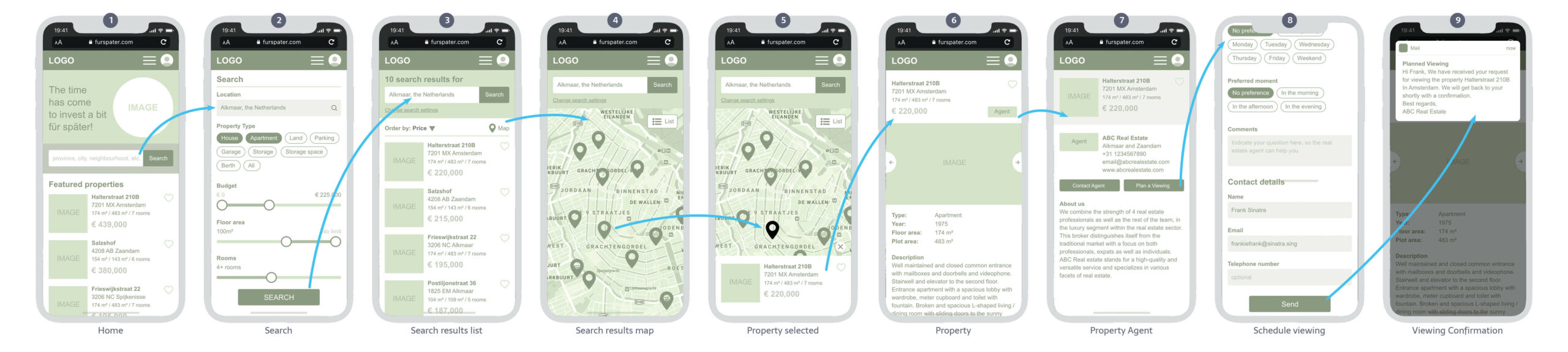
Hi-Fidelity Wireframes
Finished design with full imagery, created in Adobe XD.
Schedule a viewing for a property.
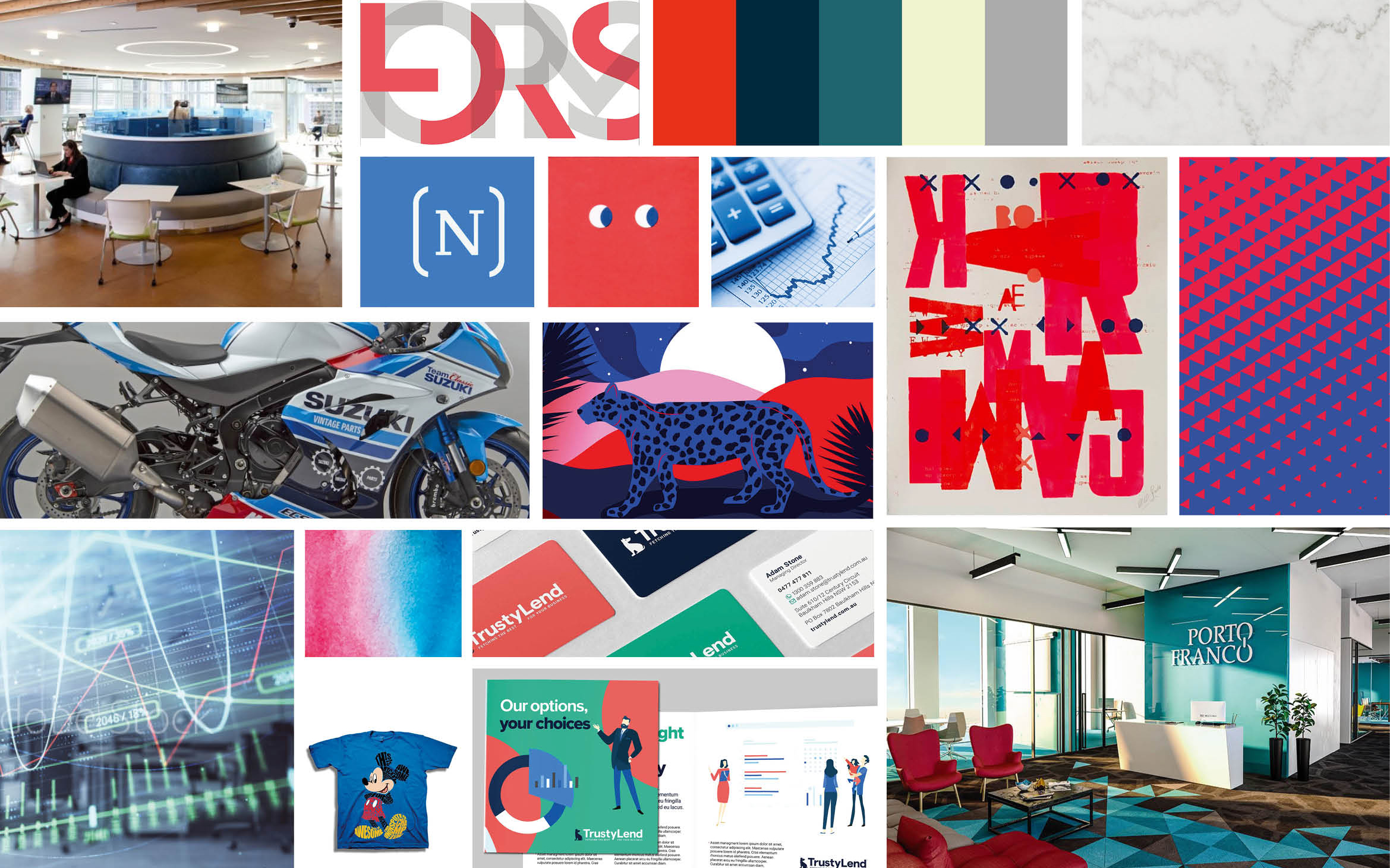
Creating a Moodboard
Blues & Aqua
This moodboard consists mostly of a blue and red color scheme. Blue stands for trustworthy and inviting, often used by banks or financial businesses. These colors can be accompanied with large captions in a serif font in combination with a non-serif.
The overall mood of this artboard is more classic and goes well with the trustworthy relationship we would like to maintain with our users. Although it does not have to be too classic, it has to maintain a modern feel.
While designing the UI, I experienced that designing with a combination with blue and red is hard, since red is often associated with negative events, such as errors. With that in mind, I shifted to a combination of blue and aqua with a few red accents.
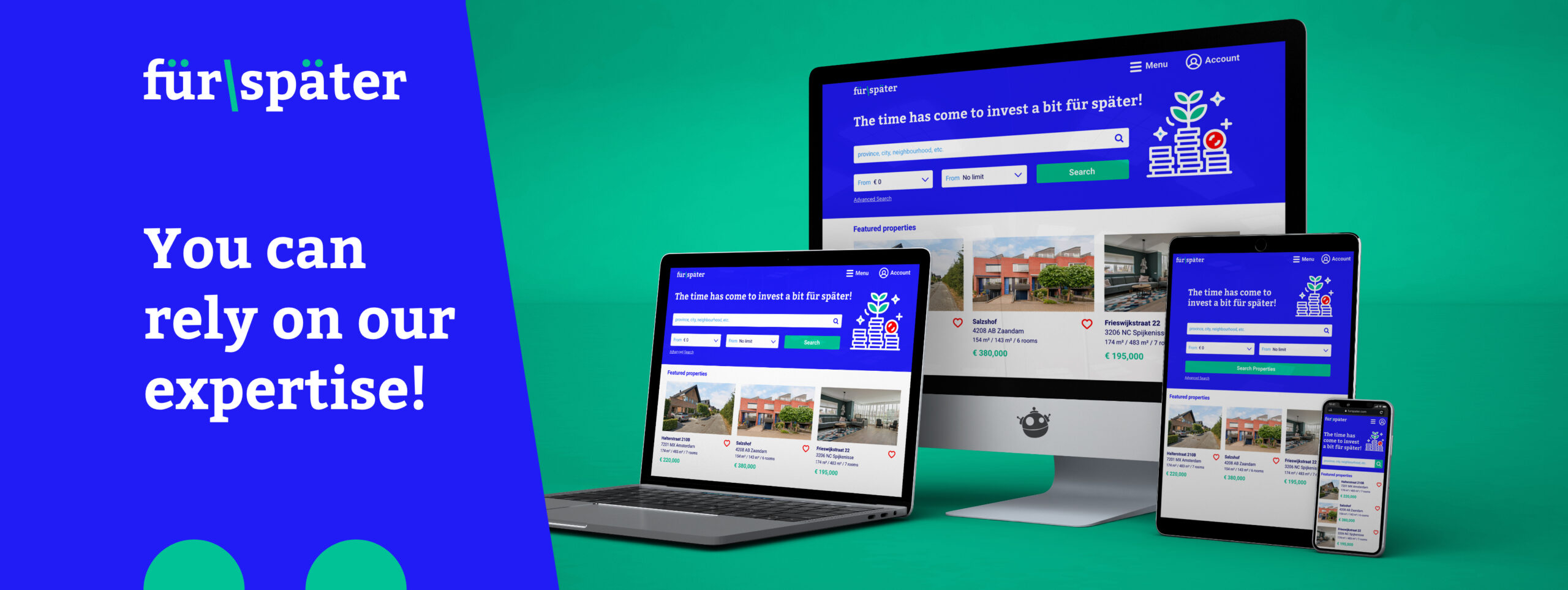
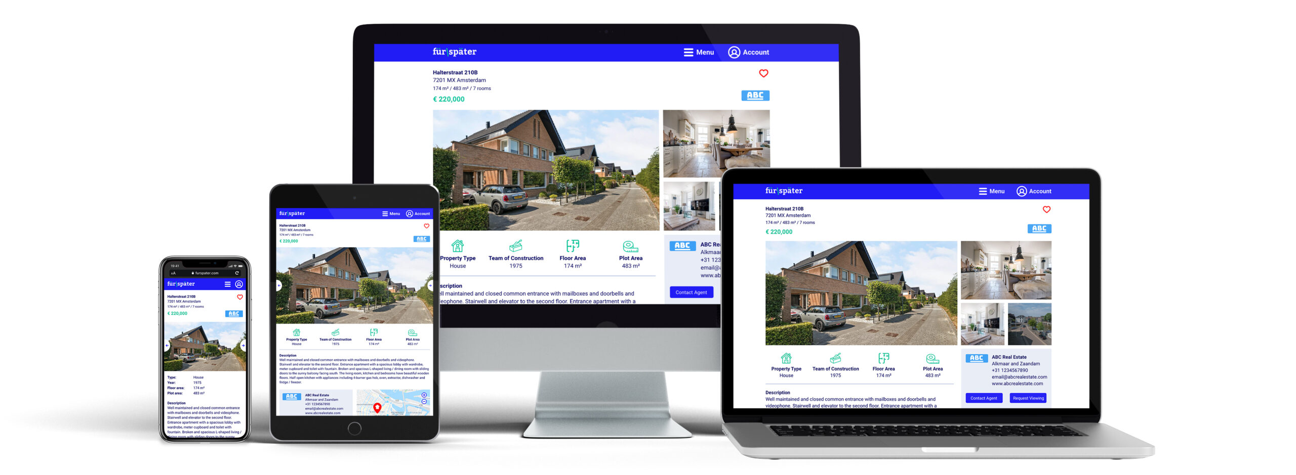
Designing for Breakpoints
Mobile first
This project is designed with a mobile-first approach. Mainly because our user persona, Rashida, is frequently on the go, and often holds meetings by phone in her car while driving. She is good at multitasking and relies heavily on technology to help her with this.
It’s expected that most of the users will use the service on their mobile, but we also need to support for tablet and desktop, which requires a responsive design. For this purpose I have converted a few screens to breakpoints for tablet and desktop.
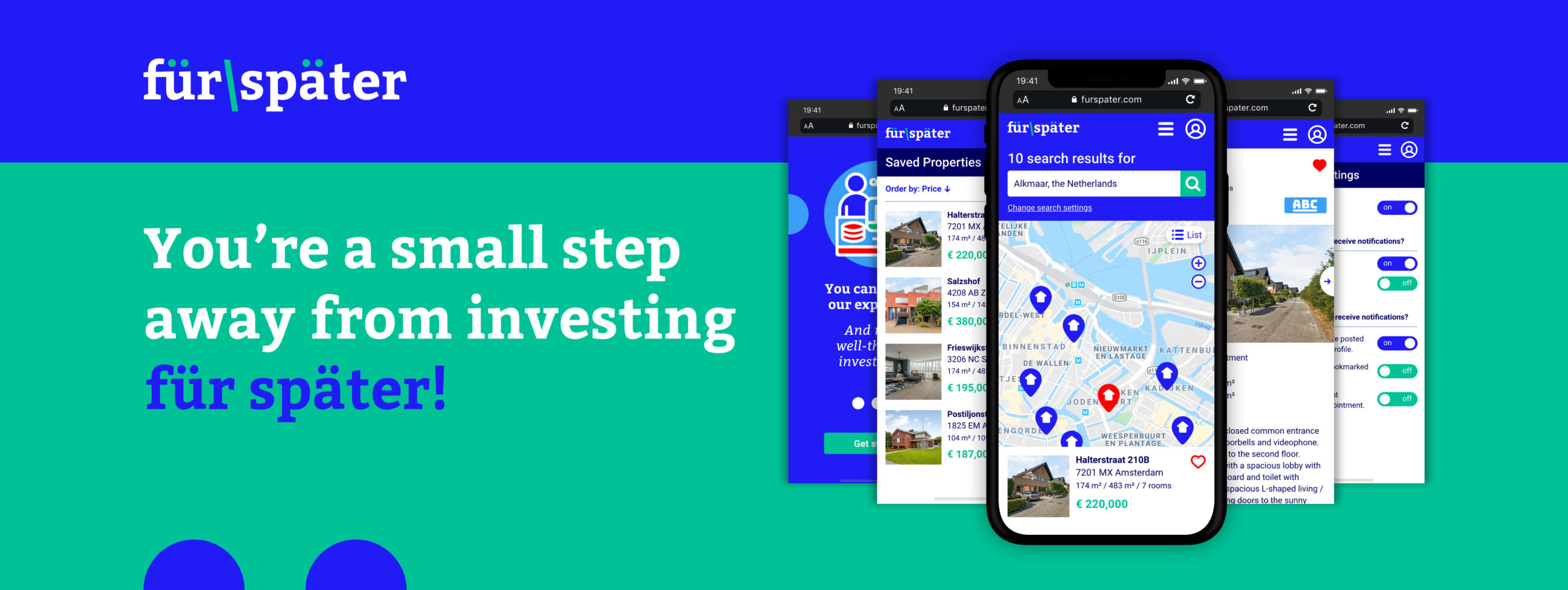
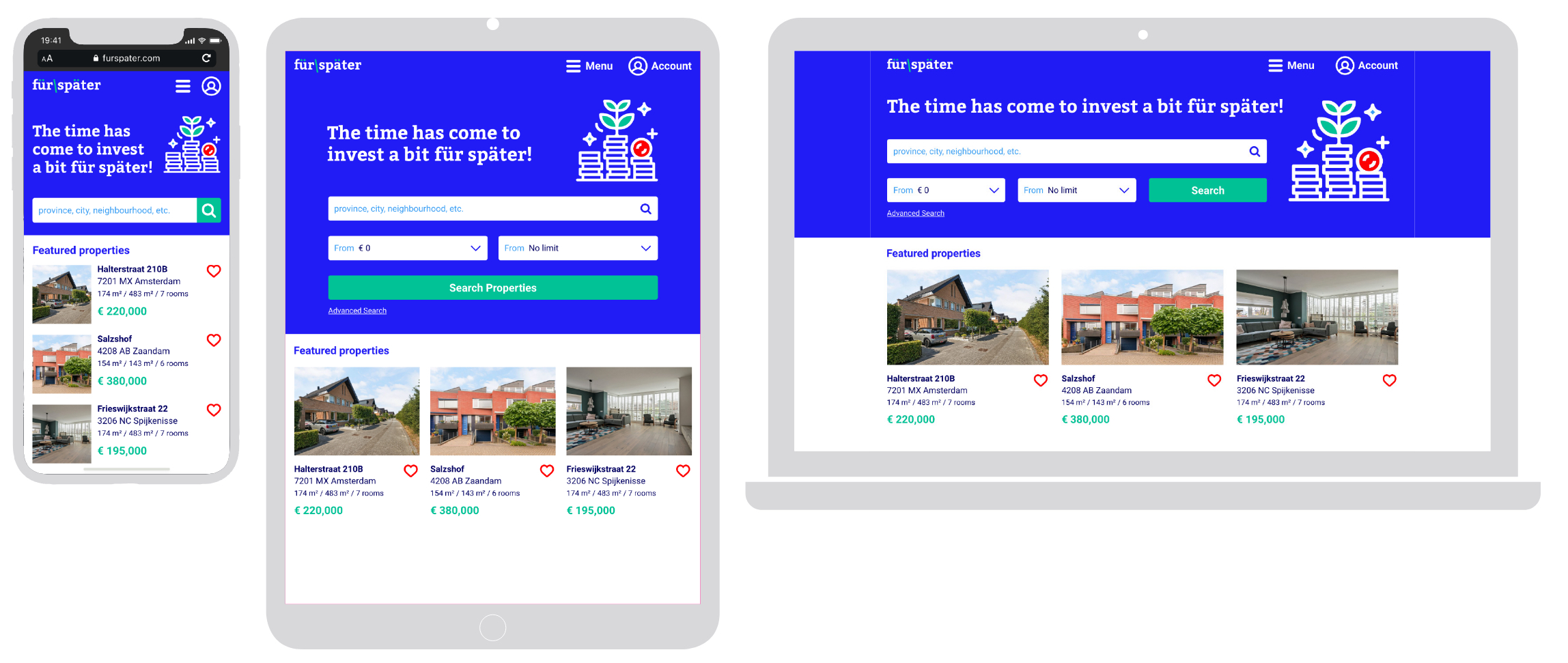
Home screen
Search Properties
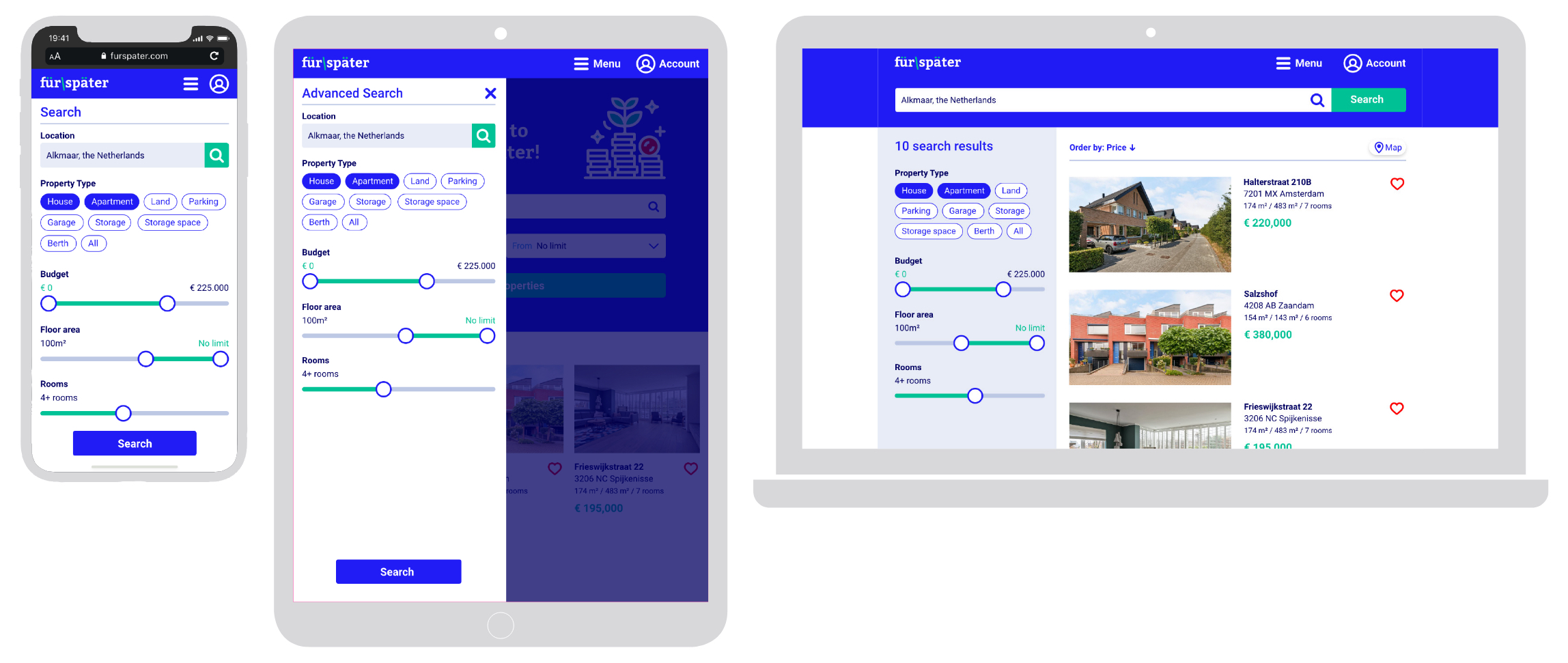
Property Page
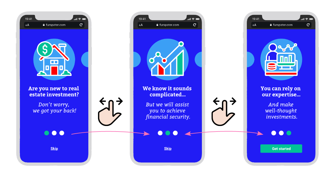
Gestures & Animations
Onboarding
In the onboarding sequence the user can swipe left and right to navigate through the 3 steps. Animation were added, so it suggests that the illustrations are pulled into the viewport.
Navigation
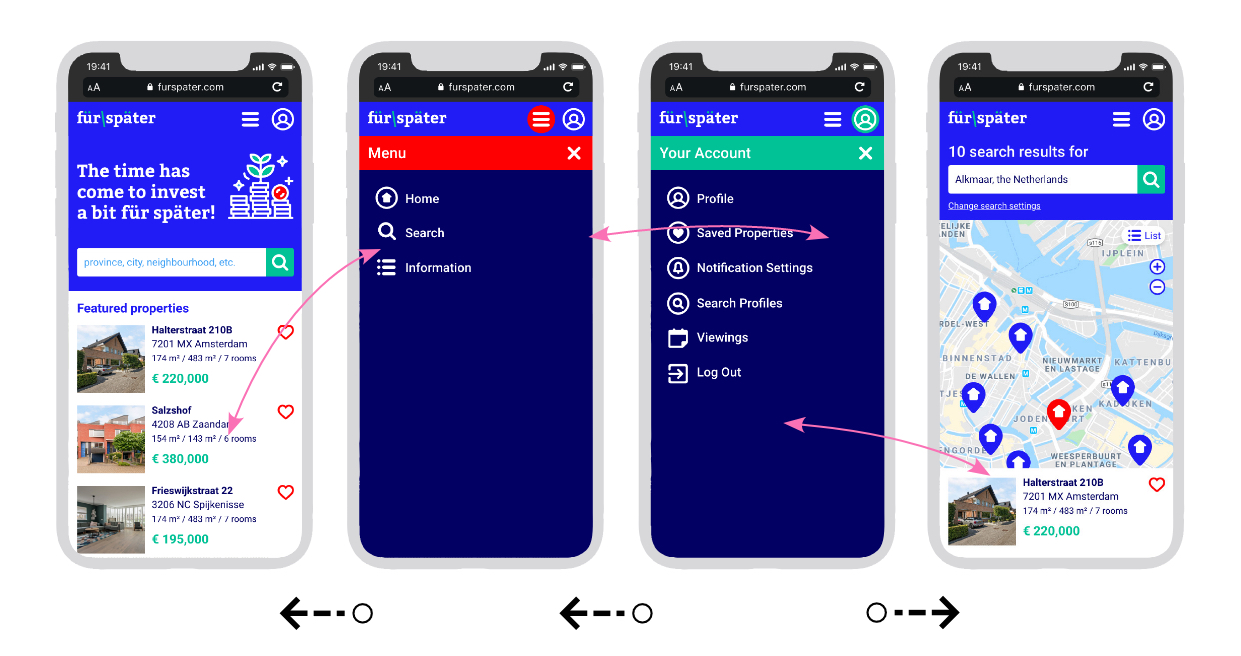
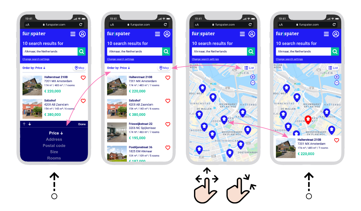
List and map view
The user can sort their sort results by different methods. If he clicks the sorting icon, a menu slides in from the bottom of the screen. After selecting the sorting method, the menu slides back again.
The user can also switch between list and map view. The map can be navigated by sliding up, down, left and right. He also can pinch the screen to zoom in and out.
When a marker on the map is clicked, a box slides into the screen with information about that specific property. When the marker is clicked again, or another marker is clicker, the box slides out.
Refining the Design
By creating a click-through prototype of my hi-fidelity design, I could test if the flows work and if the prototype feels natural. To really determine if my design meets the needs and goals of its users, one or more usability tests would need to be conducted with prospect users. You can see this as a sort of MVP (minimum viable product) where we could test a preliminary version with a selection of users.
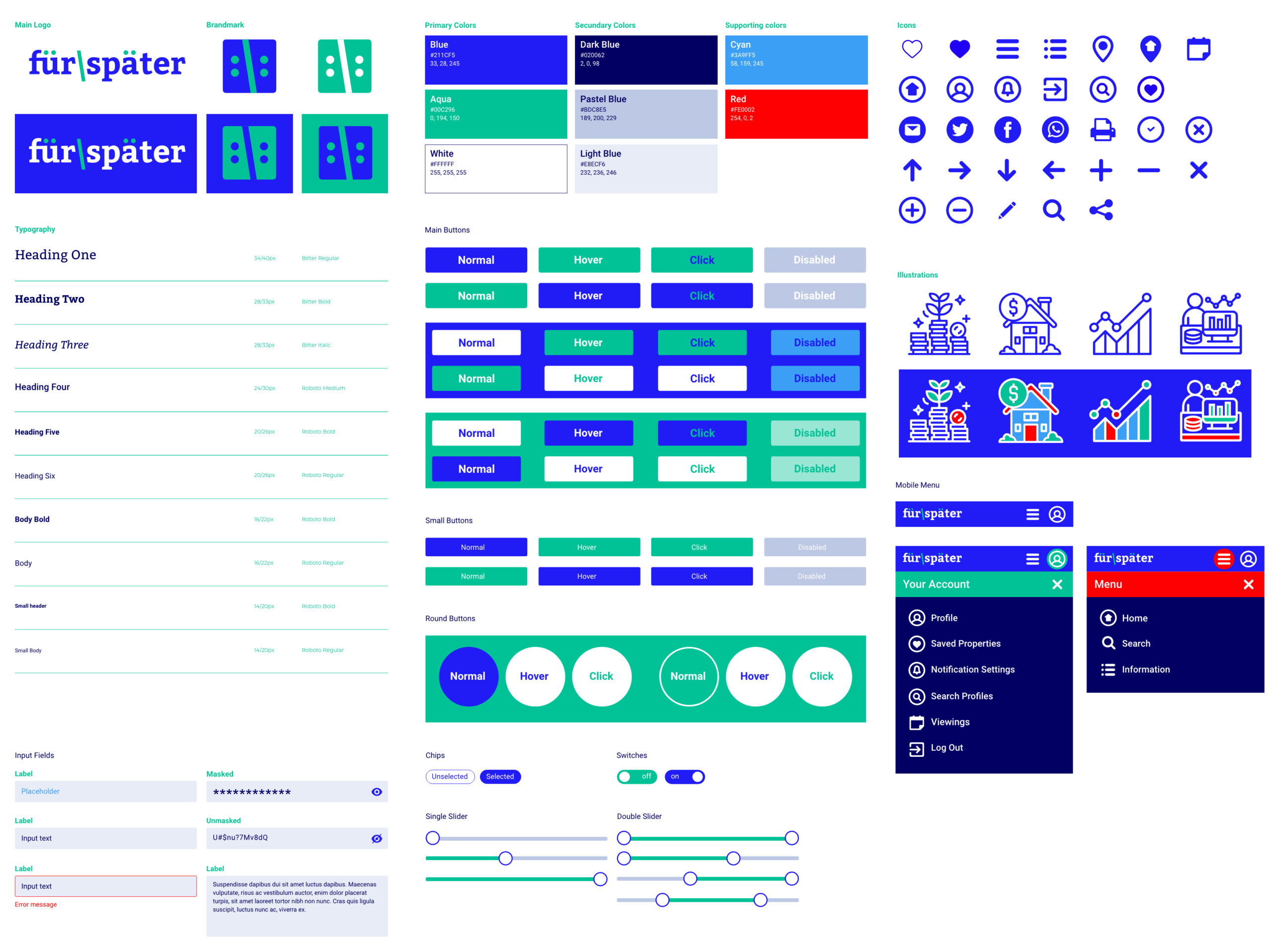
From my high-fidelity designs I have created a “final” design and setup a design language for Für Später. This helps with handoff to other designers of developers, since they can take a look at the documentation and view all guidelines regarding, icons, illustrations, images, UI elements, etc.
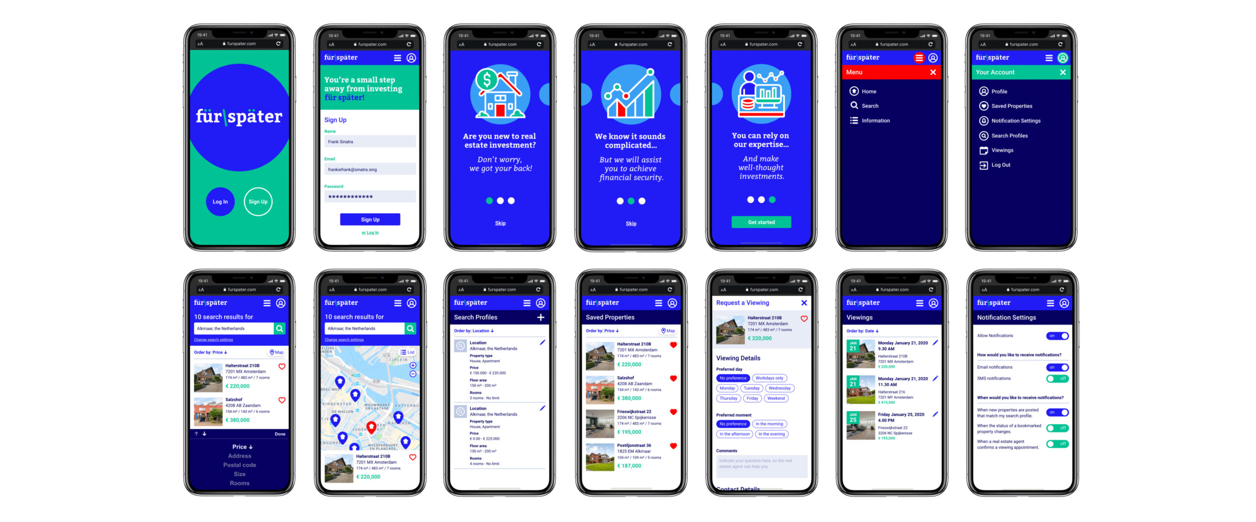
A selection of screens from the “final” design.

Final Prototype
Throughout this project I have learned so much about user interface design. Design is not all about creating pretty things, but also about getting to know your user and their needs and goals.
Making designs for specific breakpoints was good practice and adding gestures and animations really make a design come to life. I have used functionality of Adobe XD that I never did before and it was a breathtaking experience. Although it sometimes is obvious that it is still in beta phase, it comes with some bugs.